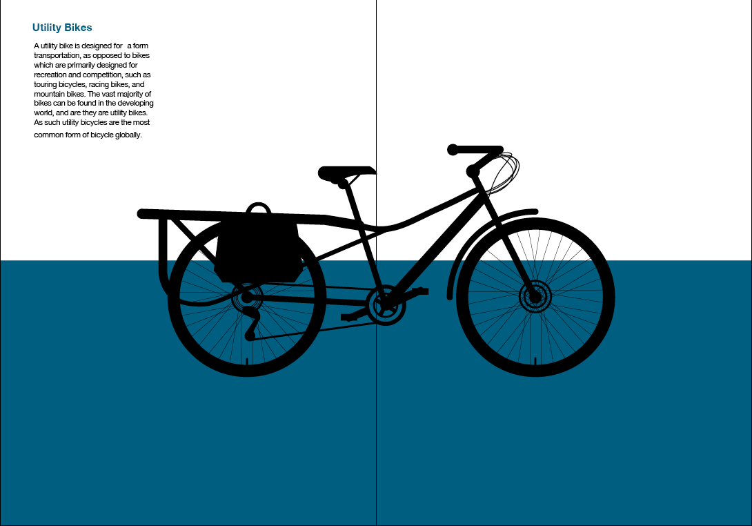
I then created these layouts shown below, using one of the illustrations i have created i used to see where would be best to have it. I also put in text to see where that would work with my design.
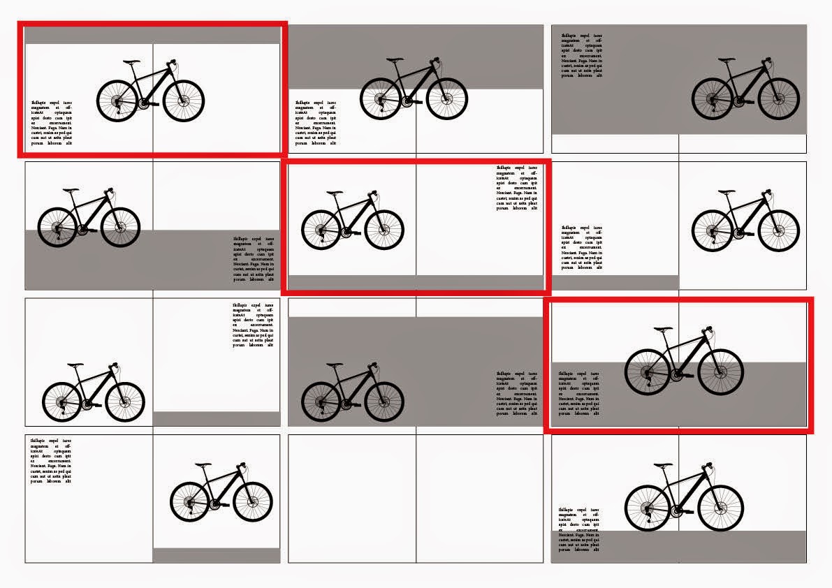
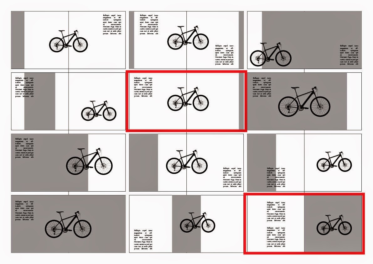
I have highlighted the ones i feel are best and ones i will take forward with my publication.
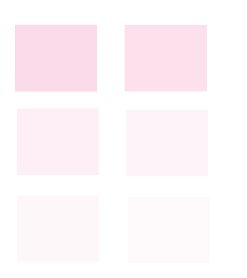
I then started to look at different colour schemes to see what i could use for my publication.


I used this grid system to layout my book,

I then looked at the colours i selected earlier to see what they look like.


I decided that the blue looked best, and that it also worked best as a gradient.
Using the layouts above to see what works best
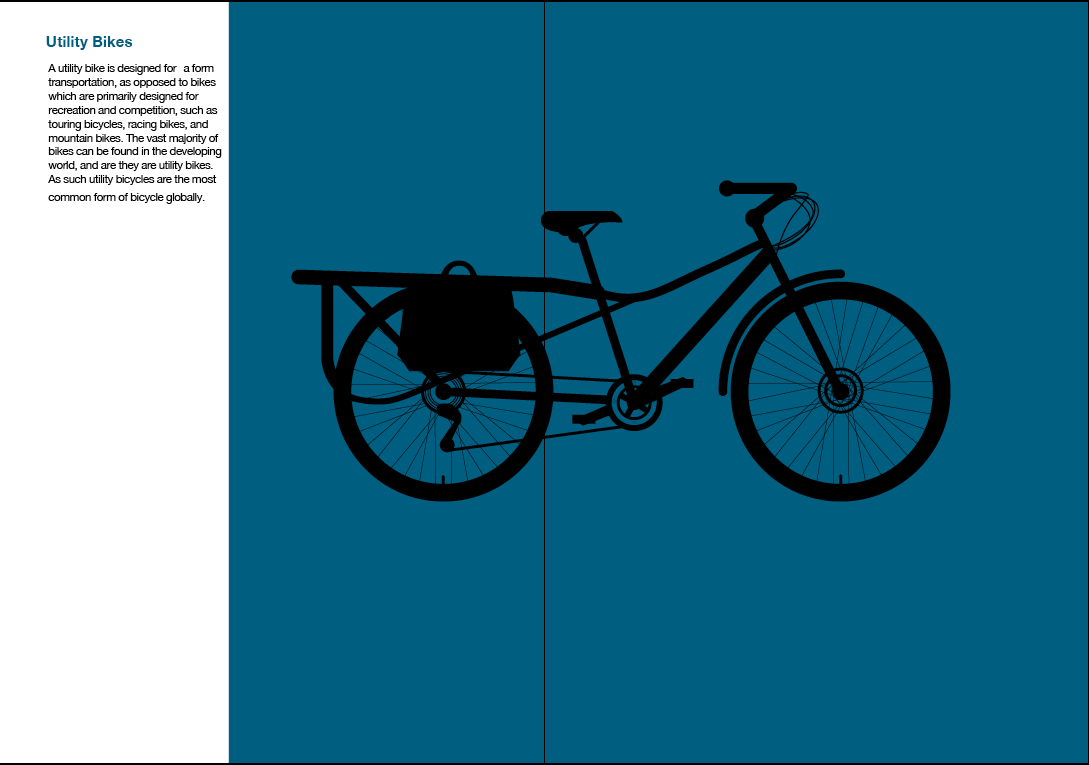
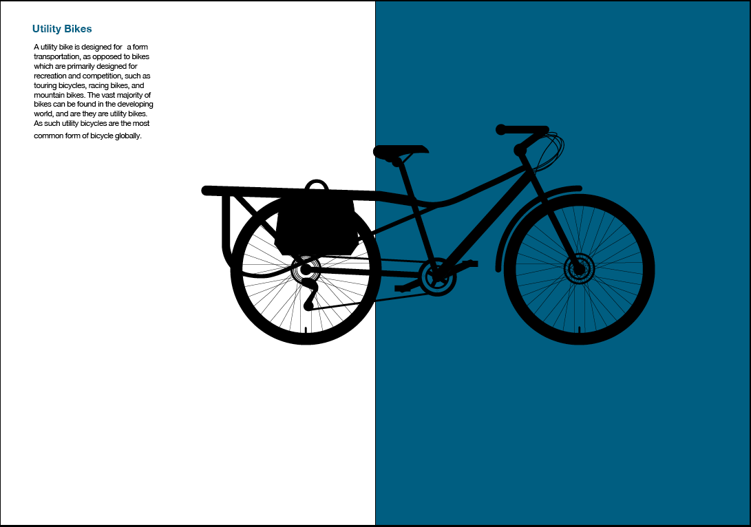


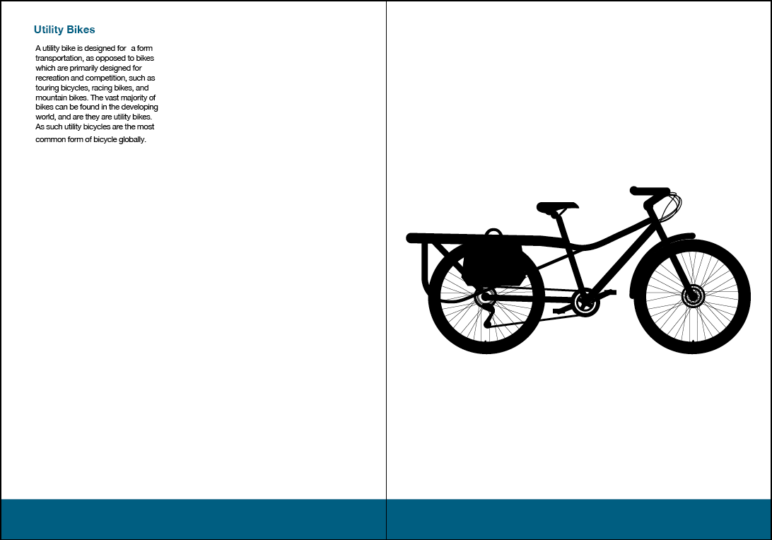
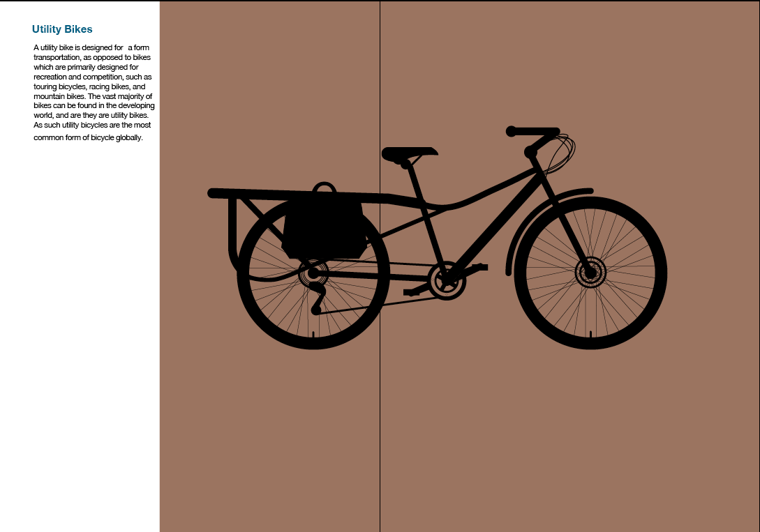
I then selected the layout above, i felt this was the best because it showed the bike as the main attraction and the colour isn't too overpowering on the whole page. There is also a small description that isn't too big but is easily readable.
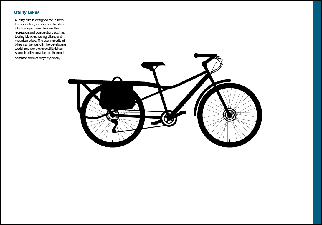
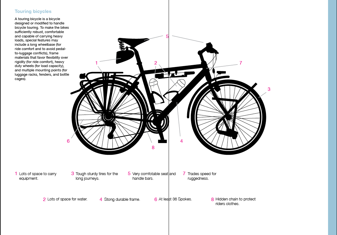
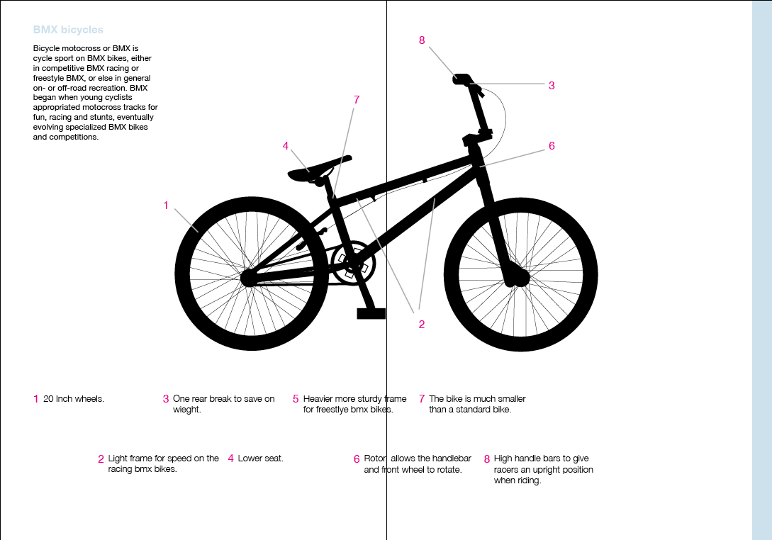
Using the gradient i then started to insert the other illustrations i had made.
I also added information at each bike, from my research i was able to find out information about key parts of the bike, i have put these on to the page via a numbering system, where each part is labeled with a line and that number is put at the bottom.


Front cover
for the front cover i took the gradient and used it across the bottom and put the title of my book at the top, keeping it simple and easier to read.


No comments:
Post a Comment