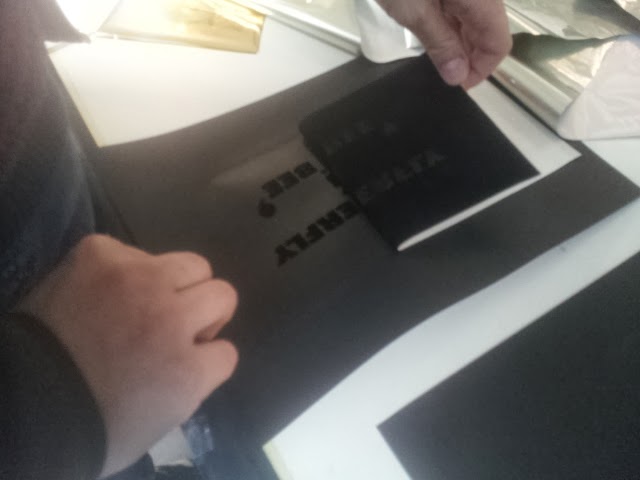
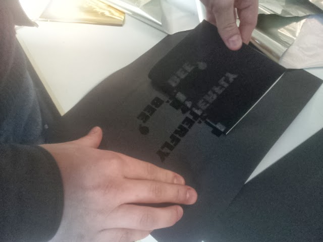
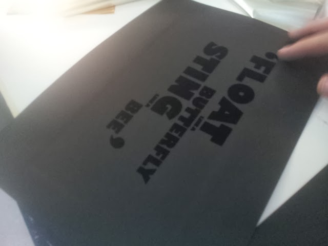
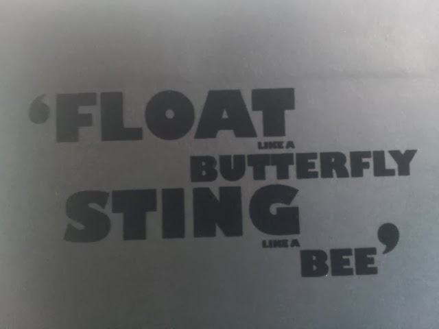
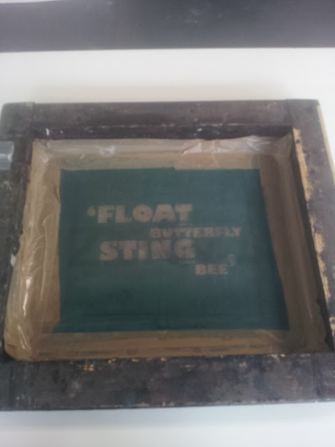
We were given the task to find 9 errors that had been deliberately made in a indesign document, we had to find them as if we were preparing it to go to print.
Things to consider
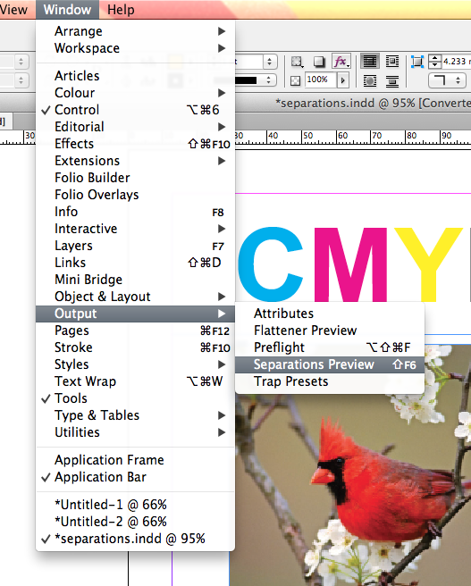
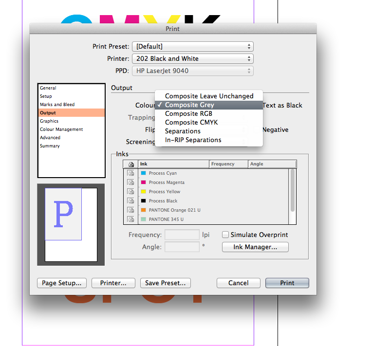
5 ink print job
9 errors
Things we found
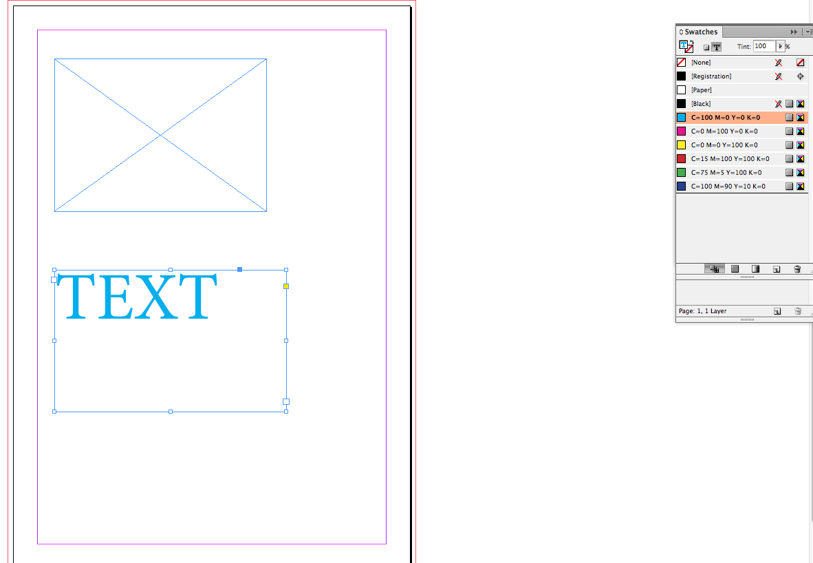
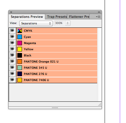
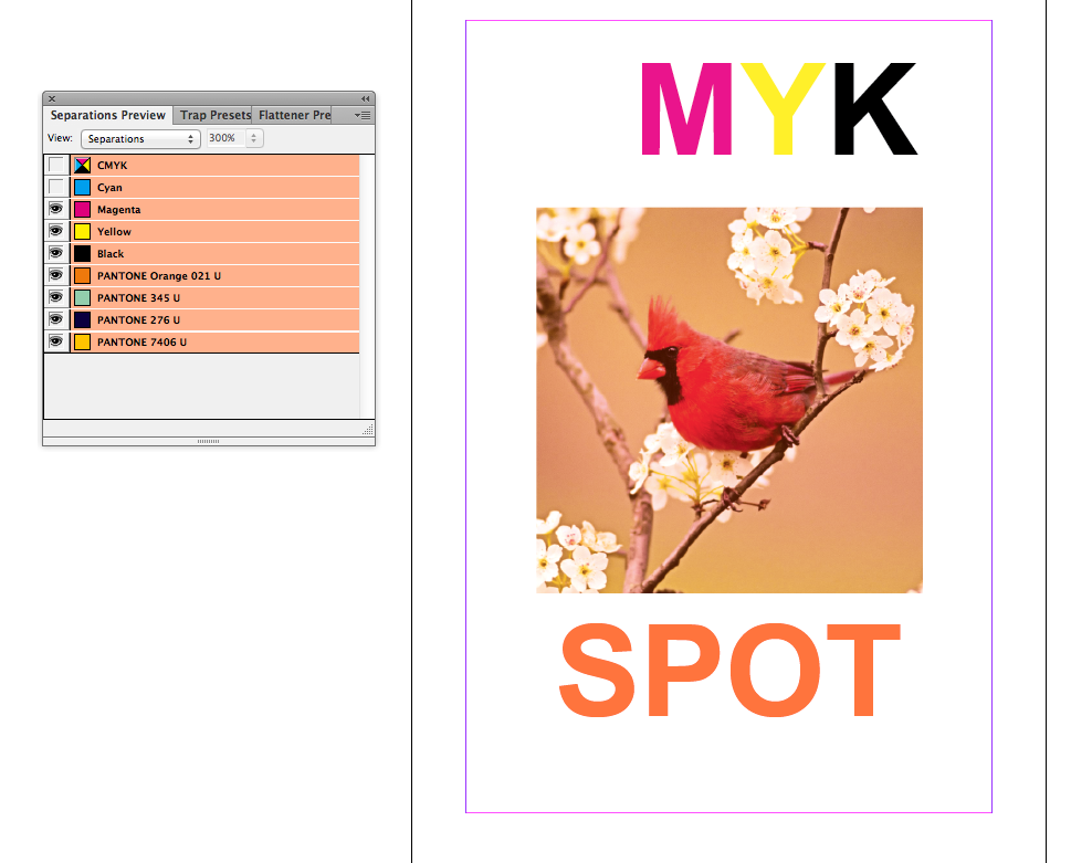
- 6 inks are being used so it makes it a 6 plate process not 5 which it specified
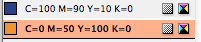
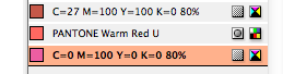
- 2 spot colours one is not being used, so delete it
- The top right Image is RGB needs to be changed to CMYK, right click the image and press edit with then choose Photoshop or use Alt and double click the image
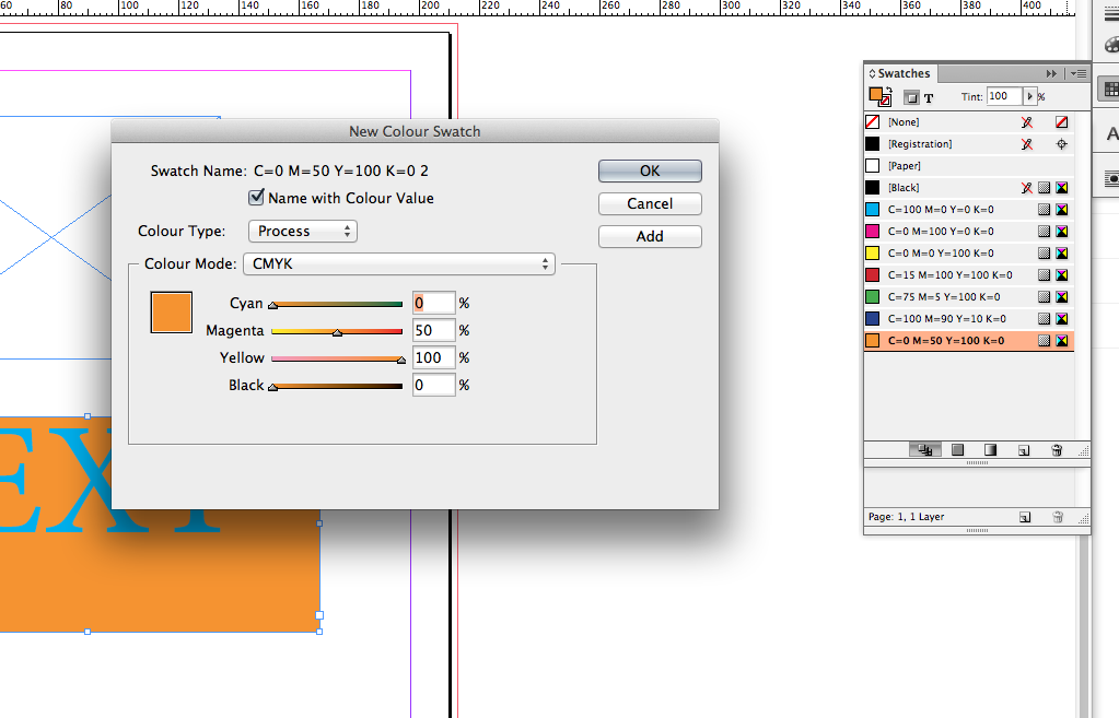
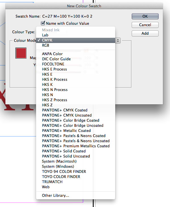
- One colour swatch is RGB, change it on Swatch Options to CMYK
- One of the images is 200dpi it should be at least 300dpi, this can be edited in Photoshop
- The cow needs to be scaled in Photoshop (Alt and double click)
- Left Logo at the bottom needs to be scaled up in Photoshop. Greyscale TIFF files can have there colours changed in indesign.
- Right Logo at the bottom needs to be scaled down in Photoshop, (Alt and double click)
this logo would have to be made again because the quality of the image will decrease a lot when scaled.
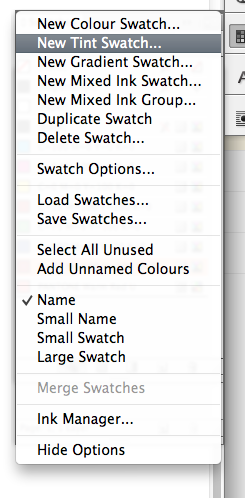
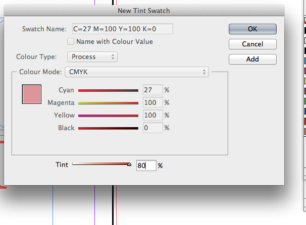
- Good Practice to have a tint swatch of the CMYK colour
- The image of the 'heifer water' should be saved as a TIFF or PSD not a JPEG, reopen the file, right click and open with Photoshop, then save as a TIFF file. Then in indesign relink the image and exchange the jpeg for the tiff file.
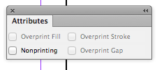
- The type at the bottom is set as a registration not black, the registration is used for printers marks and it will go on every plate so it will be layered with a lot of ink
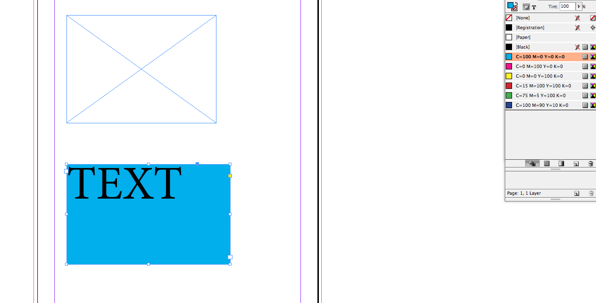
- The image on the far left doesn't have a bleed of the edge of the page so there might be a white edge when cut.
There is a quick way we can get to all this information we just discovered about this flyer. We can gather everything together in Package, it makes a copy of everything in the indesign document and all the images and all the fonts, this gives you everything you need to send to the printers.
It also gives us a summary of what has gone wrong on the document, such as links, images and there resolution, fonts that might not be there and also the inks that are being used. A report can also be printed out.
It then offers printing instructions, where a note can be left for the printer, such as things that are there for finishing processes.
It all then gets put into a folder.
We would also provide a PDF file for the printers, for print the best quality one to use is [Press Quality]
For Digital Print just use 'High Quality Print'
If sending an email that will just be viewed on screen smallest file size will do
PDF contains everything
PDF export options, during the process of creating a PDF all colours get converted to CMYK apart from Spot colours
Make sure you confirm with the printers that crop marks and bleed are being used
Then press export

.jpg)

.jpg)