Saturday 22 March 2014

Design for Champneys

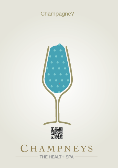
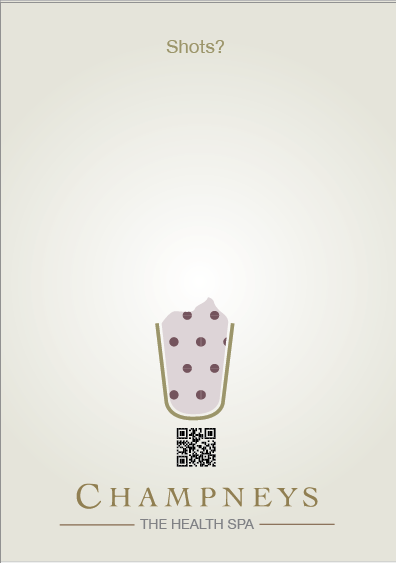
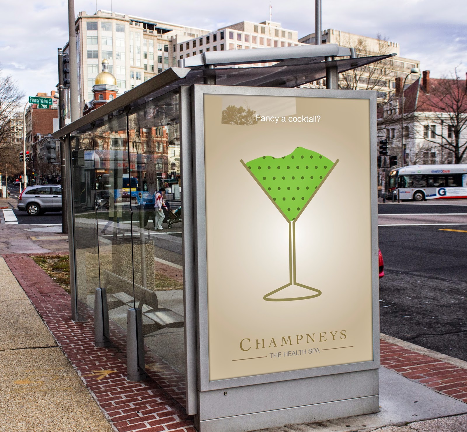
Taking the illustrations created by ant i set about creating posters that would be used to advertise the products and the Champneys brand. These posters should be simple and in keeping with all the other Champneys brand as well as the app Ant has made. 


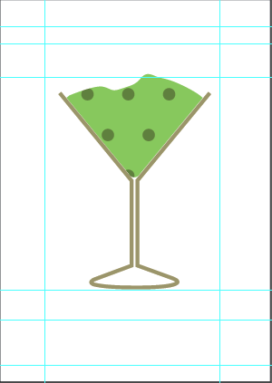
So after the crit and the ideas we got Ant created these drinks shown below using the research i did when i went to boots to look at there product range. 


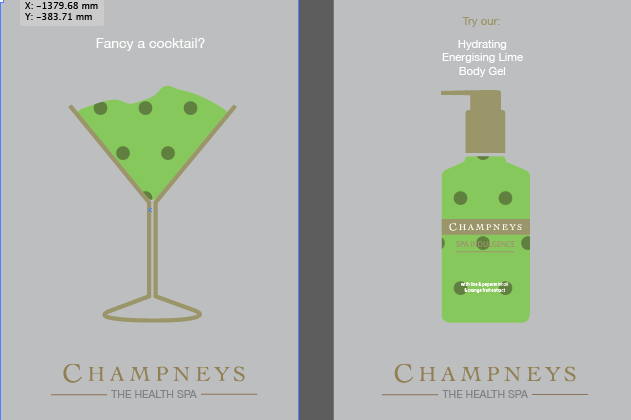
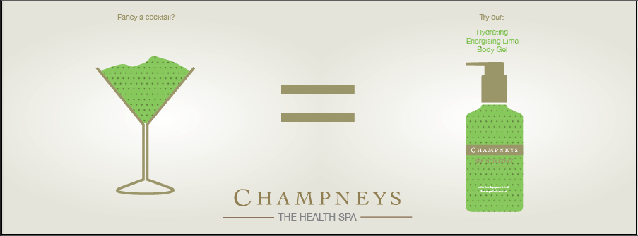
So using these illustrations created by Ant i am going to create posters that will show the glass on one side and then the product on the other, incorporating the Qr code that Ant has made. 


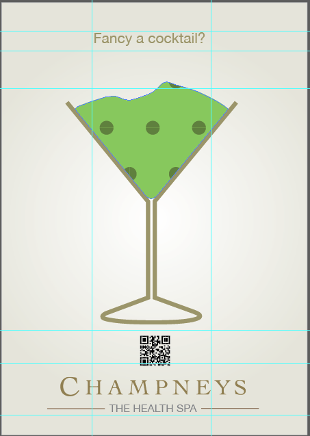
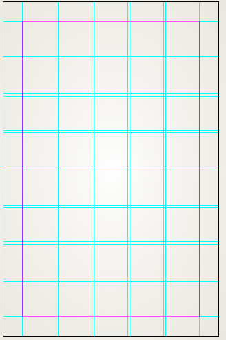
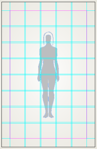
I started off with a simple grid that i took from the brochures i had been researching so they would tie in with the rest of the Champneys brand. 


This grid allows me to have the product as the centre of attention but also i can insert other information at the bottom and top. 


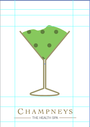
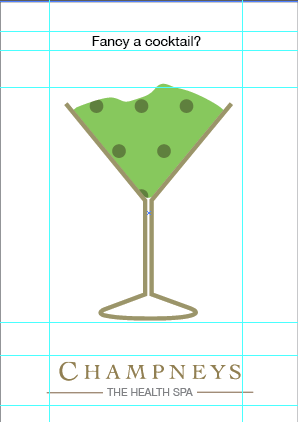
i then started dropping in relevant information


The main image in the centre 


The logo at the bottom so they know its Champneys 


Then the slogan 


After this i felt it looked a bit boring so i inserted a colour to the background. 


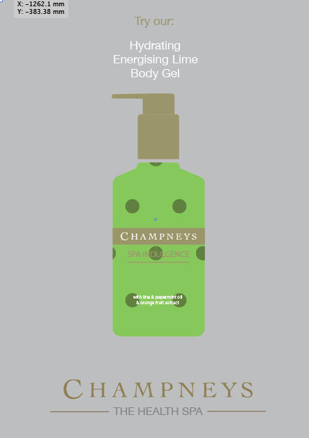
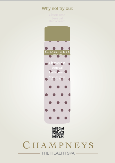
I then created the product poster that would be displayed next to the one above. 


This is how they would be displayed next to each other. 


After looking at them closely i felt they didn't match very well with the App that Ant made and the colours needed to be changed and maybe changing the type as well. 


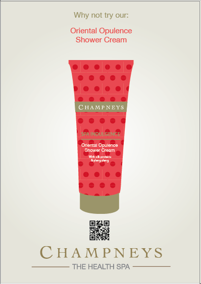
SO using the same grid i inserted relevant information and also chnaged the background colour. 


I then did the same for the product poster. 


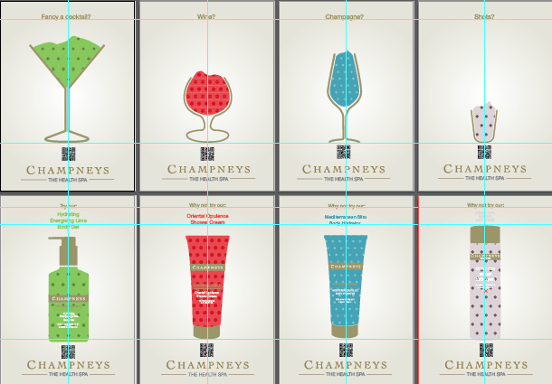
I then did the same for all the other products. 


I then made sure they were all consistent and so lined them up and used rulers to line them up. 


I then went about creating some mock ups for the design boards of the posters in an environment. 


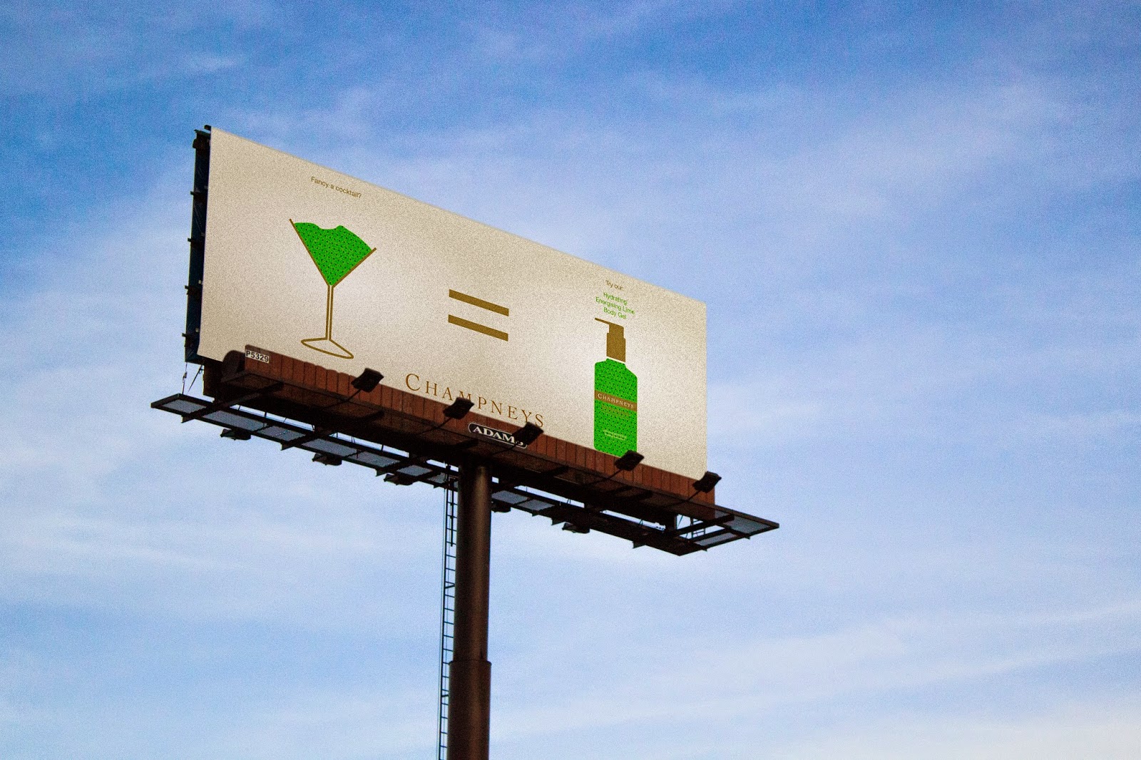
Next i thought about other ways of advertising and so i thought a billboard would work well with what we were portraying. 


i firstly created one with just one of the products 


and then made one with all the products 


I then mocked these up on to a billboard.


Monday 17 March 2014

Champneys Leaflet


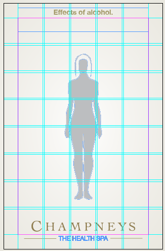
For something to take away with the products i created a leaflet that describes the benefits of going to Champneys and what part of the body it effects and also on the reverse was a image to show the effect of alcohol and the parts of the body it effects.  

I again stuck with a very simple layout that fits in with my publication and the rest of the Champneys brand. I have used the same grid as my publication as well. 


This is a very simple leaflet that gets to the point. It can be used to shock and persuade the people who are given it, it has very simple illustrations that are easily understandable and would be appreciated by the target audience. 


Friday 14 March 2014

Design for champneys


Creating the info-graphics using the information i gathered. All these infogrpahics are to be used in the booklet i am creating that is to be handed out with products. Each one represents a benefit of the Champneys Spa. 


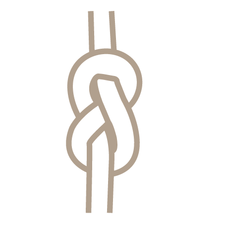
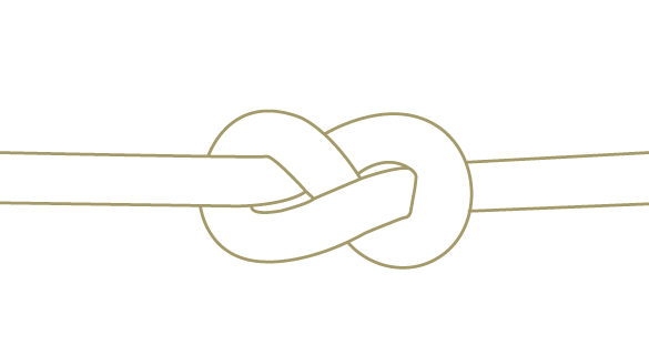
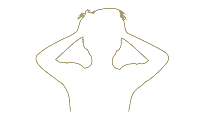
Helps prevent knotting muscles


This initial drawing of the knot but i felt it was to strong a weight and need to be horizontal 


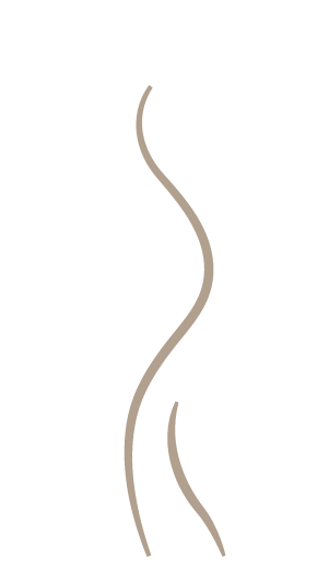
Body contouring helps prevent weight game and helps the loss of weight and prevention of obesity. 


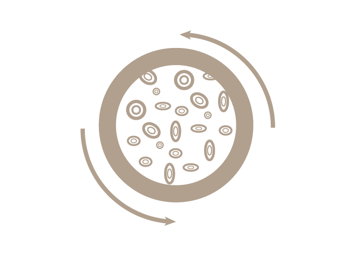
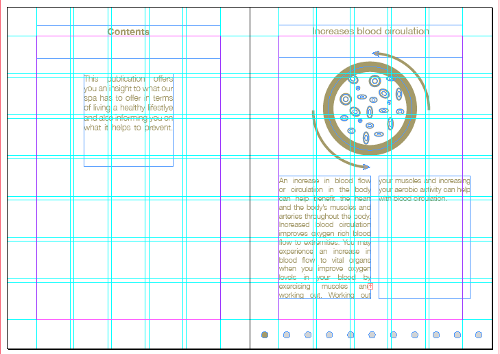
Increases blood circulation 


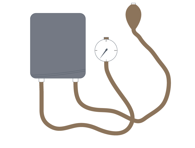
lowers blood pressure 


Mud therapy helps smoothen skin and prevent pores from forming 


Helps prevent stress


Stress can then lead to heart disease, sleep disorders 


Improves sleep


After creating these info graphics i then created a grid on a leaflet hand out sized publication (5in by 4in) 


Layout ideas 

I started looking at different layouts that i could use for the publication, i have created very simple layouts that fit in with the Champneys brand and all of there other publications that i have researched. I have highlighted the layouts i liked best and the ones i am going to focus. 


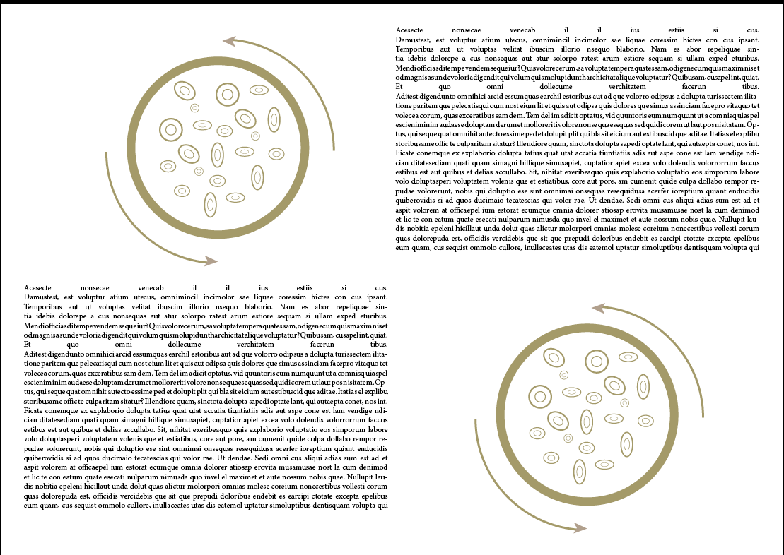
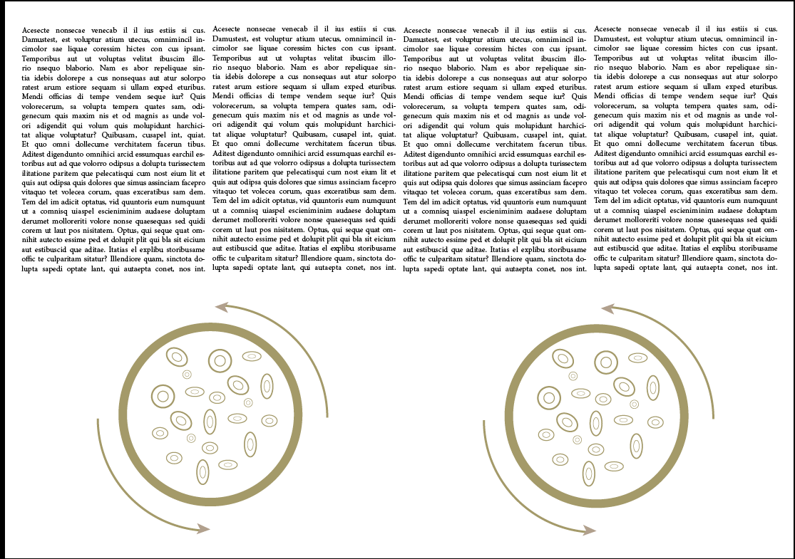
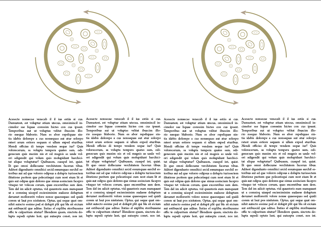
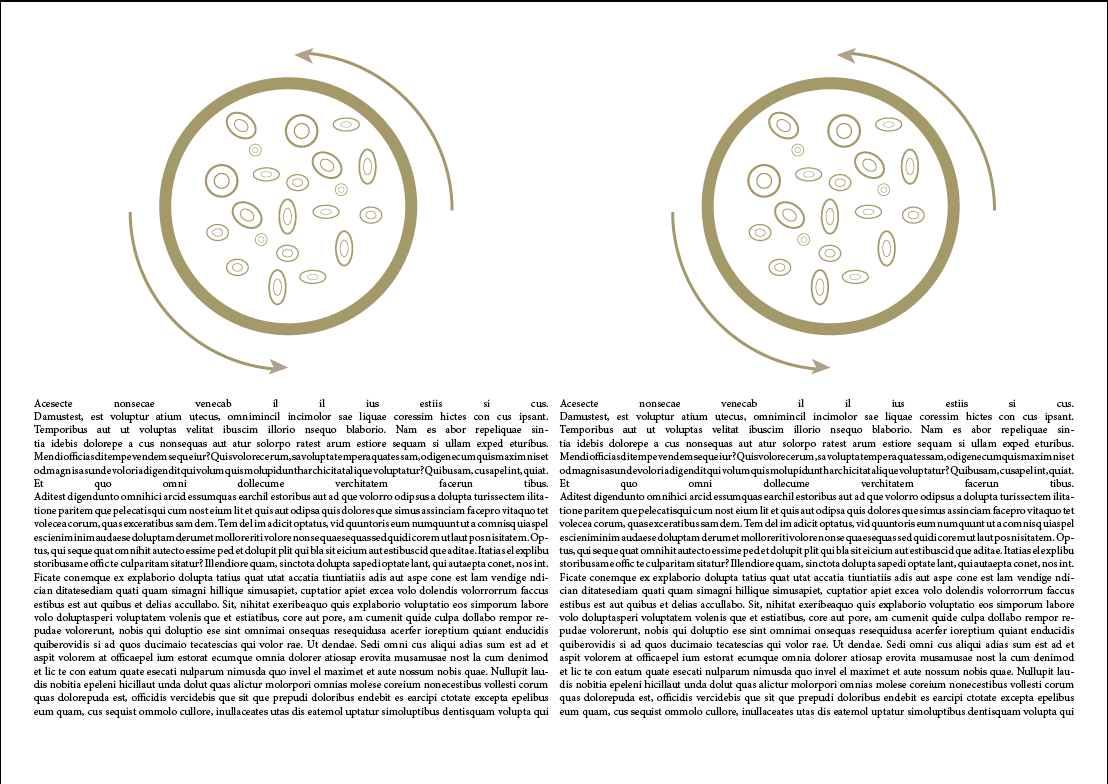
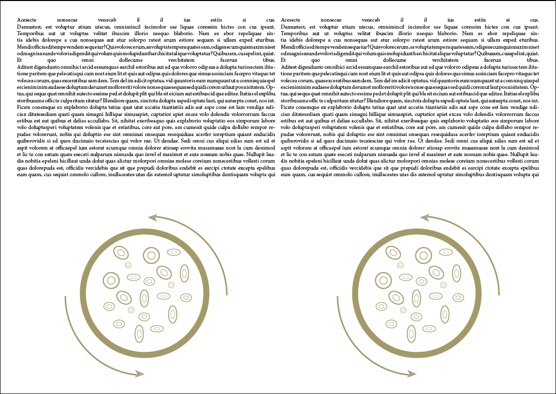
I then looked to see what the three layouts looked like with one of my illustrations in them.


I think the one below is best with the two columns and the image at the top, the text has been shortened and so is easier to read and isn't boring.


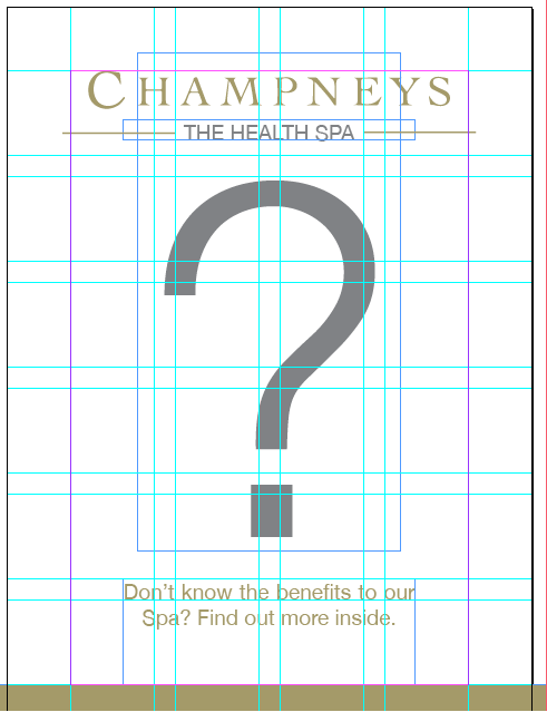
I then put a grid behind the pages, shown below, so i could line things like the text up.


I kept the layout simple in-fitting with all there branding and there publications that i have already researched. 


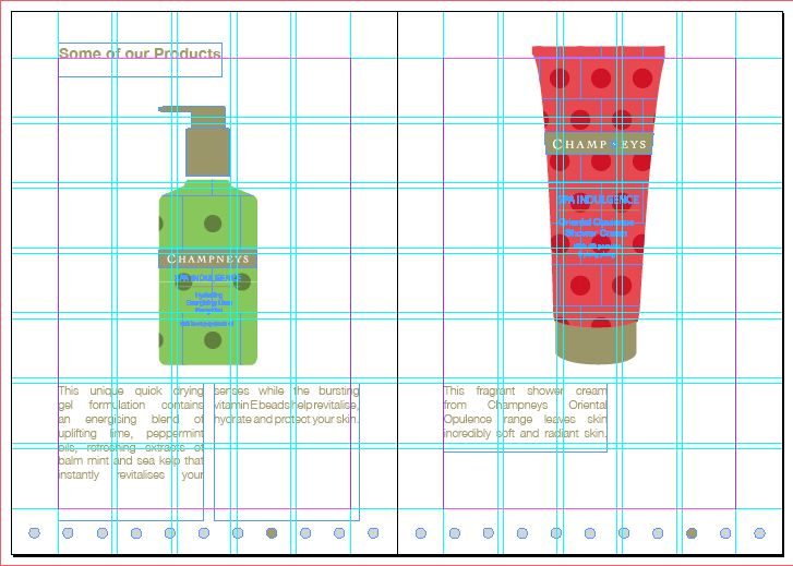
I then added in some of Ants illustrations for the products and then adding in an explanation.


Final Publication