
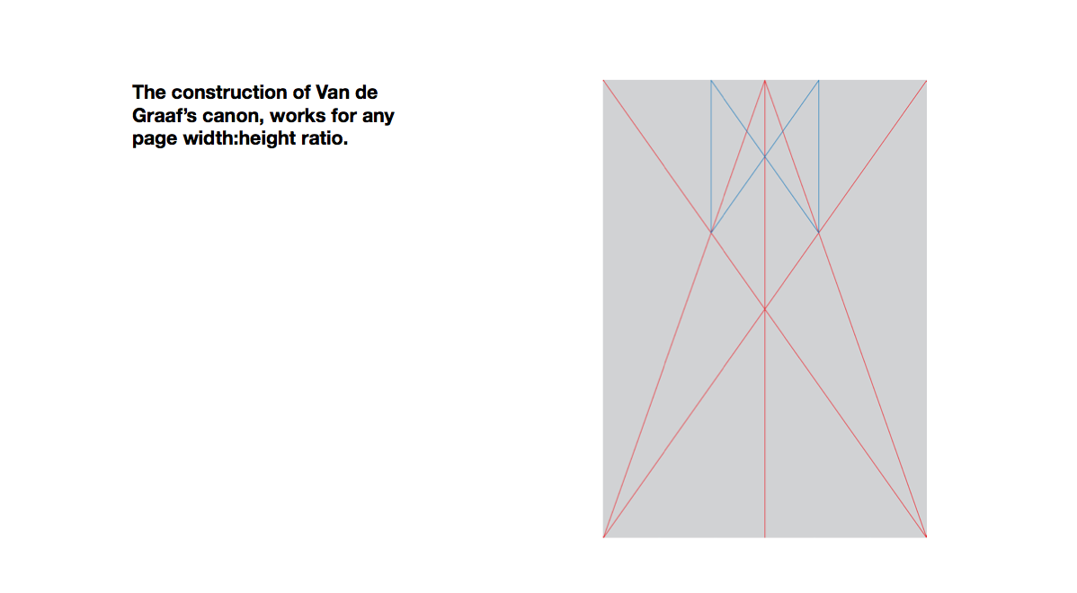
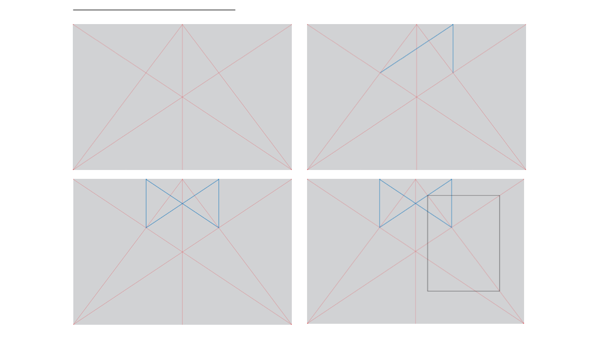
Van de Graaf
Van de Graaf cannon creates instant layouts that then leaves columns that can then hold numbers and more information, such as pagination.
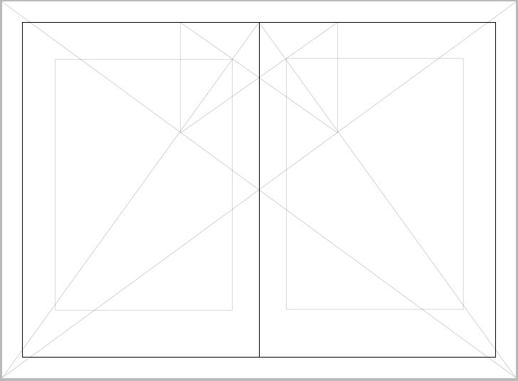
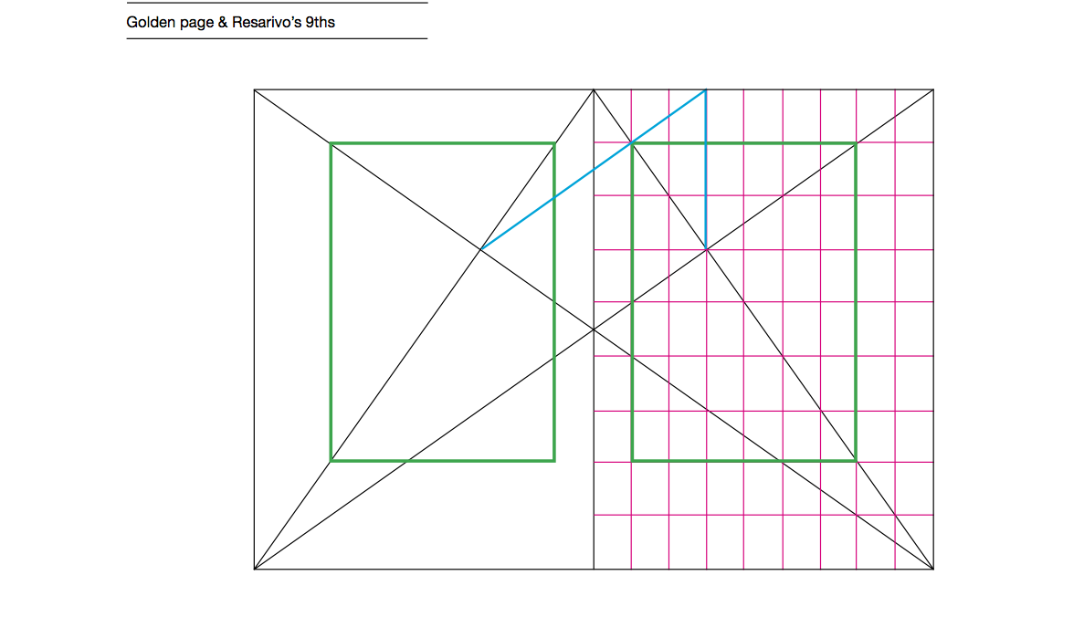
As can be seen with my drawn image below, each colour depicting the the lines that make up the cannon. As can be seen the boxes are formed with equal colums ether side.

Digital version
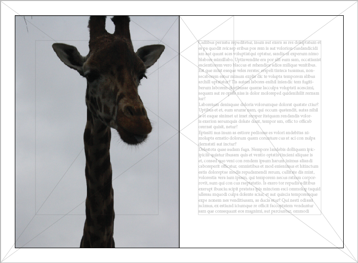
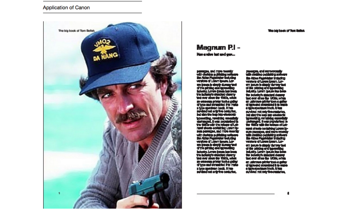
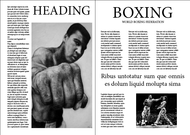
These examples below are ways in which this layout can work with both text and images. I have used one of my own images and two different sizes. As can be seen the columns allow space for pagination.


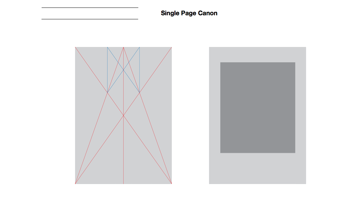
As can been seen here the Van de Graaf cannon can be applied to a single page.

Leading
Width of a column is very important, it makes things legible and more readable.
A column shouldn't have more than 7 words a line, the line becomes too long and less legible. It is less cluttered and has more space that is easy on the eye.
A shorter line is less tiring but the eye can tend to jump between lines.
This rule cant be applied to headings and subheadings because this is where advertising needs to to stand out and capture the viewers eye and so is generally a larger point size.
Are colums just aesthetic?
I believe that colums can be used to produce asthetic and easy on the page layouts that are legible. But thats not the only reason they are used, they help to split a page up into convenient sections that hold just the right amount of information. Although there are these rules they can be broken to create very individual and interesting layouts, but when it goes wrong it can look illegible and not aesthetically pleasing wheres applying these rules generally creates a strong aesthetic layout.
Margins, the outside edge.
If they are too small they become too full.
Too large and the margin becomes drowned.
If the margins are well portioned they are more interesting and easier to read.
Creating my own layouts.
Single and double page layouts

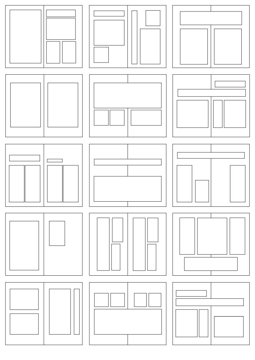
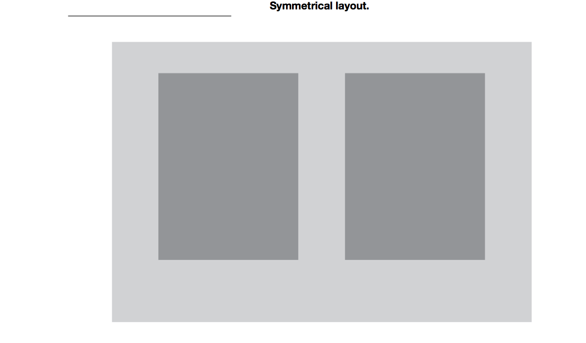
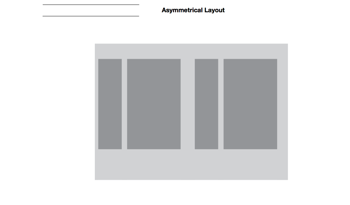
These are some thumbnails i created to go into my designs for the 10 things and the animal layout.
These are some quick layouts i created using the thumbnails above.

These are very simple but the information is all there and legible.
Is there a definite answer to grids, columns and margins?
As i said before i feel that these provide rules that will in most cases provide a layout that is legible and aesthetically pleasing, but again when these rules are broken the outcome can be impressive, so grids, columns and margins aren't definite but do provide something that can then be modified.