Monday 16 December 2013

Design for Web Coding


Starting to code my website 


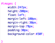
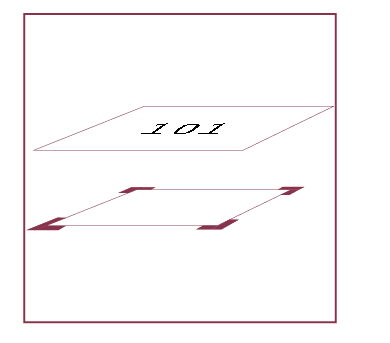
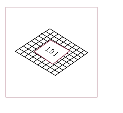
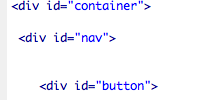
Creating the container on the homepage 


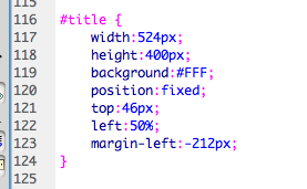
Calling the container on the  


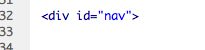
Creating the nav bar


Calling it on the source code 


Making my text Helvetica on the homepage


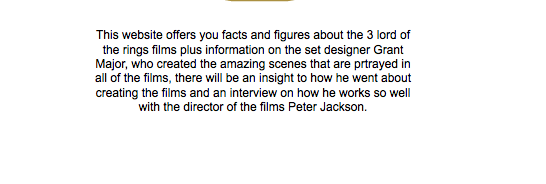
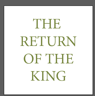
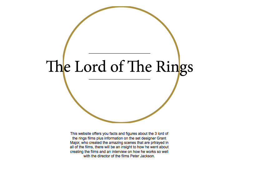
Coding the title on the homepage


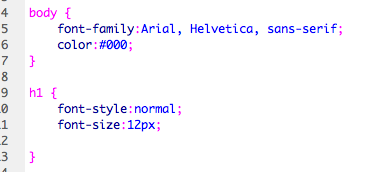
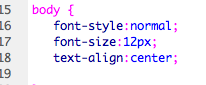
Making the text on the hompage central


Starting to create the buttons


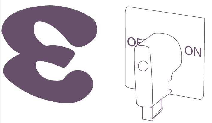
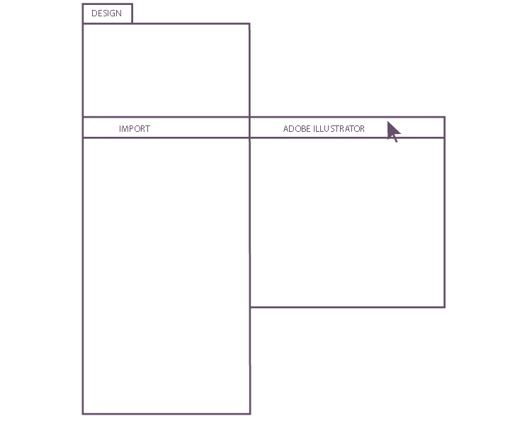
Creating the buttons on illustrator 

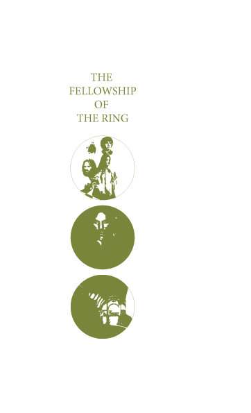
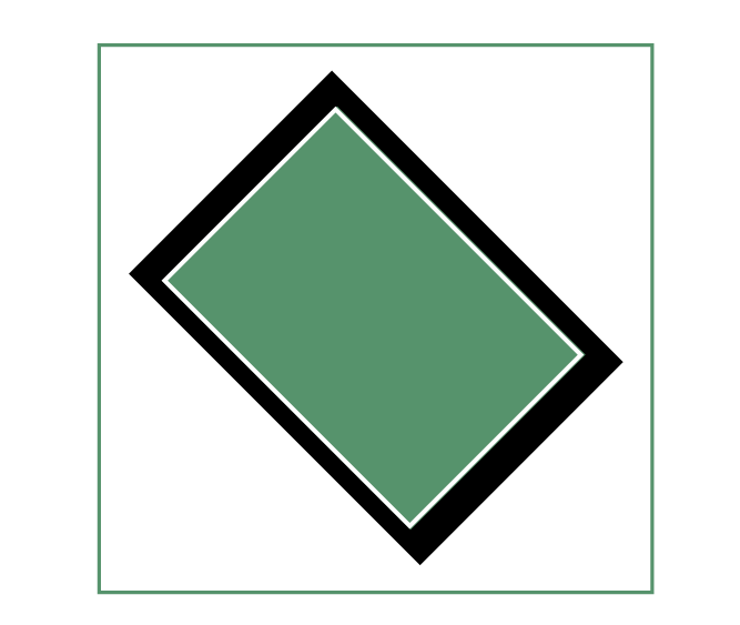
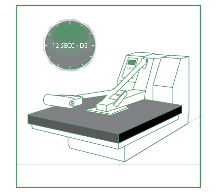
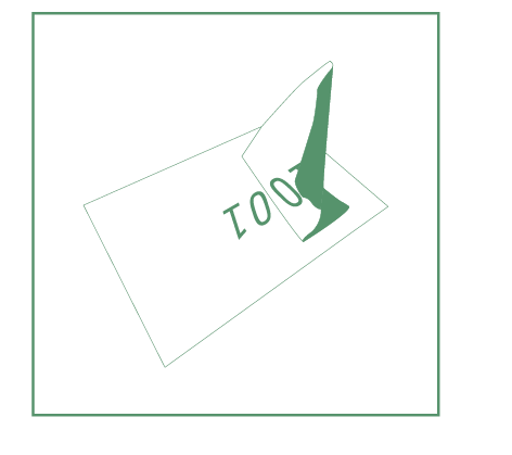
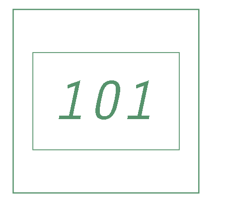
These are my deisgns for the rollover buttons for my website


Then i made a new sheet in illustrator the exact size i wanted it on Dreamweaver and my website, the image below was on a second layer and was what it would look like when somebody went over it  with there mouse, the original image would be one of the ones shown above but in the green the same as the type. 


My first idea was to have the buttons the colour above and then have the background for the nav bar in green, but after doing this the buttons weren't as visible so i got rid of the background colour and changed them to a earthy green. 


Wednesday 11 December 2013

Mutton Quad


The Brief Title 


The Brief


Considerations 
The area in which the restaurant will be placed 
How typography can be used on a larger format 
How typography can be used on a much smaller format, menus, costars ect
The visual material that can be produced 
How it can be promoted  


Concept/Proposition
To propose a restaurant that creates a unique experience for the visitor through the use of type, with the table they sit at the menu they read and floor the see, the lights, the toilets ect. To then create a brand that works well typographically and can be used across a number of different types of material. Also how it can then be transferred to web. 


Background
A food restaurant, typographically themed, high end food, quite expensive in a nice area.


Target Audience
People who enjoy going out to a restaurants
People who appreciate typography and good design 
Middle ages couples or friends who are well off and can afford more expensive meals 


Mandatory requirements

A typographically themed restaurant with a range of promotional material and a website


Tone Of Voice

Serious but playful with the use of type, to convince people this is the best restaurant.


Deliverables
A promotional mailer/poster/billboard 
A range of in restaurant material, napkins, costars, place mats, wooden boards ect 
A front shop view 
The dress code of people in the shop   

Bottles and drinks


My initial ideas

Some of my initial ideas were to look at glyphs and the anatomy of type and how i could transfer these across to logos and the brand i wanted to create. 


One idea i had that i thought was good when looking at all the anatomy of type was to use the 'o' with the axis line going through it! This would of provided the perfect logo and would have been a strong use of type. But i then discovered that somebody else had done exactly the same thing.

Something else i looked into was having the restaurant called pica, which is a unit of measurement used in type 

the picas would then convert into inches, this would then translate across to pizzas, i was thinking maybe of having a gauremet pizza restaurent, higher end than pizza express and pizza hut. 

54picas = 9" pizza = 6 slices 

72picas = 12" pizza = 8 slices 

After my crit the feedback i got was to look into the name pica because they thought this was a good idea and also having a rustic pizza restaurant would work really well with this idea. 


Saturday 7 December 2013

Design for print Page content

After collecting research on the different desing methods i have decided to focus on 4 for my publications.


ScreenPrint

Foiling and Flocking 

Embossing 

Laser cutting 


I then started to draw out the steps to how i would go about doing these methods so i could have an explanation next to each illustration in my books. 


Step by step for each process


Screenprint


1. Get your design ready and make sure that its blacked out, you can ether have a design blacked out on tracing paper (Shown in Stock Book) or just print a black and white image on paper.  

2. Get a screen that covers the size of your design, with extra space for movement with the squeegee, coat the screen in light sensitive emulsion and then leave to dry. 

3. Get your design and the screen, then expose your design on to the screen using the UV light box. This is dangerous and so should be done by a trained professional, or technician who’s there.

4. Wash the screen using washing up liquid after it has been exposed, this will then reveal the image. In the case above, 101. Then leave to dry in the drying room. 

5. Take your screen and place it on the screen bed, and then tighten the clamps on one side of the screen so it can be lifted. Then place a registration sheet under the screen. 
 
6. Put ink across the top end of the screen as you look at it, and use the squeegee to pull the ink across the screen, forcing the ink through the tiny holes and revealing the print on the registration paper.


7. Using the registration sheet, place your stock underneath, lining the design up so when it’s printed it fits neatly in the center. Then using masking tape mark out the corners of the stock so you can easily place the other stock in the same place.  


8. Now remove the registration sheet, put the screen down and spread your ink across the top of the screen. 

9. Now using the squeegee pressing down firmly pull the ink across the screen, then lift the screen and push the excess ink back across to its starting position. Flood the screen.

10. Finish printing then leave to dry on the rack.


Foil and flock

  1. Get your design ready and make sure that its blacked out, you can ether have a design blacked out on tracing paper (Shown in Stock Book) or just print a black and white image on paper. 
  2. Get a fabric screen that covers the size of your design, with extra space for movement with the squeegee, coat the screen in light sensitive emulsion and then leave to dry.
  3. Get your design and the screen, then expose your design on to the screen using the UV light box. This is dangerous and so should be done by a trained professional, or technician who’s there. 
  4. Wash the screen using washing up liquid after it has been exposed, this will then reveal the image. In the case above, 101. Then leave to dry in the drying room.  
  5. Take your screen and place it on the screen bed, and then tighten the clamps on one side of the screen so it can be lifted. Then place a registration sheet under the screen. 
  6. Put the glue across the top end of the screen as you look at it, and use the squeegee to pull the glue across the screen, forcing it through the tiny holes and revealing the print on the registration paper. (Be quick before the glue drys).
  7. Using the registration sheet, place your stock underneath, lining the design up so when it’s printed it fits neatly in the centre. Then using masking tape mark out the corners of the stock so you can easily place the other stock in the same place. You should Also put little bits of blue-tack on the back corners of each piece of stock, because the glue sometimes pulls the sheet up with the screen so that keeps the stock firmly attached to the table, it also speeds up the process before it drys.
  8. Now remove the registration sheet, put the screen down and spread the rest of your glue across the top of the screen.
  9. Now using the squeegee pressing down firmly pull the glue across the screen, then lift the screen and push the excess ink back across to its starting position. You may have too pull the squeegee across a few times to get the print!

  10. Now get you design that now has the glue print on it, take your foil and place it on top of the design with the shiny side facing upwards. Or get the flock and place that with the flock facing down.     
  11. Take the design with the foil or flock on and place it on the heat press between sheets of newsprint. Make sure the design is facing upwards and that the temperature is at least 160 degrees and the timer is set to 12 seconds.  
  12. Lower the press and leave for the set time. Then remove the design from under the paper and leave to cool off before taking off the foil or flock. 
  13. Peel back the foil or flock slowley to reveal the image that should now be covered in the foil or flock.
  14. The final image, this is now fine to touch and use straight away, it doesn’t have to be left to dry, and the other printed glue designs can be used weeks later. 


Laser Cutting

  1. Get your design ready, to raster it has to be saved as a JPEG, BMP, TIFF, GIF, PICT, or EPS and using a vector image save it as AI, DWG, EPS or DXF. Using a vector image is the easiest and quickest way to create a laser-cut image  
  2. Turn on the Machine and load APS Ethos on the computer. 
  3. Load the vector image:
         1. Design
         2. Import
         3. Adobe Illustrator 
  4. Place your material into the machine, make sure it is larger than your design 
  5. Now using a 3mm block measure the distance between your material and the laser and adjust the height of the laser so it touches the top of this 3mm block 
  6. On the control pannel press 1. Online 2. Material Manager  3. Enter 
  7. Now use the arrows to stear the laser to the x axis which will be the bottom left of the material and this represents the bottom left of your work on screen. Then press enter, Do the same for the y axis which will be the top left of your material and press enter
  8. Now go to the computer and select individual parts of your design and using the drop down menu on the top right of the screen choose if you want them cut through, engraved, kiss cut or no cut. 
  9. Next go to output, then material manager and select material and then what was put into the machine so the laser knows how powerful it needs to be, then select okay.
  10. Now go to output again and press cut design, and check the material is correct and then your ready to send to the cutter. 
  11. Once the material is finished cutting it is ready to use, you can use sand paper to clean the dark edges if necessary


Embossing

  1. Using the instructions in the how to laser cut book open Aps Ethos and turn on the laser cutter and set up a piece of wood in the machine, this wood should be lager than the paper you want to emboss on
  2. save your type image as a JPEG and open in Aps Ethos by going on 1. image 2. insert image, this should be scaled so its smaller than your material in the machine.
  3. Next go on 1.edit 2. properties 3. engraving properties and select enable engraving and have the scan line at 0.2 mm and press apply
  4. Set up the material (shown on step 8 on the how to laser cut book) and have the cut effect on Raster 
  5. Then cut the design 1.output 2.cut design
  6. Get your design and sand paper off the dark burnt material on the wood  
  7. Take your design to the press and put the paper you want to emboss on directly on top of the laser cut wood (with the type facing upwards) and pad out the rest so it fits neatly into the gap. 
  8. Turn the silver screw on the right finger tight shut
  9. Pump the arm till it gets too hard to do so anymore 
  10. Then release the pressure with the black knob on the left and pump again till it cant be moved anymore or up to when the gage is at halfway
  11. Release the silver screw and the black knob
  12. Take out the embossed type 


Final Publications