Thursday 31 January 2013

END OF MODULE SELF EVALUATION


What skills have you developed through this module and how effectively do you think you have a applied them?

Skills I have learnt through this module are aspects on Photoshop, where I developed the skills to layer images on top of each other, change the sky within a image and create a panorama image, I also learned how to get rid of a crowd of people in a image should I ever need to do that. Along with Photoshop I was learned how to change pictures to a TIFF and create a PDF file for printing in acrobat. Another program I was introduced to was InDesign, where I learned a vast amount of information about layout and setting up a image to print. I applied these when creating my postcards, using different techniques in Photoshop to edit the image and then saving it as a TIFF on acrobat to get a 2-sided file.


What approaches to/methods of design production have you developed and how have they informed your design development process?

I have developed a understanding of how to use Photoshop and InDesign, this has allowed me to edit digital images which I then went on to use in the postcard brief, creating a abstract image for the front. Then using InDesign I was able to create a layouts and was shown how to import text to different shapes. Having these tools helped to give me my work a more professional finish and gave me another tool I could use with my work.  


What strengths can you identify in your work and how have /will you capitalise on these?

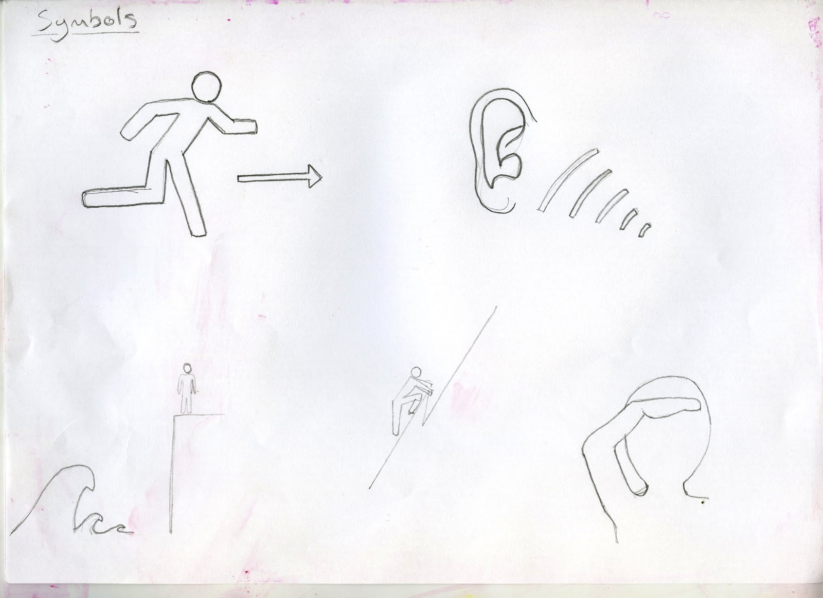
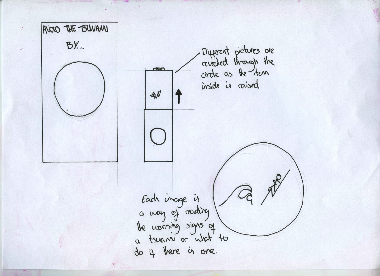
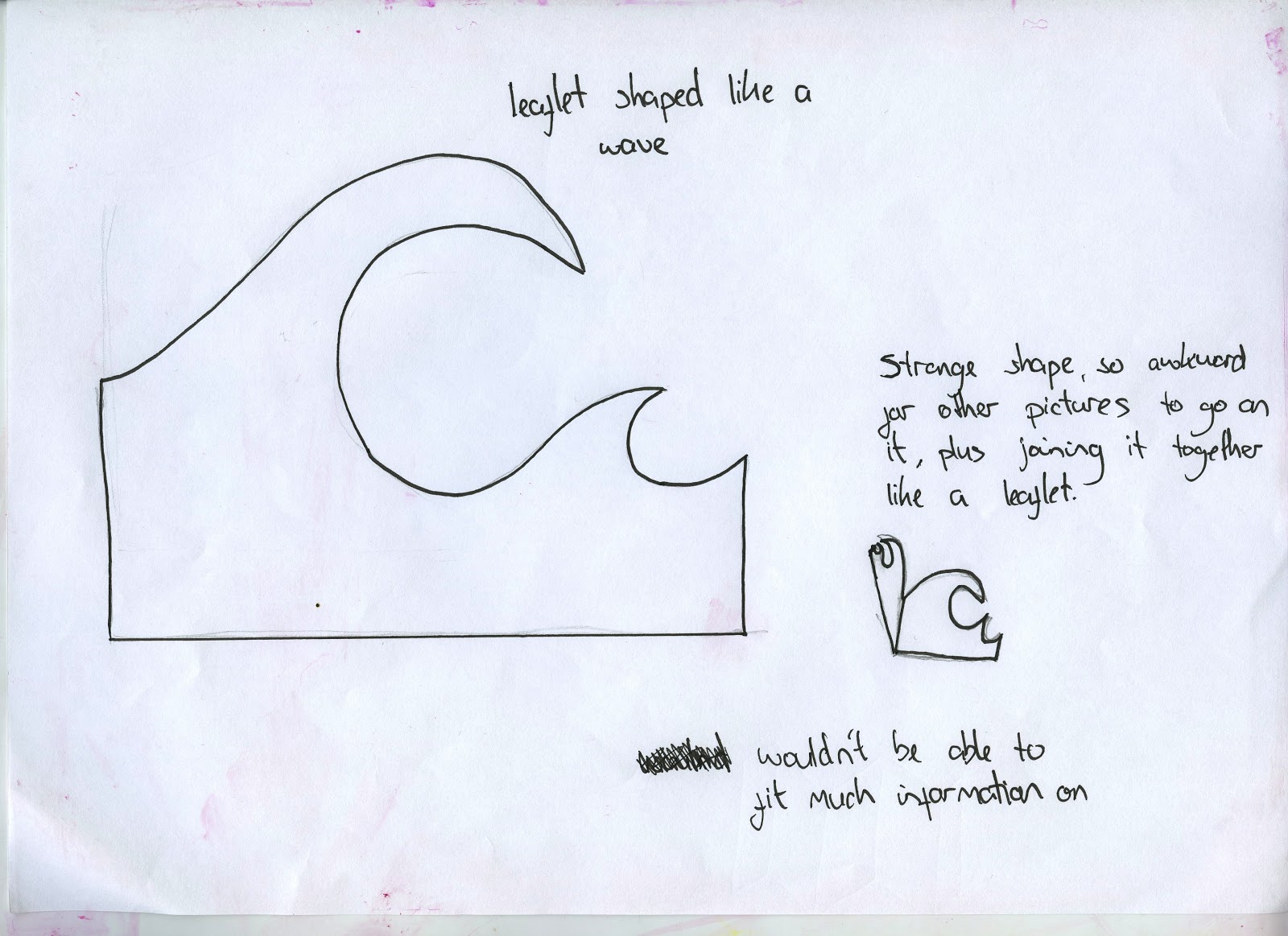
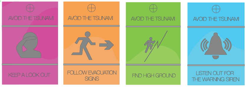
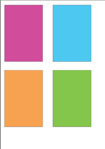
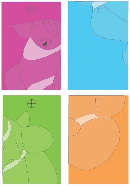
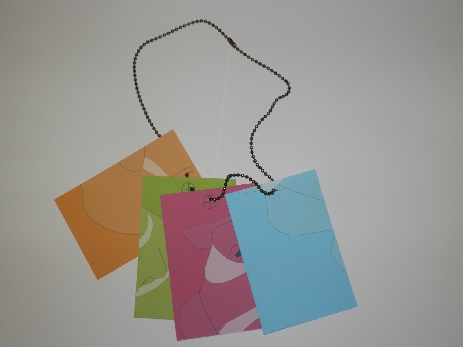
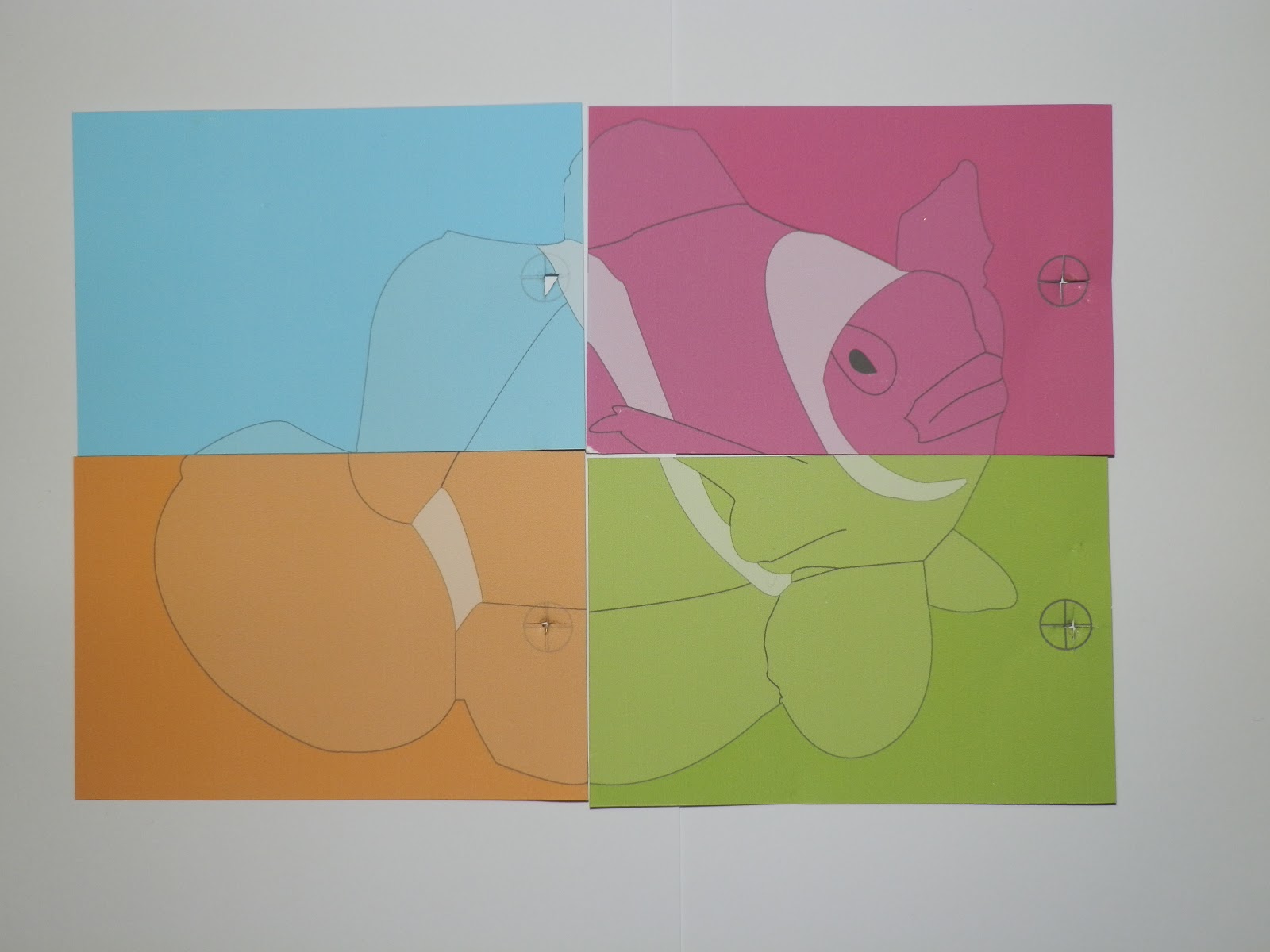
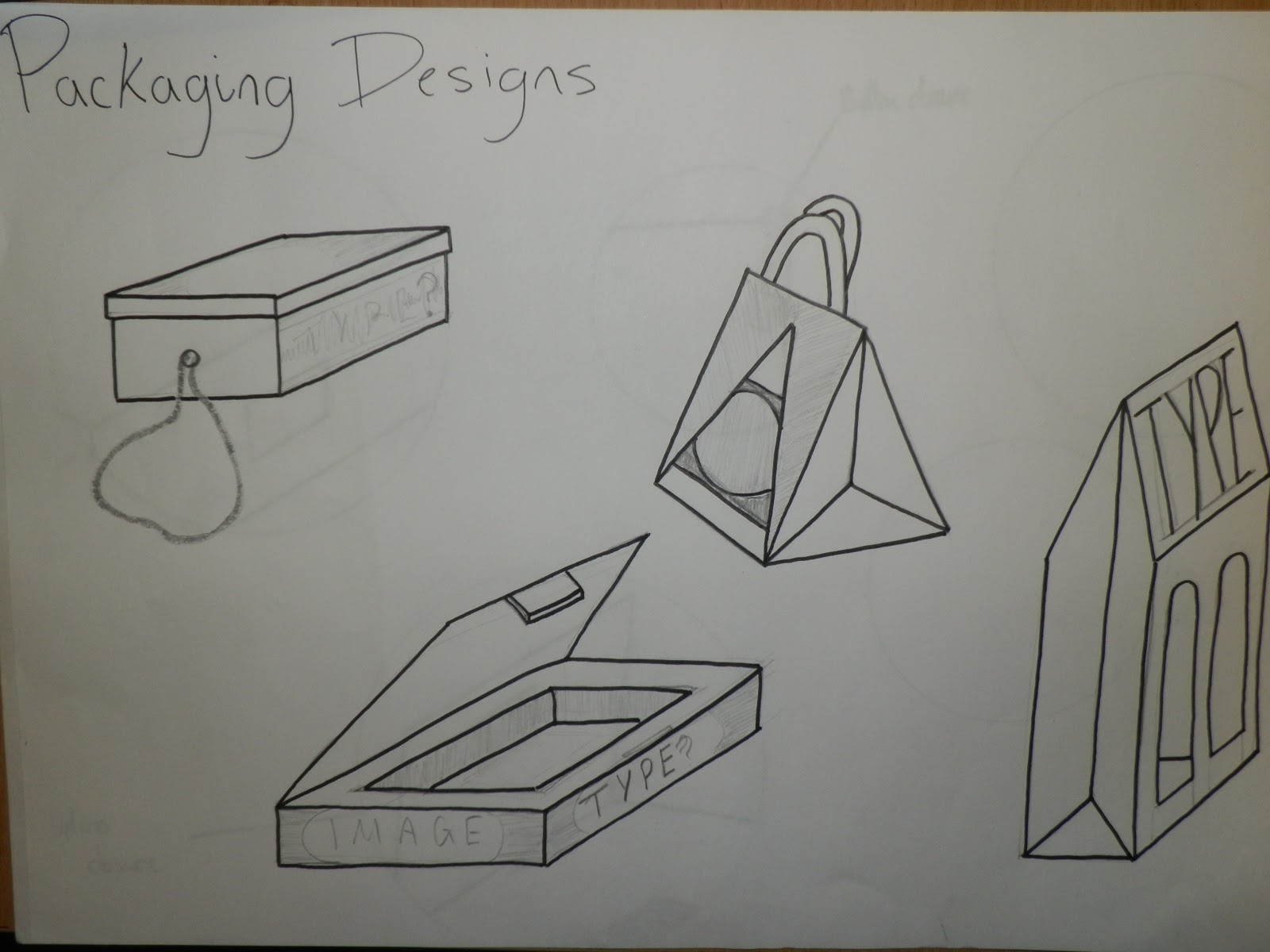
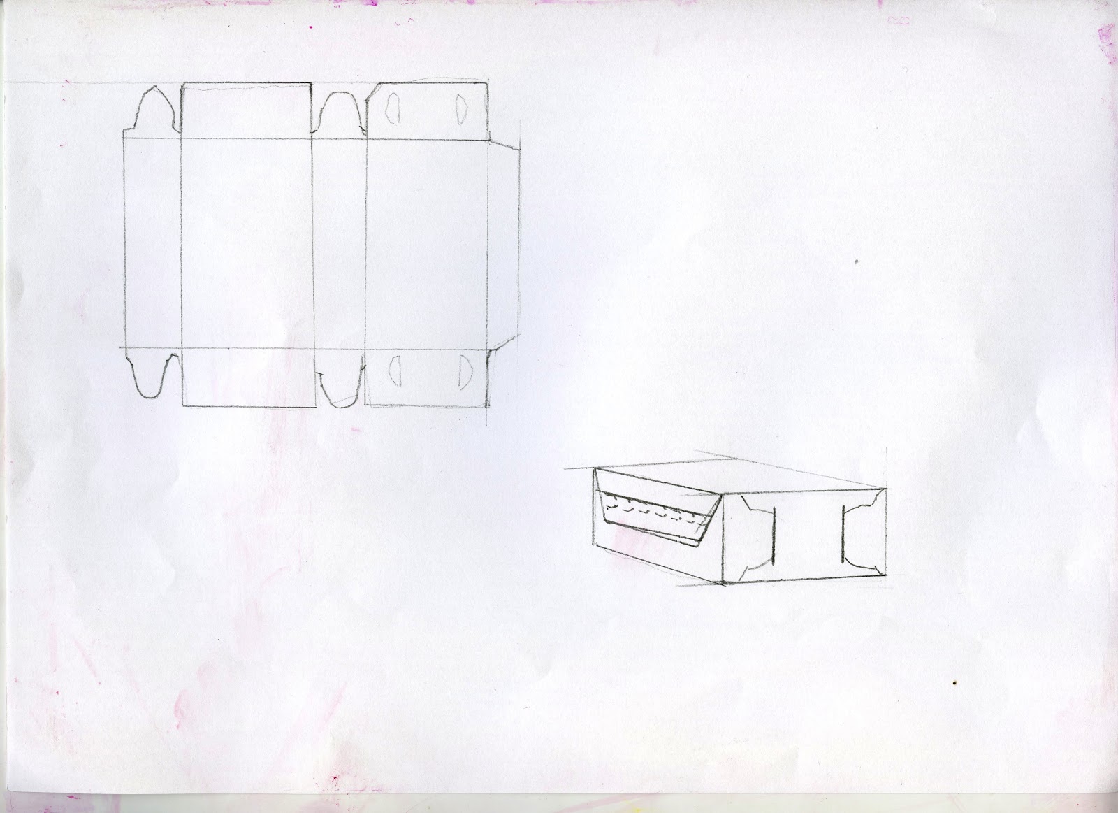
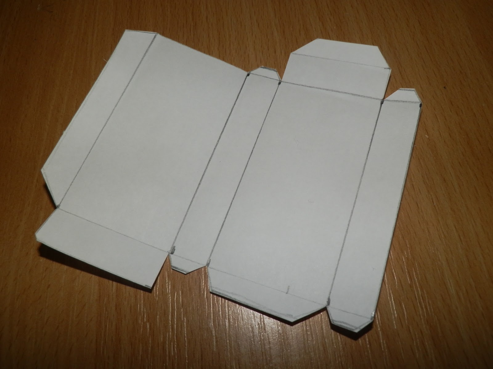
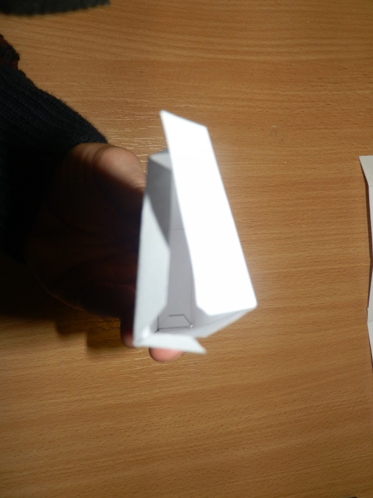
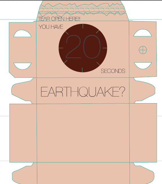
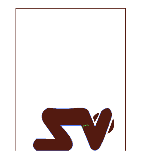
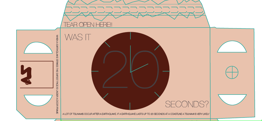
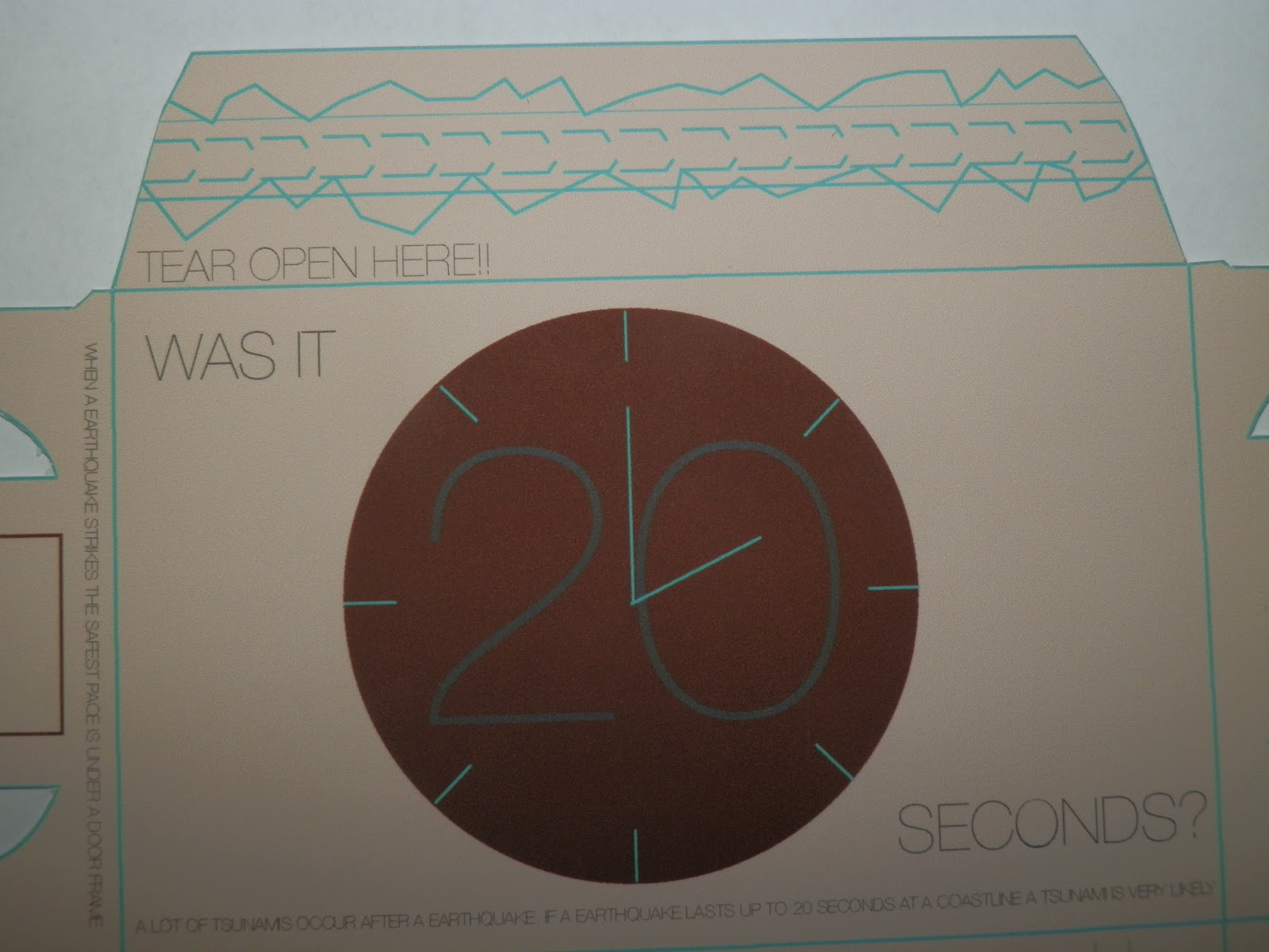
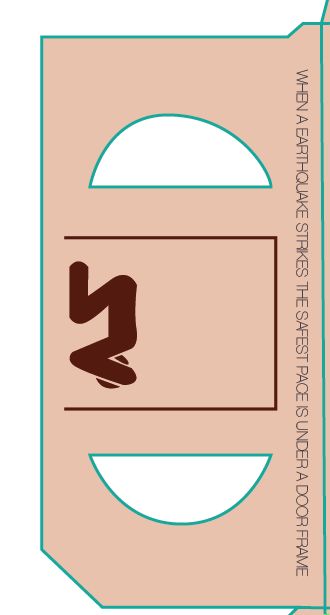
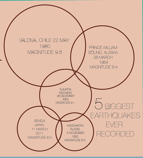
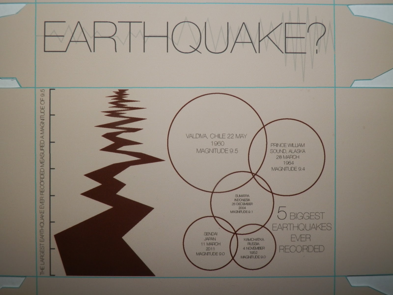
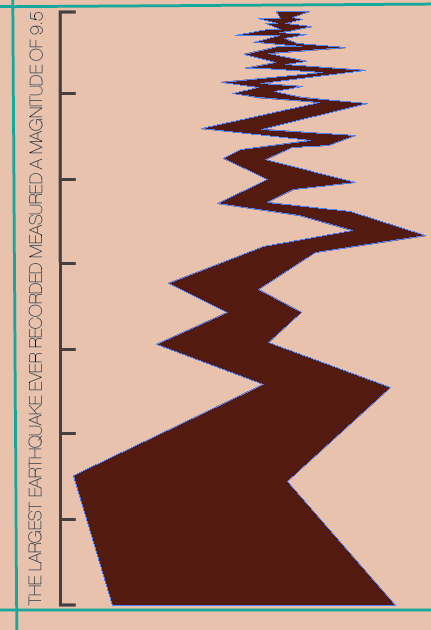
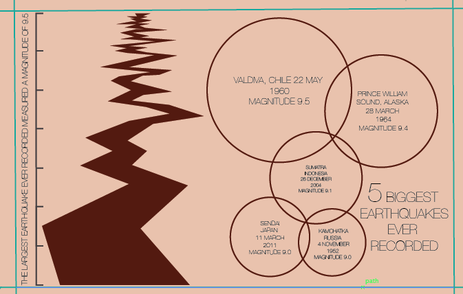
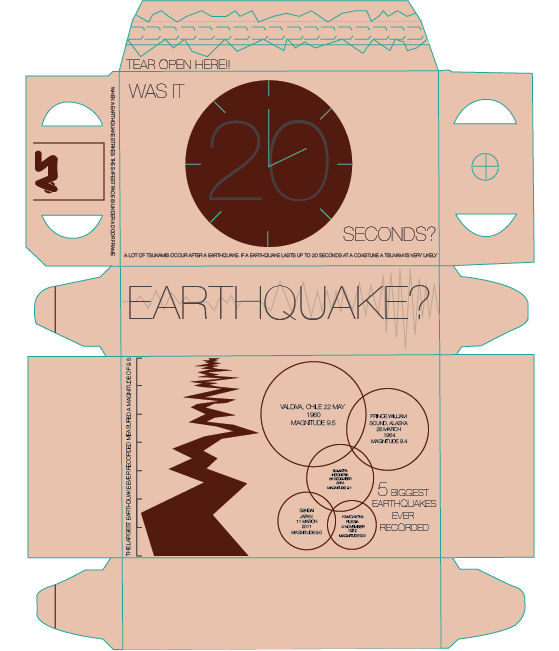
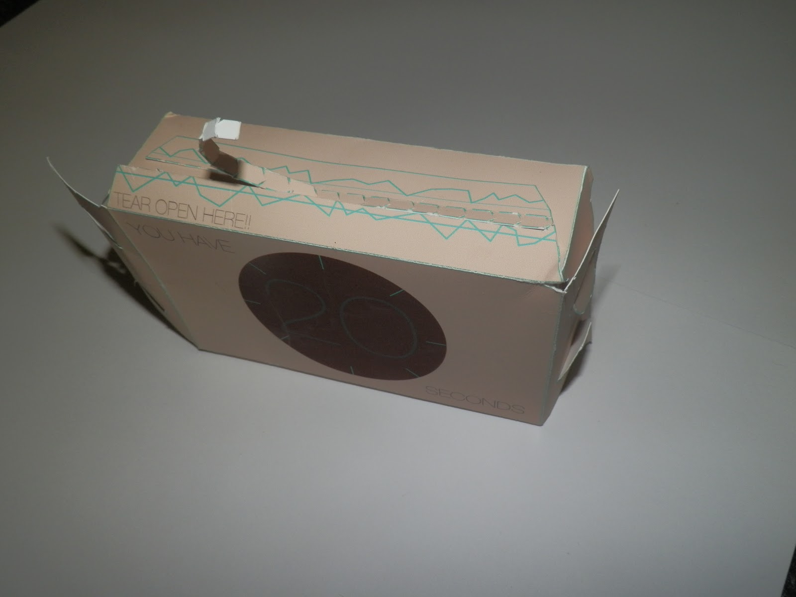
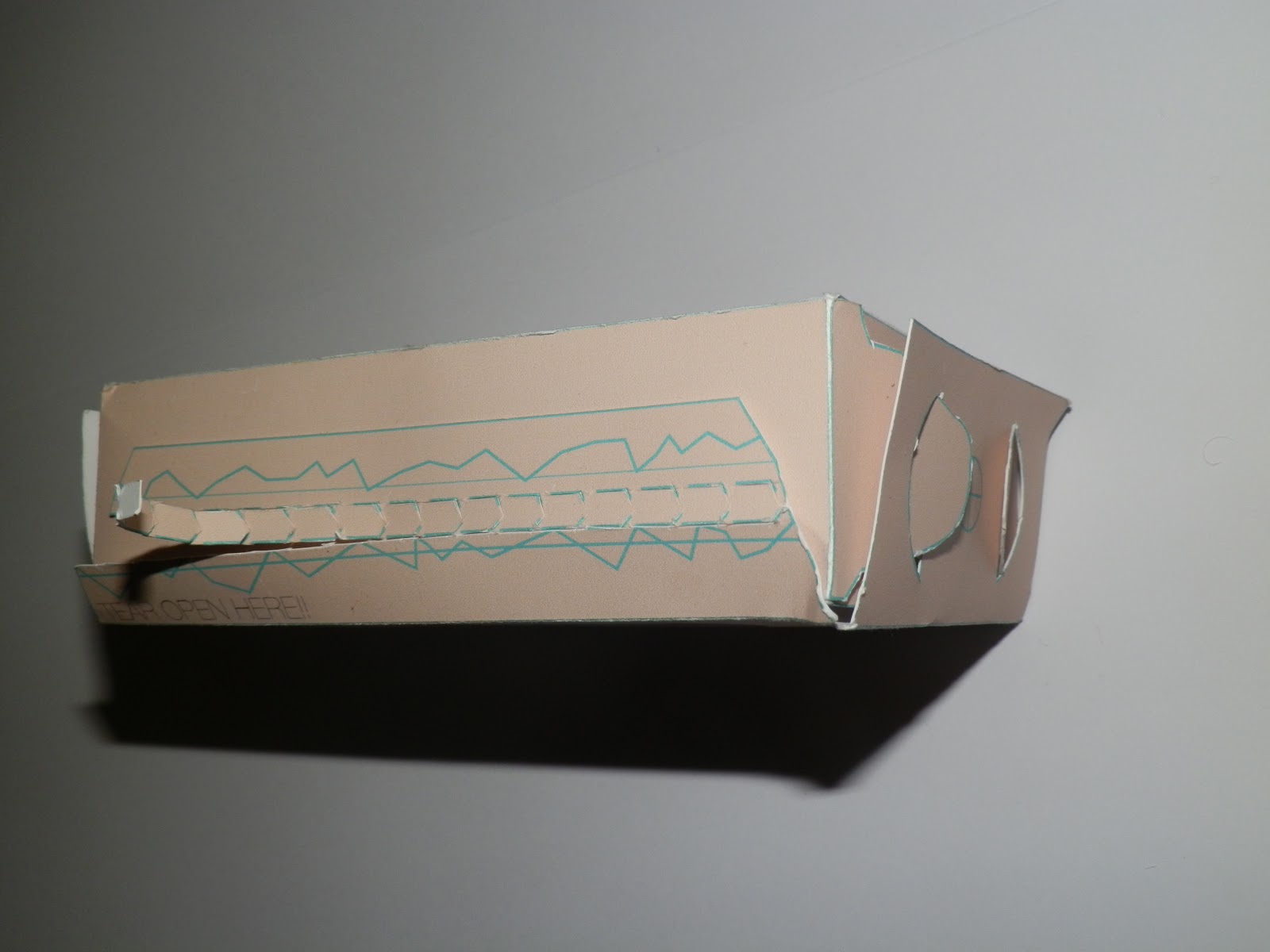
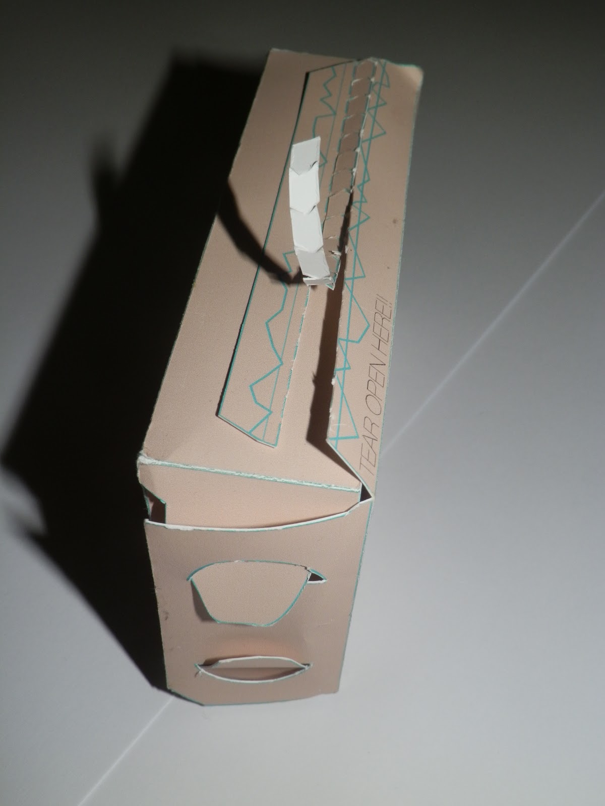
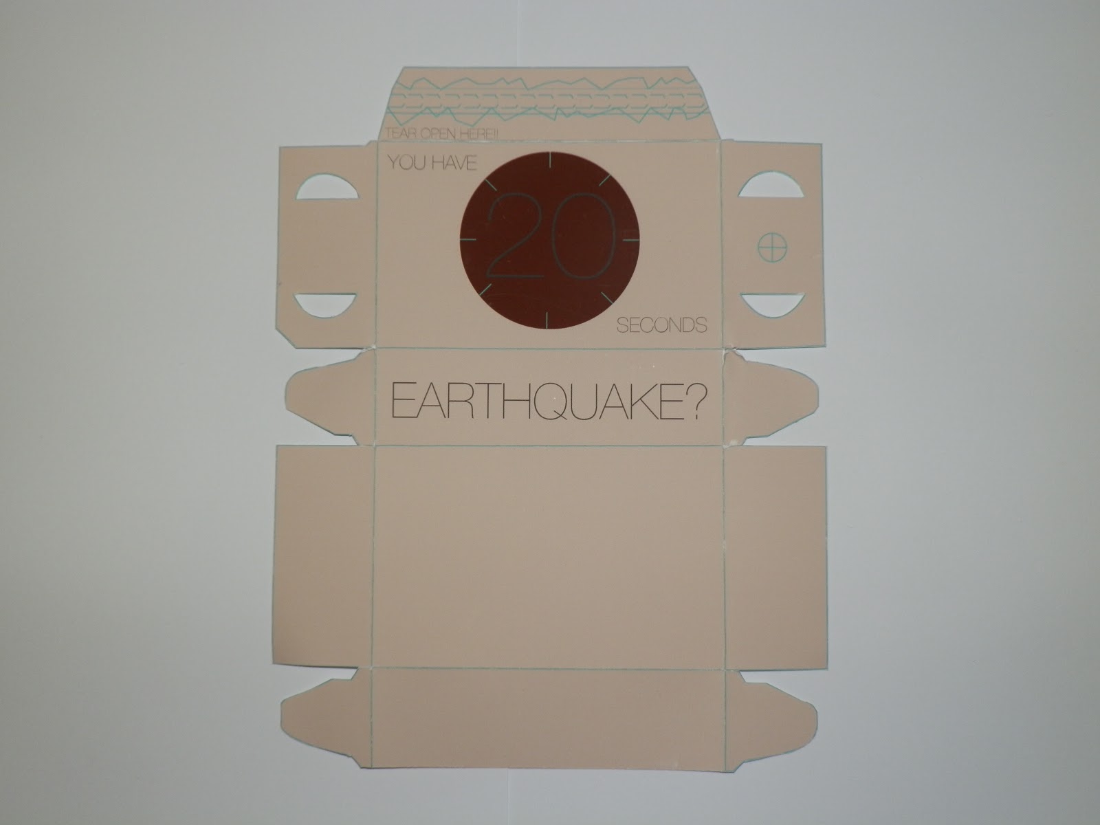
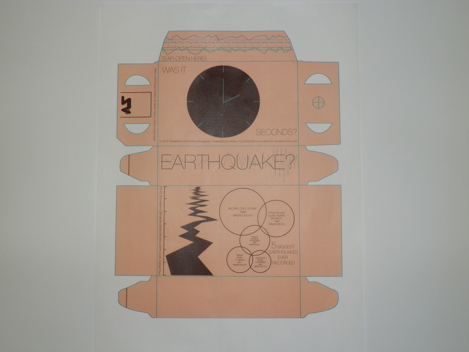
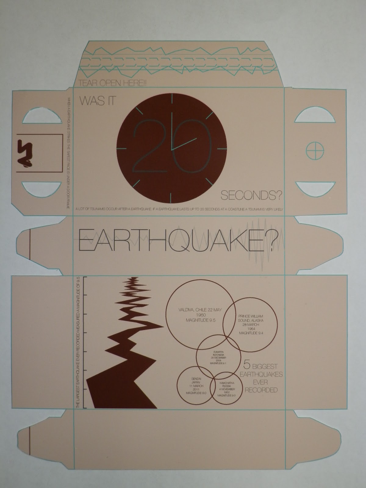
The strengths I have seen in my work this module is having a problem and then being able to solve it with interesting methods, such as the final project where I created infographic cards for children in tsunami areas. I also feel from the last project the finish quality of my work has improved. Which maybe stems from using the digital print lab more often and is something I’m going to look into more, such as the different printing techniques.  


What weaknesses can you identify in your work and how will you address these in the future?

Some weaknesses are that I could of managed my time better, this would of allowed me to produce more work and not just come in and be sat around for hours. Doing this will also give me more time to experiment with different media such as screen print and lino cut ect. which is something that lacks in this module. 


Identify five things that you will do differently next time and what do you expect to gain from doing these?

1.     Plan my time better, this will allow me to become better organised and give me a better chance of doing some experimentation.
2.     Advance my skills on Photoshop, this will allow me to start using photography more often which can give a completely different look to a item of graphic design.
3.     Blog work on a more frequent basis this will again allow me to organise my time better so I can then look back at work and see what’s wrong by just looking at my blog, then giving me time to edit it.
4.     Look at more designers and studios in the professional world, this will give me a understanding of what’s going on and help to give me a lot more inspiration.
5.     Go into a greater detail with my research, this will give me heaps more visuals that I can work from and give me a much better understanding of the subject matter, therefore giving me the tools to solve a problem.  


5=excellent,  4=very good,  3=good,  2=average, 1=poor


1
2
3
4
5
Attendance


x

Punctuality


x

Motivation


x


Commitment


x

Quantity of work produced


x


Quality of work produced


x


Contribution to group


 x

Tuesday 29 January 2013

Research, Collect, Communicate: Product

Brief

Through a process of collection and categorising of content to your own research theme, you are required to focus on information graphics. How can you translate facts, figures and statistics into clear and understandable visuals? 


Using your research theme explore information graphics through one of the following outcomes: 

Product and Publication 
Product and Packaging   
Product and Distribution 

Your resolution should reflect your own practical and conceptual interests (derived from your given research theme) within the field of contemporary graphic design. 


Background/Considerations

The product/resolution can take on many different forms dependent on its function, content, audience and context. How will these affect the decisions you make about format, scale etc..? 

You should consider the relationship between content, categories, organisation, media and form. How does one affect the other? Who is your audience and how can you engage with them? How will they interact with your product? What are you trying to achieve? What is the function of your product, is it supposed to inform, educate, document, entertain or instruct? 

Having decided on the content you should focus on the practical, formal and conceptual development of possible design solutions. In doing so you should address those aspects of the design process that reflect your interests, ambitions and skills. 


Mandatory Requirements 

Research 
Demonstrating an application of a range of appropriate and inventive approaches to collecting, organising and responding to primary and secondary source material. 

Deliverables 

A body of supporting research. 

Product and Publication 
Product and Packaging 
Product and Distribution 


After reading this brief we were given a few extra days to delve deeper into are research theme so we could narrow down to something we were interested in. 


We were then given a Rationale to fill in. 

PUBLICATION AND PROMOTION. 

Why have you made this decision? 
I have chosen publication and promotion because the research i have collected is best suited to a publication like a leaflet or poster ect. 


Who is the audience and how do you intend to engage with them? 
People who are effected by earthquakes and tsunamis. Make them interact with the leaflet.


What is the function of the product, is it supposed to inform/ educate/ document/ entertain/ instruct? What has informed the this decision?
Inform, educate, instruct. People need to know the information, saves lives, gives information fast and in a easy way.  


How will the audience interact with the product? 
Pick it up read it, peel it open, look at the information provided and act upon it. 


After researching different information on earthquakes and tsunamis and looking at the different symbols and graphics that already exist, i felt producing symbols of my own and creating some cards that children could interact with. 


The cards would then hold info-graphics, to hold these cards i could create some packaging that could hold them, this would then also have info-graphics on it.       


I firstly started by drawing some symbols that i could use on the cards.


Next i started to design different types of packaging and leaflets. 


The idea here was to have a leaflet that pulled out the sleeve, as the leaflet moved passed the hole different things that could be done during a tsunami would be shown. 


This is another idea where the leaflet would be the actual wave, i feel this idea is a bit tacky though and very boring, it also isn't a very practical shape to hold a decent amount of information.  


This is another design for a leaflet. This is a very simple design that could hold a fair amount of information, it would also be able to fold up neatly and small so would be easily carried around, very convenient. 


I next drew this leaflet that to be opened it had to be ripped, almost like a earthquake when it rips a crack in the layer of the earth. I feel this is a strong design and would be able to hold a lot of information within it. 


These are the type of cards i would like to create with the rope/chain, i don't think i will cut the corner off though as this looks a a bit tacky.

I then choose bright bold colours because I've aimed my product at children, as i feel they will need most guidance in a disaster situation. On illustrator i then drew this wave so when they are placed next to each other they become interactive for the children. 

I changed the wave that sweeps across the cards, as i had the taller bit on the wrong side. They also didn't flow that well. I also then started to recreate the symbols to put on the cards, these would help provide information in a simple manner.  


These are the 4 finished cards, they provide the children with information on what to do in the case of a tsunami, they are also interactive with the wave that goes through them all. They also all have a circle at the top, this is so i can cut on the lines and then have the chain go through them so they can be attached around the children's necks. 
I next wanted to make them more interactive so i lay them out in this patter, and then decided to make them into a type of puzzle. 

This is the design i came up with, i used a fish because i thought this would apply to children well, especially as its a clown fish as well. 

Final Card Designs 


DESIGNING THE BOX


I next applied the design for the leaflet above to see if i could adapt it to a box, this then gave me the idea that, the box could hold the information cards that are hung around the next of the children, it would hold info graphics, with the EARTHQUAKE? on the side of the box it would insinuate that when theres an earthquake the children would have to open the box. 


I then discovered that producing the box with the rip to open idea would be hard to recreate if i did it like the first box design, so i created the box directly above, the rip would be on the side and so it could open like a normal box. The net shows that there would be sufficient space to add info-graphics. 

Idea for packaging 


INITIAL PACKAGING DESIGN


This is my first box design, as you can see its got little information on it and what is on it isn't explained that well. I have chosen to do earthly colours that i thought are associated mostly with a earthquake, which are from underground on the earths crust. 

 I then started to create some info graphics that could go on the packaging. These would help inform and educate the children on earthquakes. 
These circles would give information on earthquakes and would make the children read them and become educated about them. 

This is going to be a picture I'm going to use on the packaging, it resembles a earthquake. 


I edited the packaging so that it wasn't boring and held more information, i also made it more clear to what the images are about, such as the clock, where it now has information as to why it says 20 seconds. 


This is going to be on the side of the packaging, it tells the children the safest places to sit when there is an earthquake. 


This is the edited version of the side of the box, i have now added a faded zig zag graph in the background, which resembles a seismograph. 


This is what i created from the circles and the earthquake crack shown above, they both give facts on the largest earthquakes ever recorded. 


FINAL BOX DESIGN 


FINAL DESIGN