Monday 25 February 2013

Design Principles Part 1 Grids and divine proportions

Today we started off looking at the form and function of a book. Behind every page there is a layout that has been used to create a strong looking composition.   


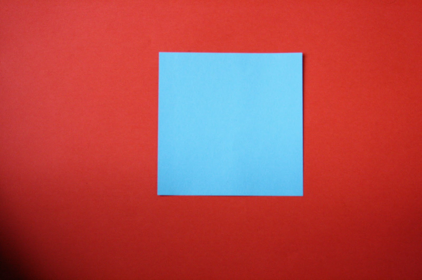
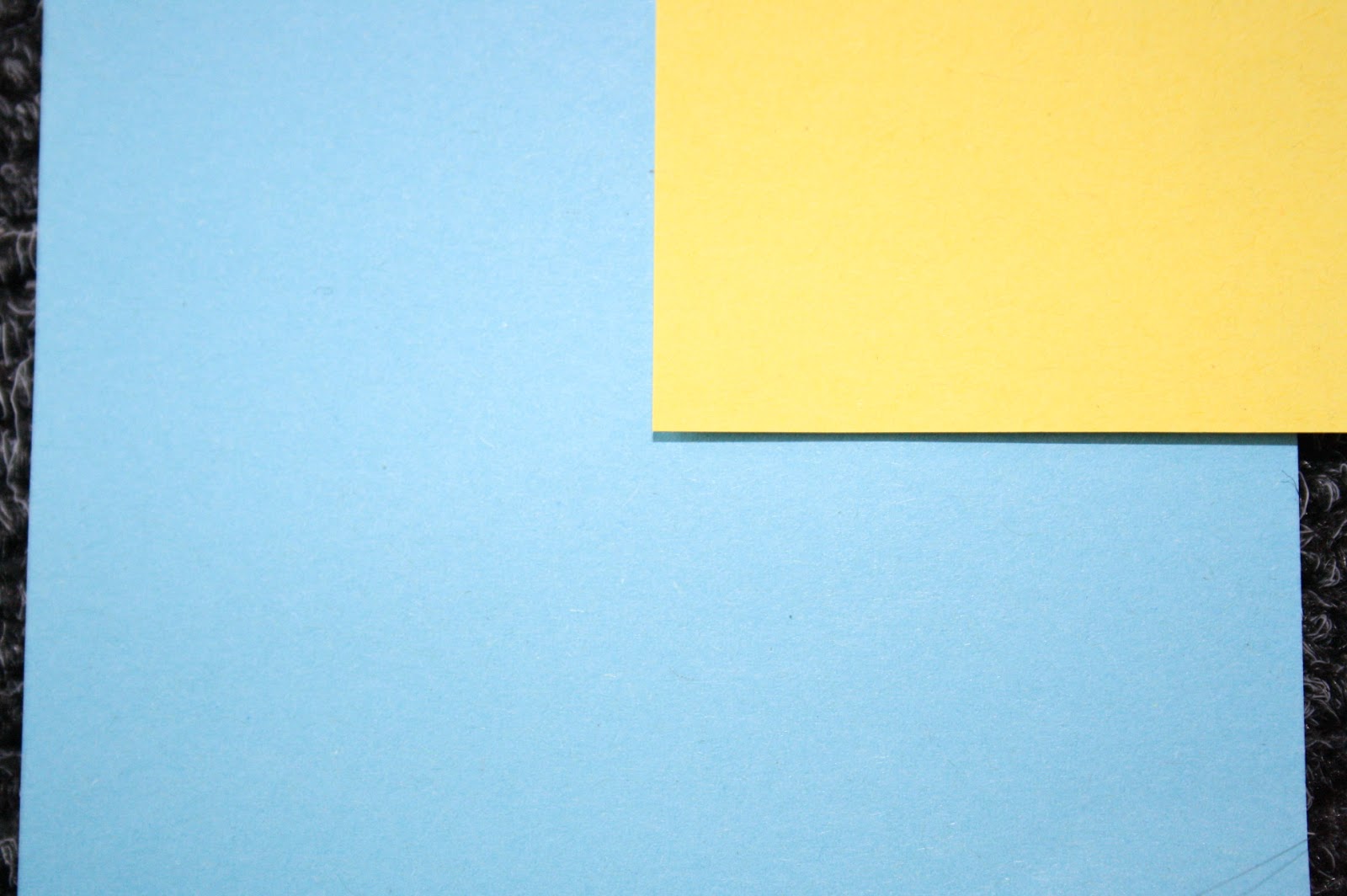
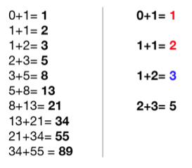
The first grid we looked at was Fibonacci sequence.
This grid is all about proportions, it is derived form nature, it is a series of numbers that each number is the sum of preceding number.  

A 55 point title should be complimented with 34 point body copy. 

0+1=1
1+1=2 
1+2=3 
2+3=5
3+5=8 
5+8=13 
8+13=21
13+21=34 
21+34=55 
34+55=84 


An example of how this works is shown below, the spiral shows where the eye is directed towards the point of focus. 
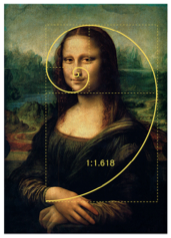
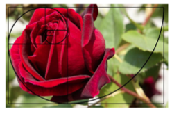
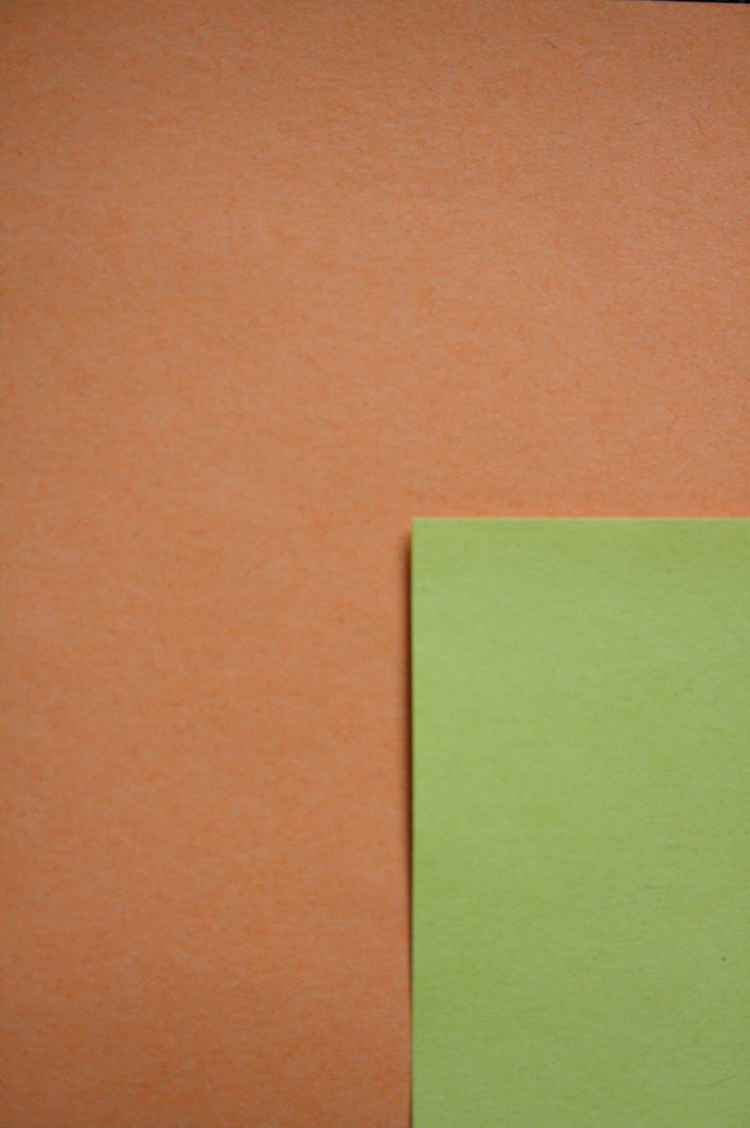
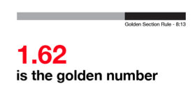


http://1.bp.blogspot.com/-NCVkJ4jXWio/USNYbz2M3uI/AAAAAAAAEGA/V0qi1yirdHw/s1600/Screen+Shot+2013-02-19+at+09.53.07.png


http://4.bp.blogspot.com/-KwO7VeR3sG8/USNYeSXw2vI/AAAAAAAAEG0/yl_lpl2E4cw/s1600/Screen+Shot+2013-02-19+at+09.56.26.png


Golden section

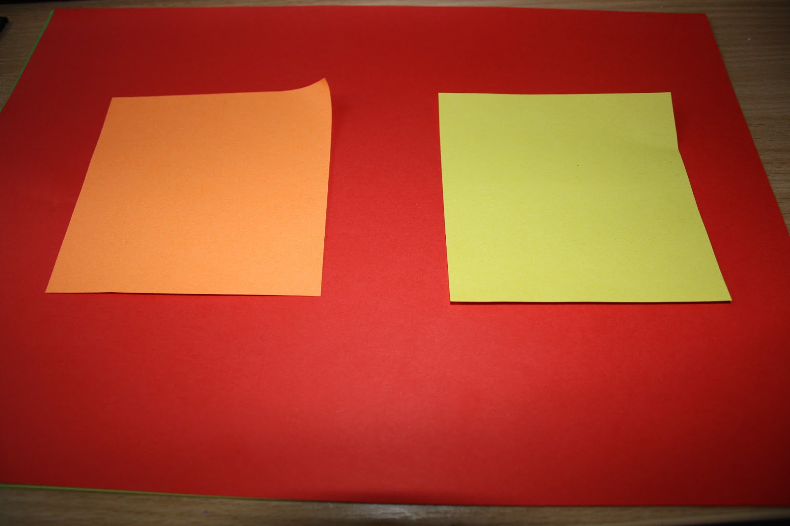
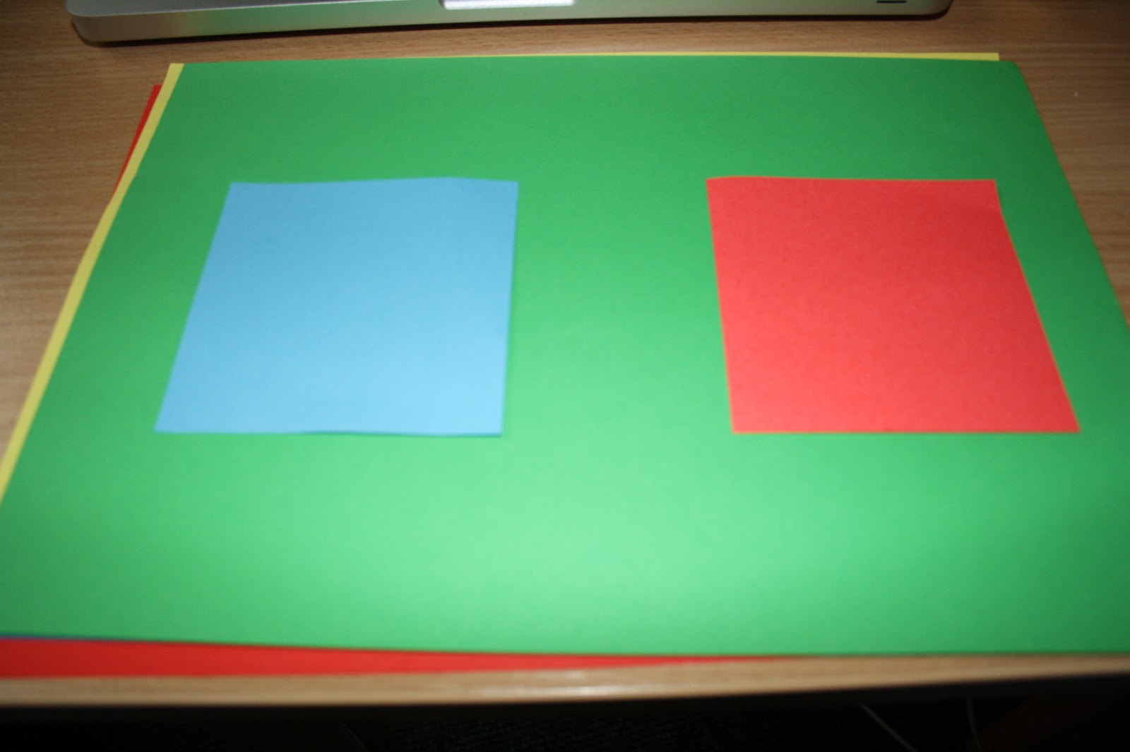
Golden section has perfect proportions. It achieves perfect balance in design and is deep routed in culture. A rectangle where the length and width are at a golden ratio. 

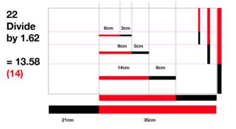
1.62 is the golden number  

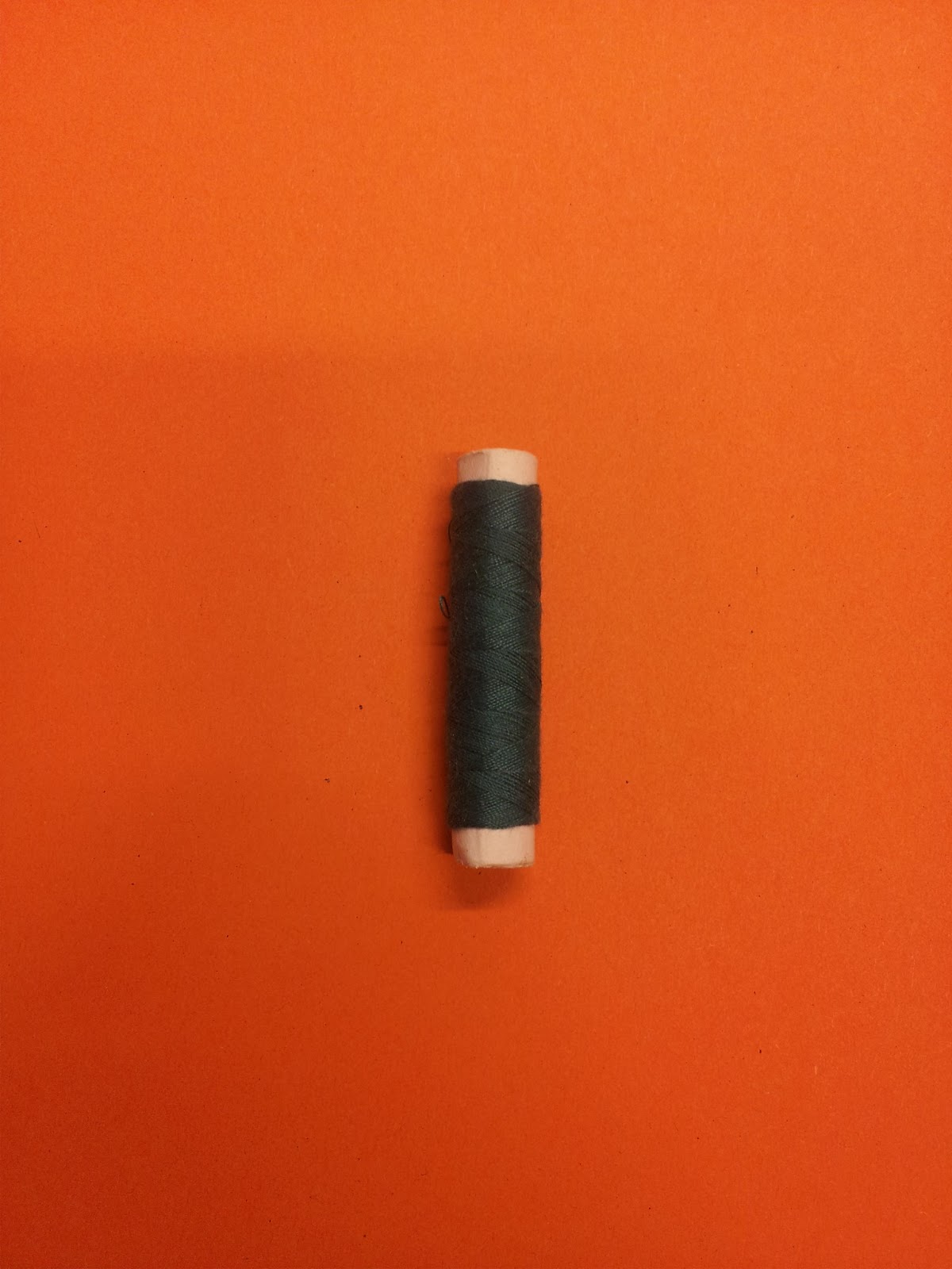
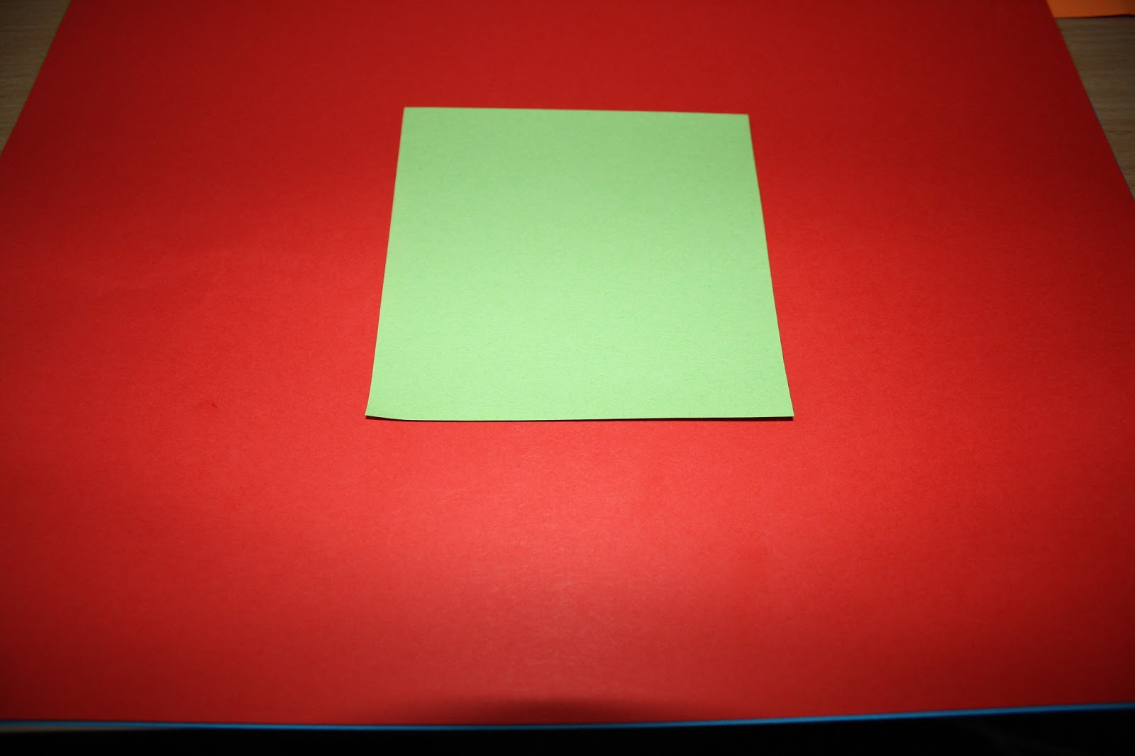
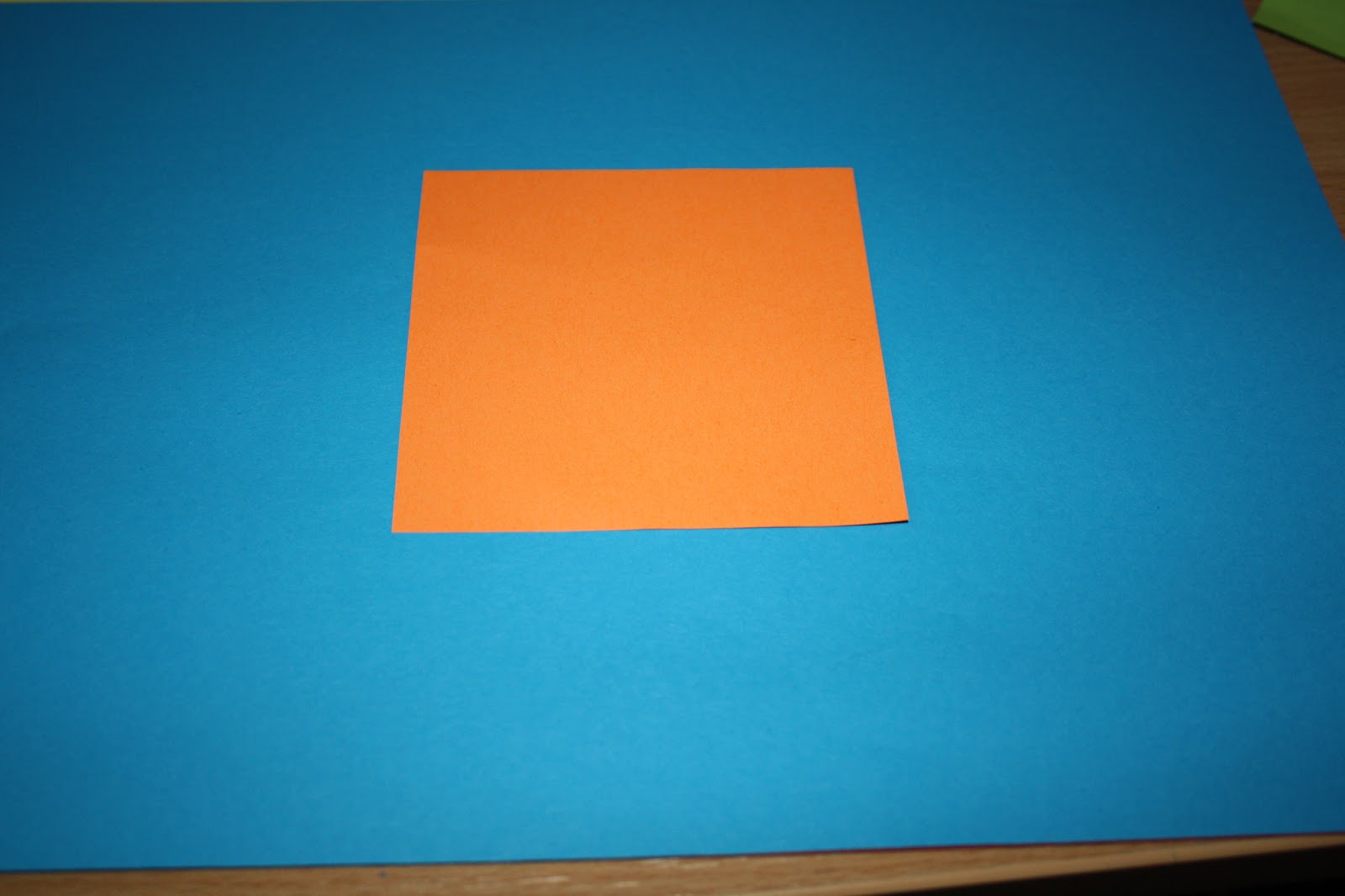
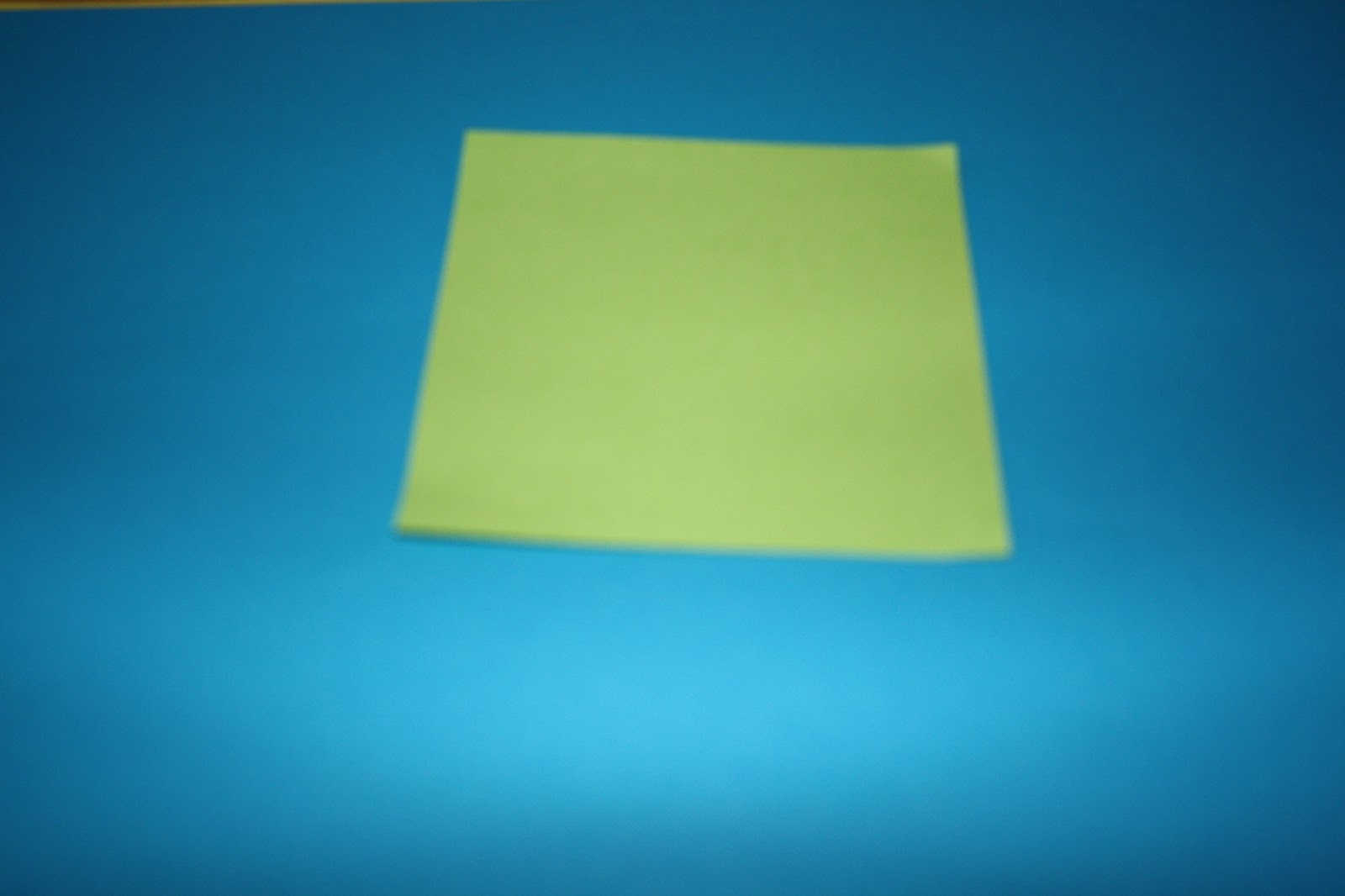
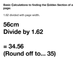
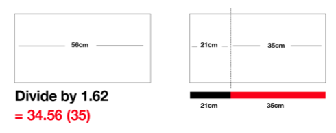
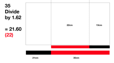
Example: 56cm divided by 1.62 = 34.56 ( round of to 35 ) 
so the 56cm paper would be cut at 35cm 


http://2.bp.blogspot.com/-z_uoh7zVyNk/USNYcdU3HXI/AAAAAAAAEGI/EuCqwnbkS8Y/s1600/Screen+Shot+2013-02-19+at+09.54.09.png


http://4.bp.blogspot.com/--ra-hmj6WIY/USNYcnvmigI/AAAAAAAAEGM/93_blRiDFnc/s1600/Screen+Shot+2013-02-19+at+09.54.20.png


http://4.bp.blogspot.com/-Hl-W0-T2gA0/USNYcxcBkhI/AAAAAAAAEGQ/-ZOs1jcr4rs/s1600/Screen+Shot+2013-02-19+at+09.55.12.png

http://4.bp.blogspot.com/-O8Ie5NYQPo0/USNYdEnf6KI/AAAAAAAAEGU/22vamyAk7C8/s1600/Screen+Shot+2013-02-19+at+09.55.20.png


 This paper could then be cut up and cut up again, taking the length of each section of paper and dividing the using the golden number 1.62. 


Rule of thirds


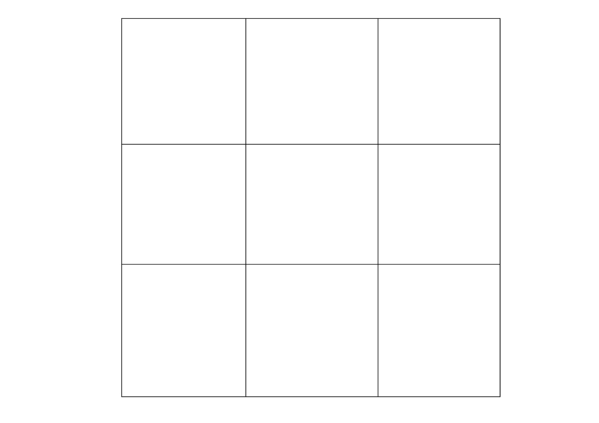
 This method helps to divide any image into thirds, it helps to show where the focal points are, the areas of interest where the eyes are drawn towards ( the square in the middle and the one above ). The eye starts in the center and works its way out. 

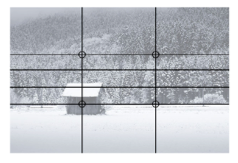
We then looked through our magezines and picked a page to split into the rule of thirds. 
As can be seen below, the main focal point which is the picture of the bird fits in the middle and top squares.


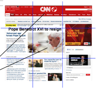
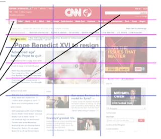
Examples of how the rule of thirds is divided across even internet pages and not just publications. As can be seen below the main focal point is the pope who is the center of the rule of thirds, then the next most important information is where the eye is next drawn to the top middle box, this is then where the CNN logo is.    


Saturday 16 February 2013

A study in colour


Contrast of tone

formed by the juxtaposition of light and dark values. This could be monochromatic (single colour). 

If the colour wheel is made monochrome you can distinguish what is the lightest, darkest and the mid tone from the actual colours (blue, yellow and red) 

Mid tone and dark and light most readable, make it another mid tone becomes less readable. 

Colours opposite on the colour wheel are most readable. Higher contrast. Colour has a tonal value. 


The green shampoo has a higher contrast on the red paper in comparison to the red glove, because its directly opposite on the colour wheel.  


 There is a higher contrast between the purple pen lid and the yellow paper because they are opposite on the colour wheel.

The red mug has a higher contrast on the green paper because they are opposite on the color wheel. 


The orange scissors have a higher contrast on the blue paper than on the red paper where there is a lower contrast, this is because the blue if further away on the colour wheel and the red is closer to the orange so has a lower contrast. 


 The green lighter has a very low contrast because the colours are extremely similar


Contrast of temperature  

Changes the way we see colour, one colour can chnage another when placed next to each other, it can create a perceived gradient. 


Contrast of Saturation 
Formed by the juxtaposition of light and dark values and their relative saturations Saturation is similar to contrast, however instead of increasing the separation between shadows and highlights, we increase the separation between colors.


Complimentary Contrast 


Formed by juxtaposing complementary colours from a colour wheel or perceptual opposites


Simultaneous Contrast 


Formed when boundaries between colours, they perceptually vibrate.


Contrast of Hue

Formed by the juxtaposing of different hues. The greater the distance between hues on a colour wheel, the greater the contrast


The green folder has a lower hue than the darker thread because it is closer to the orange on the colour wheel.


 The orange paper has a lower hue when placed on the red card because it is closer to red on the colour wheel than green.


 The green paper has a lower hue than the orange paper when placed on the yellow paper because it is closer on the colour wheel.


The green paper has a lower hue than the orange paper on the blue because it is closer to the blue on the colour wheel. 


 The orange has a lower hue because it is closer to the red on the colour wheel than yellow


The blue has a lower hue than the red on the green paper because it is closer to the green on the colour wheel.

Contrast of extension  

Formed by assigning proportional field sizes in relation to the visual weight of a colour. Also known as the contrast as proportion


 As the green crosses the red the contrst of extension changes