Sunday 28 October 2012

STUDIO BRIEF 3 - ALPHABET SOUP - ILLUSTRATOR - WORKSHOP


Vector 

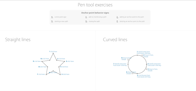
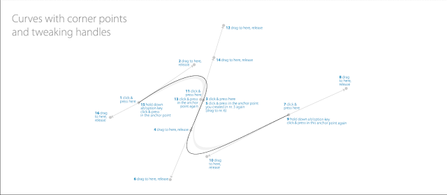
To start of with in the illustrator workshop we used the pen tool which is a vital part of Adobe illustrator. We were given these individual tasks to do which took you step by step what to do, like how to do curves and circles. 


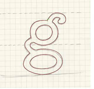
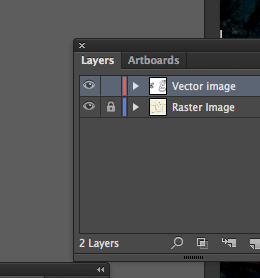
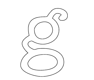
Next we were given a letter g that we had to vector using the pen tool. Using the techniques we learnt from the previous task we basically went round the letter. We could then change parts of it by using the direct selection tool by moving the anchor points. I then  as you can see below selected the eye to hide the 'Raster Image. This then left me with the letter g shown below. 

This is my final letter g. 


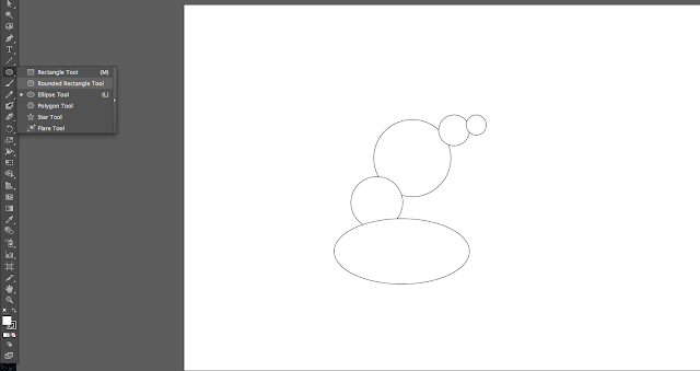
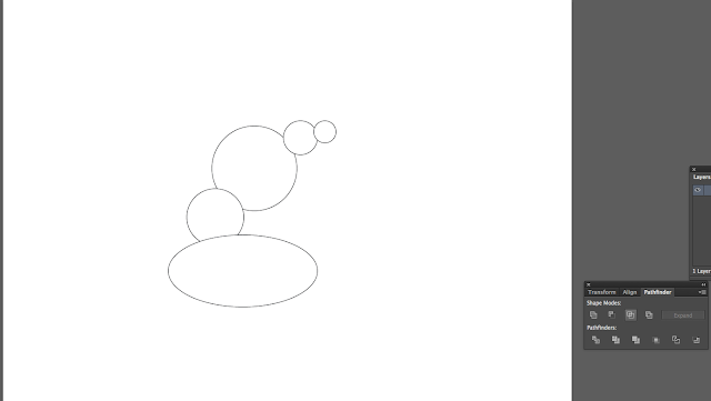
Next we created the letter g just using circles. To do this i selected the shape tool and created a oval for the base of the g, i then used circles for the remaining shapes, holding the shift key allows you to draw a perfect circle. 


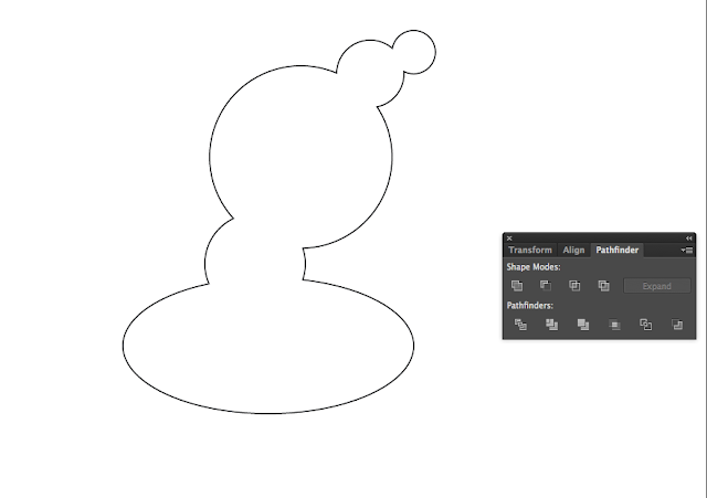
Next selecting the whole image and using the pathfinder, i selected the unite option so that all the shapes merged together. 


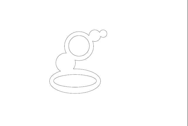
This is what happened after selecting the unite option, as you can see all the shapes have merged together. I then added circles inside them so the letter g started to form. As shown below. 


Next using the direct selection tool i selected anchor points to alter the shape of the letter g so i could change shapes that didn't quite work. 

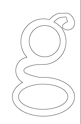
As you can see i changed the link on the g so it curved round, doing this it created a point this is altered as shown below by changing the handle. 

This is the final g below, i feel it is all good apart from the ear, where it doesn't curve round properly, its too disjointed and doesn't tie in with the rest of the letter. 


Blend 
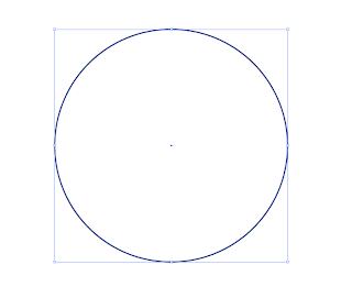
 Next i created a circle holding the shift key so it formed perfectly. I then created a smaller circle shown below. This circle can be placed anywhere, it can also be any shape other than a circle.


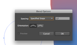
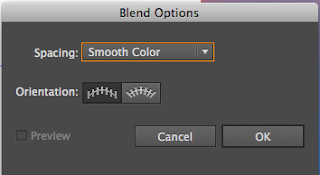
Then double clicking on the blend tool, which is the highlighted square below, this then brings up the blend options. Selecting the specified steps you can change the amount of steps between the two shapes. 


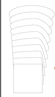
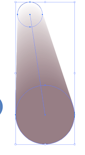
Then selecting a corner of one sahpe then slecting the opposite corner of the other shape a transformation will happen as shown below.


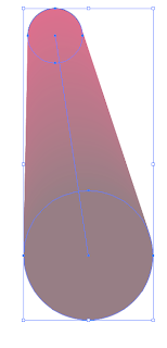
The same process can be applied then instead of going on specified steps you choose smooth colour. After selecitng the two colours you wish to blend you next select a part of one shape then select the part of the other shape and the colours blend between the shapes.


These are examples of how the colour has transfomed between the shapes.


Strokes 


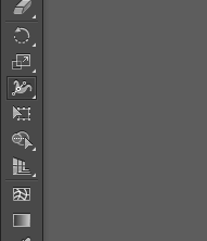
The next thing we learnt was to use the stroke tool. Selecting the stoke tool you can alter the weight of any line making it thicker of thiner. this helps to make images or transofrm letters. The stroke tool is selected as shwon below.


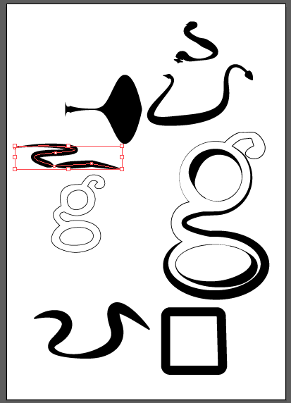
I created this line shown below which in then thickened using the stoke tool to try and create a snake.  

These are the random images i created, as you can see the stroke tool can be very usefull transforming a dull thin line into a more interesting shape. I also edited the letter G i created earlier on, adding thick edges to add more depth and make it look more interesting.
This same process can be applied to shapes as well, again which can be seen bottom left of this picture.

Sunday 21 October 2012

Studio Brief 2 - Alphabet Soup - Typeface


After getting the brief ( shown on design context ), i asked Abi a set of questions to try and get an idea of her personality/character, the questions and answers were: 

What is your favorite colour? 
Purple 

What is your earliest memory? 
Mum leaving me on pebbles 

Which living designer do you most admire, and why? 
Michael Perry, because he does hand drawn stuff 

What is your most treasured possessions? 
Fat cat 

What would your super power be? 
Create money, only when needed, wouldn't be greedy

Who would play you in the film of your life? 
Jackie Chan 

Who would you invite to your dream dinner party? 
Jessie J or Alex Pettyfer 

What makes you unhappy? 
Boring people 

What would be your fancy dress costume of choice?
Bin bag 

Which words pr phrases do you most overuse? 
'Dude' and 'no way' 

After asking Abi these questions i decided to ask her a load of random questions, to try and find out her hobbies, bad habits, likes and dislikes. The answers were- 

- loud,  - slow (nickname snail), - Intelligent, - Not very tidy, - Unorganised, - Perfectionist, - Indecisive, - No hobbies, - Cant concentrate, - Bored easily, - Bubbly,   - Mango, - 500 days of summer, - Drawing, - Karate, - Lively, - Cheesy films/Rom com, - Being outside, - New girl, - bargain hunter, - Ebay, - Strange/wired, - Forgetful, - Cheese, - fired onions, - Scared of dogs and heights,
         

After these questions i got the idea she was a lively, loud, bubbly personality so i tried to find some typefaces that in a way resembled her. Some of the typefaces i found are: 

-Alba Super 
-Bagadek 
-Practicum 
-News Gothic 

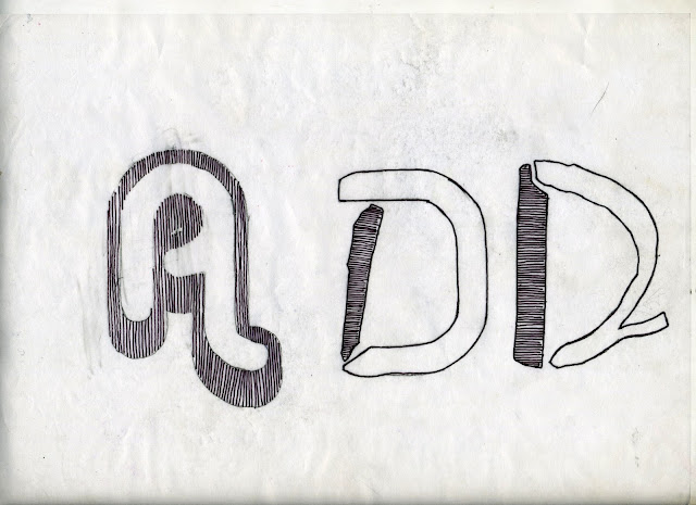
After collecting these i asked Abi what designers she liked and researched them, shown on design context! I then started off combining different typefaces together to try and resemble her disorganised side, the 2 letters on the right shown below are what came of this, i also incorporated a pattern because most the designers i researched for her used a lot of pattern. I then took this idea to the typeface i feel was the best suited to her ( Alba Super ), not combining different types but just slightly editing it by adding a patter, shown on the left!   


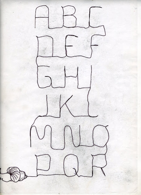
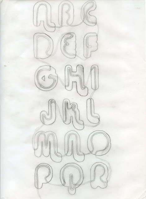
Leaving the idea shown above i started to look into the fact she has the nickname snail, as i thought this might produce some interesting alphabets and letterforms. Using the snail trail i traced over the typeface bagadek to try and create a line that when having the snail at the end looked like a snail trail. i feel this looks like a strong idea but the line is too thin and fragile and doesn't really resemble Abi very well.


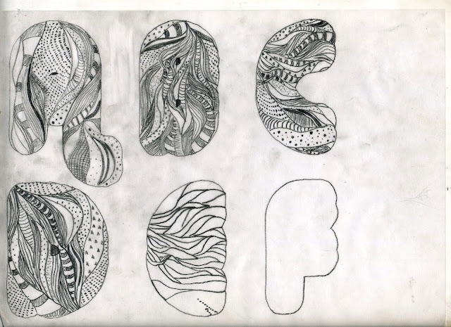
I then started to expirement with a bolder more bubbly typeface, so i used alba super. Within the typeface i used a pattern that i selected from various artists that Abi liked ( Nikki Farquharson and Andy Smith ). I feel this produced a strong typeface that was visually interesing not only this but it provides a strong representation of Abi. The negatives of the type is that its only a pattern within a type so could be preseaved as boring and on some letters might not be legibale. 

After this i took the snail idea and adapted it to the bolder type to combine the 2 ideas, this then doesn't use a thin fragile typeface so resembles Abi in a better way. I started off trying to use the pattern and incorporate the snail trail but that just got lost within it, so i took the trail through every letter trying to form the shape inside it. So if the bold typeface was taken away and you were jsut left with the line it would still form a alphabet. 

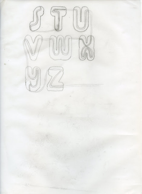
I next drew the path through the letters so i could see what the final outcome might look like and so i got a visual representation of where to go through the letters. I feel it looks very effective and i like how the line forms the letters, so if the outside letter was to be taken away it would still form the alphabet. I also like how it flows taken the viewers eye all over the page. 


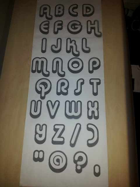
After deciding on the path, to start i printed out the typeface i was going to use in the layout  i wanted. I then started to trace the outer outline of the shape, so i could then formulate the direction of the snail trail and how the composition works. I think the typeface is really suited to Abi even without the white line inside it, because it still provides a bubbly/lively typeface. 


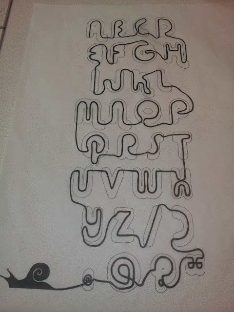
This is the final resolution to the project (shown below). i feel visually it has worked well and some of the letters are very eligible but others are not, also if i was to right a word where the letters are not next to each other as seen in the alphabet it may not work or may not produce such a visually strong piece of work. I do feel though that this is a strong representation of Abi and some of the lines through the letters work really well, like the A, F G, O, ", ?, @ and the full stop. 


This is the name card i produced on illustrator using the same typeface that i created above, although i had to slightly adjust the way the line flowed through the typeface because it wouldn't of worked as well. I then inserted the snail to make it fit in with the typeface and to resemble Abi as well. 


Wednesday 17 October 2012

Studio Brief 1 - Visual Thinking Alphabet Soup

After collecting the research shown on my Design Context blog i started to experiment with different ways of layering different letter forms.


Experimentation


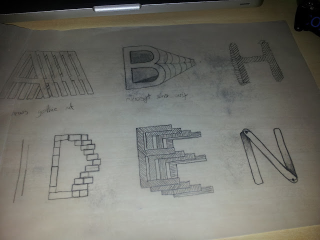
I started off drawing small examples of ways to draw layered letterforms and i decided on the 10 letters i was going to use ( shown by the highlighted letter ). After this i started to draw the ideas on tracing paper so i could use a typeface to work from. I selected some of my favourite typefaces to use, news gothic, Microsoft sans serif, furtura and helvetica. 


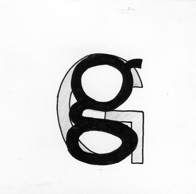
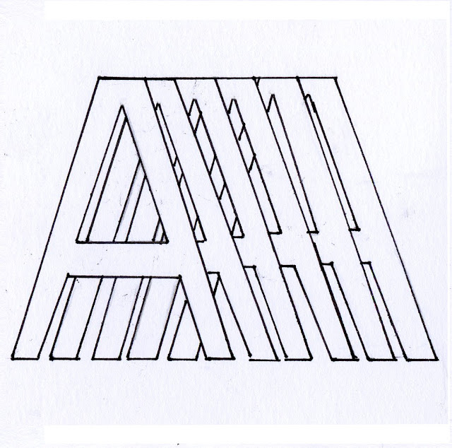
These are the examples i drew on tracing paper, i feel they all represent layers well, accept maybe the on shown bottom left. Although they all need to be drawn neater with cleaner crisp lines and in black pen. Id say my favourites were the lowercase and uppercase G, the Q, A and H. Because they all showcase layers the best and at the same time provide the best visual image. 
Next i put these ideas onto some decent card so i could then display them in our group crit.     


My final selection


These are my final selection of letters for the word layers, i feel each one resembles the word but some better than others. They are simple but get the point across plus providing a strong visual image. The strongest letter-form i feel is the first (letter A), because it provides a intricate design that looks effective and could be used across each letter of the alphabet. Another one i consider to be strong is the letter H, it is again a simple idea that has a strong visual aesthetic, this also will work across every other letter of the alphabet and when presented as a whole set it could look visually pleasing. The 2 ideas i thought could have worked well with a little more work are the Q and the G, the Q is a mixture of different typefaces layered on top of each other, this could work if some of them were moved around a bit, but at the moment the whole thing looks a bit jumbled up ( a bit messy ). With the letter G the idea was to have the lowercase g faded behind the uppercase G but this didn't work because we had to hand render and only use black and white so it was hard to get that faded look, i do feel that this idea could be strong if worked upon on Photoshop / illustrator. The weakest letters are the E and R, the E just gets lost with all the patterns and just looks a bit messy as whole. The R is just way too simple and boring!