Friday 30 November 2012

Photoshop - Workshop

Today we had our first workshop on adobe Photoshop. With a purpose of how to use Photoshop professionally. Photoshop is purposefully used to manipulate a photo that has been scanned in or imported in, unlike illustrator which is used to create a illustration. 

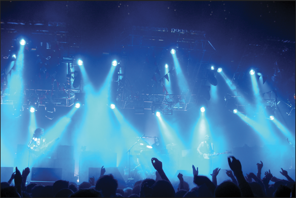
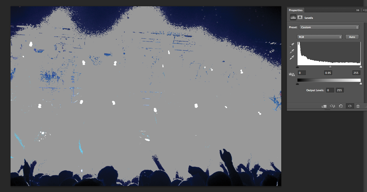
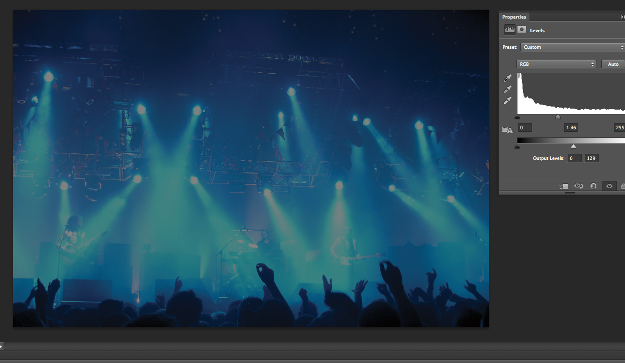
Our first task was to edit a photo that was given to use using 'levels'. As shown below i used the shortcut cmd L and the levels graph known as a Histogram appeared. I then edited the picture and pressed 'ok'


Next we created a new file, to do this i used the shortcut cmd N, this then brought up this window,


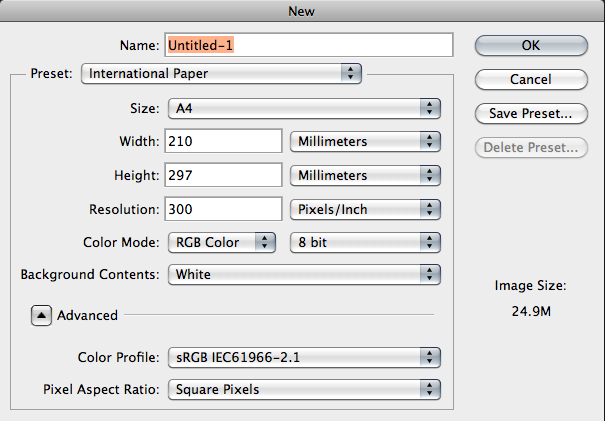
As you can see i have selected A4 paper size, the resolution on this document is at 300 which is the amount of pixels the human eye cant distinguish within a inch. So within a inch the human eye cannot detect the pixels. Also shown here is the colour mode, which is set on RGB because i will be working on a computer screen. 


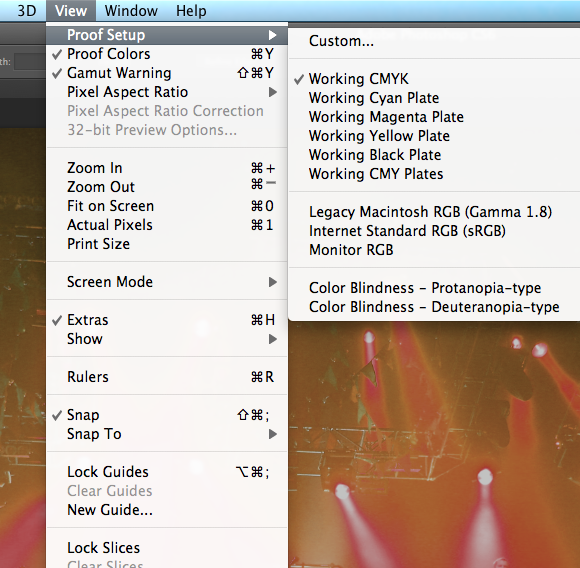
Before opening this file we opened a picture to show the difference between working in RGB and then CMYK. 


Next we put on the gamut warning, this then showed this image which reveals the areas that need to be put into the colour range, to try and get the image back to the original i changed the levels on the image. This then changed the image to the one below the gamut image.  


When changing the image form CMYK to RGB 

DESTRUCTIVE WAY 

IMAGE-MODE-CMYK doing this you cant get back to the original image and so is destructive   


NON DESTRUCTIVE WAY


When editing this image we created a adjustment layer so it didn't effect the original image. This is shown below.    


Because of this adjustment layer i could edit the image on top then and have aspects of the image below coming through. This is done by using the brush tool, i choose a soft brush and increased the size. 


As you can see the original image on the left the stain glass is bold and bright but the buildings and the row of shops is very dark, so on the adjustment layer i increased the brightness and then used the brush tool over the stain glass windows to bring them through. The final image is then a lot brighter and more detailed.


Next we created a panorama image using Photoshop. 


This is done by going on file, automate and then photomerge. 


Next selecting browse then choosing the files that want to be merged together and then pressing ok. Photoshop will then complete the process for you. 


Next we taught how to use the quick selection tool, in this case we used it to edit a very dark object in a image without changing other parts of the picture.


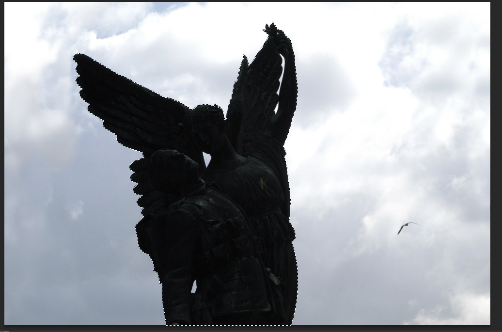
As you can see the statue has been selected but nothing else. Now using levels again i can change the darkness of the statue, increasing the brightness so more detail can be shown.


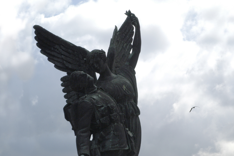
As you can now see the image is a lot stronger with a lot more detailed being showed. 


Sunday 25 November 2012

Design Principles - Type and Character

The anatomy of type part  3

'Type is speech made visible' 

Type transformed fundamentally when print was invented 
Type grew when people started to learn to read and write 
Communication changed from word of mouth to type becoming the visual representation of that speech. 


Definitions of a font and a typeface


FONT - Same weight, individual. The physical means used to create a typeface be it computer code, lithograph film.

TYPEFACE - A collection of characters, letters, numbers, symbols, punctuation etc. Which have the same distinct design. Group of fonts is a typeface 


4 Key Fonts

BLOCK - display fonts, big, black heavy fonts 
GOTHIC - Sans Serif 
ROMAN - Serif 
SCRIPT - Hand written, brush 

Our fonts separated into these groups 


Readability and Legibility 

Legibility is the degree to which glyphs (individual characters) in text are understandable or recognisable based on appearance. 

Readability is the ease in which text can be read and understood. It is influenced by line length, primary and secondary leading, justification, typestyle, kerning, tracking, point size ect. 

These are maximised through appropriate type and layout. 


Counter: defining factor if something is eligible, makes something readable. Area in and around a letter (negative space).  


Different fonts are easier to read, for example, a sans serif is easier to read on the scale of 12 - 14pt and a serif is easier to read at a scale of 9 - 11pt. 


In Word when changing a sentence/word to bold they extend everything so there is more space between the counters, it becomes more legible. 


Friday 23 November 2012

END OF MODULE SELF EVALUATION OUDG403

What skills have you developed through this module and how effectively do you think you have applied them?

Some skills  I have developed through this module are using different aspects of illustrator. I feel I have applied these skills well in the making of my illustrator typeface, especially as the skills I learnt applied directly to the making of it. The typeface has been well crafted on illustrator and contains a lot of detail that still relates back to the word ‘layers’ I randomly selected. I have also carried these skills through to other parts of my work, using it to develop images for my posters and mail shots.  


What approaches to/methods of design production have you developed and how have they informed your design development process?

I have developed a understanding of how to use illustrator, this has allowed me to scan images in and transform them digitally, not only this but also helping me to create fast designs that help a project to move along. Another approach is creating designs sheets which allow me to quickly get my initial thoughts down and straight away a visual representation of my work is created. This again helps a brief move along at a quicker speed.


What Strengths can you identify in your work and how have/will you capitalise on thses?

Some strengths I feel I have are colour selection and composition. I also feel drawing is a strong aspect of my work, this can be seen on my ‘layers’ project with the hand drawn letters. Also my illustration strengths helped me to produce the alphabet for another person (Abi). Helping me to produce a visually strong outcome.


What weaknesses can you identify in your work and how will you address these in the future?  

Some weaknesses are that my final outcome could have a stronger finish, more clean cut and crisp, the work could also be more refined, to the point. In the future I could address this by being better organised so I get more time to edit and look back at my work. Also giving myself time to look at different printing methods.


Identify five things that you will do differently next time and what do you expect to gain from doing these?


1.     Plan my time better- makes me more organised so I can look at my work and see what can be changed to improve it. This also means I wont be rushing work.
2.     Experiment more- looking at different methods of working will give me a lot more ideas and development, also allowing me to improve in other areas of Graphic design .
3.     Print my work on more professional stock- This will provide a better looking + higher quality finish
4.     Gather more research- this will help, me to generate more ideas and give me visual imagery to work form. Also providing me with a lot of information that could then be worked with.
5.     Blog as I go- This will then give me a daily diary and help me keep on top of my work therefore allowing more time to edit plus look back at my work to see what could be changed. 

  
    How would you grade yourself on the following areas:

          5=excellent, 4= very good, 3= good, 2= average, 1= poor


1
2
3
4
5
Attendance


x
Punctuality


x
Motivation


x


Commitment


x


Quantity of worked produced


x


Quality of work produced


x


Contribution to the group


x


Wednesday 21 November 2012

Studio Brief 3 - Message and Delivery: Distribution


Brief

Produce a mail shot that distributes, disseminates and reinforces your message to an appropriate list of recipients. 

Your resolution should fit within the envelope provided and be accompanied  by a visually appropriate list of recipients. 

Background/Considerations

What do you want to say and how do you want to say it? What language would be appropriate? 

What visual languages exist that relate to your message and how can you see them. 

Is the content communicated primarily through type or image? if it is both what is the relationship between the two? 

What does the mail shot aim to achieve Does it direct you to a website, encourage you to attend an event, is it interactive or is it self contained. 

A limited colour pallet (no more than 2 colours) will allow for the reproduction of your designs across arrange of media. 

The tone of voice should be appropriate to your message, the context in which its intended to be read and the audience to whom your work will be delivered. 

Mandatory requirements

Your designs should be for 2 colour (+stock) 

Deliverables

5 editions of your resolution. 
( 1 to be sent via post as directed)  

1x graphically/visually appropriate mailing list 

To start off i put down my initial ideas straight on to paper, i thought back to my poster designs that i could incorporate into my design. I first thought about creating a poster that folded up into a envelope, that also had postcards on them so the poster could be split into different sections. For each of these sections there would be information on them similar to the posters. Another idea was to have the envelope open out into a infographic. For the envelope i also thought about doing a stencil on to it so you could see through, then maybe have something behind the stencil. 


I next drew some more ideas for what could go into the mail shot, the bottom idea is like one of my ideas for the posters, showing where the most popular areas for cycling were in the world. Another idea was splitting one section in half and having the effects to the environment using cars has and what cycling does to the environment, this would be visually represented by power stations and cars creating pollution and then a bicycle surrounded by trees and greenery.  The orange one is a envelope that has a chart on it representing a fact to do with cycling, this then makes the actual envelope become interactive.


This was a quick design i created to see if i could actually have a infographic that folded into a envelope, i also drew a layout that i thought could be suitable. 


I feel like my strongest, most interactive and visually the best idea is creating the envelope that when opened out forms into a info graphic. This is because it provides the most information, not only this but it can also then be put on the wall in a flat or cycling center to make it a more interactive piece.  


This was a quick design i created of where i could have things placed for my design on illustrator. Also what random facts i could place on my design, but making sure it all fits in together. I have decided to use orange and shades of grey because i feel these will all compliment each other well. 

This is my design that i created and then used for my crit. From the crit i got some good feedback on what could be improved, like the type didn't work, maybe adding some colour to the type, slightly changing the look of the pie chart and sticking to 2 colours plus stock. 


I feel that things could be changed on this poster, the information is strong and relevant, but there are too many colours on the map which needs to be changed and i could add orange to the typeface and the pie chart. This would then tie it all together and it wouldn't be so bitty. 


Taking them things into consideration i have changed a number of things, the typeface is now futura, I've added orange to the pie chart + the important parts of type and ive made the map less confusing with less information on it and only 2 colours + stock have been used. 


FINAL DESIGN 


I also created a mailing list to where all my envelopes would be sent. I thought it would be suitable to send the poster to cycling clubs because they could then put the poster up and interact with it and find out interesting information, also sending it to schools where it could educate people/students. 


MAILING LIST


Saturday 10 November 2012

Studio Brief 2 - Message and Delivery: Research


Brief

Produce designs for a set of three high impact posters that deliver a personal identified message derived from your research.
The three posters should work as a set or series and be visually consistent. The first must be produced solely using type, the second solely with image and the third a combination of both type and image. 

Background and information

Focus on what you are trying to say and avoid generalisation and vague messages. 
Keep it simple and to the point. 
Are you making a statement, delivering facts or posing a question? 
You should consider and investigate a broad range of possible visual solutions before making your design decisions. 
Tone of voice 
Memorable, immediate high impact and clear. 
Challenging, potentially controversial but appropriate and not offensive. 
Factual, statistical, informed and specific. 

Mandatory requirements

each poster must be supported by comprehensive visual research into frame format, composition and content. 

Deliverables

You are restricted to the use of two colours plus stock. 

Three posters (2:1 format) presented at A3 scale (but not A3 format) 

To create these posters i firstly had to decide on the message we wanted to show through them, to do this i posed to myself some questions that might help, 

What statement/fact/question am i intending to communicate?
The benefits of cycling and the dangers. 

What is the tone?
Serious tone, factual, intended to explain and educate 

Who is my audience?
People who may want to take up cycling, middle ages/students 


Firstly i started off by generating  a few ideas, drawing ideas that came straight into my head because we only had one week to complete this task. These were my first few initial ideas, the top one was to represent where the most popular cycling areas were in the world, this would be shown by a small circle where it wasn't so popular, a bigger circle for where its more popular ect. The image of the three posters portrait next to each other was an idea to have all my posters working as one, this could be hard though as one has to be just type. The person was an idea to have health benefits around the the image pointing to the relevant part of the body, e.g increase legs muscles would point to his leg. The image at the bottom is contrasting how expensive travelling by transport is compared to using a bike. The one of the right is similar to the person poster, having facts and benefits around the man on the bike. 


IMAGE AND TEXT IDEAS

 I next drew up some neater ideas and started to add a few colours to see what might work together. I used the image of a bike or parts of the bike in most of my ideas because i feel this is quite important to what i am communicating, especially in a image and text poster. 
I think the ideas where i have used a fact about cycling and just a simple image are the most effective.  Because they are so simple but the message is clear and can be easily seen quickly. 


 To start i used the typeface futura because it is a very eligible font that can be read at a small scale and on a larger scale. I then changed it to italic which i thought gave it more movement  and almost a sense of speed, this then worked well with the topic of cycling. I next repeated the bike that i created using the pen tool. To create the bike i used the image shown below and traced round it using the pen tool, i then altered the pt size to 0.3 and for the final one i also changed the line too 'flat'.


After repeating the bike 8 times so if fit in with the fact i was going to use i changed the colour of one of them so it then visually showed the 1 in 8. 


I then added the horizontal lines so there was distinguished sections to the poster, so that the type and image was clearly separated. I also felt it provided a stronger layout then what it was before.

IMAGE POSTER 

I next started to look at just image ideas, this i struggled with because it is hard to get across a fact or piece of information without any text, but i started off drawing some quick thumbnails. 


After choosing my favorite design i started to create it on illustrator, using the same bike as before i duplicated it a number of times forming the shape of the Netherlands. After this i then removed the image to reveal the shape left behind. 

uniglobetravel.com


This was my final design for the poster that can only contain image. The cycles form the shape of the Netherlands, this is supposed to describe the fact that they are the nation that cycles the most. The poster has a strong impact and stands out, but if people didn't know the shape of the country they may not realize what is being described. That is why i placed the flag in the corner, but this then doesn't fit the brief because more than 2 colours and stock is being used, so i am going to remove that and just leave the shape.  


Text poster 

For my text posters i wanted to try and get a lot of facts and figures on so it could be read easily and quickly. Like the previous posters i started off with some thumb nail sketches that i quickly drew to get some ideas going. 


After these sketches i created this first poster, it doesn't work at all really, there is way too much information and there is more than 2 colors used and it feels slightly flat because there isn't much distinction between the small text and the larger text.  


After that i then created this one, where i have got rid of some of the information so it becomes easier to read, i have also changed the typeface to italic to give it some movement seeing as cycling can be a fast paced moving sport. I think it now has a better composition and isn't as flat. 


 I then changed some of the type to have a orange outline to give it more definition, i also changed the lines that are between the type making them all the same size so the viewers eye isn't distracted by larger circles/dashes.  


FINAL DESIGN


EVALUATION

Overall i feel i have produced a strong set of posters that have a high impact when looked upon. The aspects that i think are strongest are, the choice of orange and grey that compliment each other well, also the body of research that was collected as it provided me with a vast amount of interesting facts and information. I also think the imagery used has been done in a smart and interesting way that is easily understandable and the message is clear on 2 posters. Things that could be improved are that there maybe too much information on the type poster so people may not take in all the information when looked at for a small period of time, also the image poster may not have a clear message unless a lot of people knew what the Netherlands looked like, so that could be altered to become more clear. Overall i feel that i have produced a set of poster that have a strong visual impact.


Visual Literacy


Today we had our first visual literacy session. This session was based on ‘What Is Typography?’


We were asked to bring in 5 fonts, both lower and upper case.
My selection of letters was;

·      Futura
·      Cambria
·      Popular std
·      American Typewriter
·      Matura MT Script Capitals

We were then put into groups and separated all our fonts over the table. Next we put them into 5 different groups that we thought described the typefaces. Our groups 5 categories were:
1.     Italic

2.     Serif

3.     Sans Serif

4.     Weight of line, different thicknesses

5.     Bold


As a whole class we then made a bigger list of ways to categorise typefaces, so we could see what other groups had said, this list was:

1.    Serif
2.    Sans Serif
3.    Blackletter
4.    Script
5.    Italic
6.    Multiple Weights
7.    Calligraphy
8.    Handwritten
9.    Bold
10. Thin
11. Thick
12. Decorative

These are all ways of describing a typeface,  like the quality of line,  characteristic of line, how much it stands out ect.


Over the years typefaces have changed a lot, due to the methods of production when creating them, in the classic pre industrial age to start with they used stone and chisel to carve out the letters into a rock,  because of the flat edge of the chisel the ends of letters had to have a sharp edge, or point coming off it (the beginning of serif fonts).  Next in Asia, (most commonly the oriental scenes) they started to use sable, basically painting and ink, these created a very hand drawn type. Then there was bone, this process created elegant, feminem typefaces. Moving into the modern post industrial age there was wood, this process created simple, formal and modern typefaces. Then came lead, the typefaces created using this were very fragile and minimal. Then lastly it was silicon based typefaces that had been created on the computer, they are very geometric, dense and simple. 


Column1
Method of Production
Character of Letterform
Stone
Established, sophisticated, tradiitonal, commercial
Classic Pre Industrial
Sable
Rough, fast, fluid, gothic
Bone
Elegant, femin, posh
Wood
Simple, formal, carved, modern
Modern Post Industrial
Lead
Fragile, rounded, bold, minimal
Silicon
Geometric, dense, textured, simple


After looking at these methods of production we grouped our typefaces into them. 

Stone

Sable


Bone 


Wood


Lead

Silicon


Anatomy of a Typeface

Bowl
A curved stroke that encloses a letters counter

Counter
Fully or partially enclosed space within a letter 

Stem
Primary vertical stroke 

Serif
"feet" or non structural details at the ends of some strokes. 

Sans serif
'Without serif' 

Stroke
    . Ascender An upward vertical stroke found on lowercase letters that extend above typefaces x height. 
    . Arm A horizontal stroke not connected on one of both ends 
    . Crossbar A horizontal stroke 
    . Descender A downward vertical stroke found on lowercase letters that extends below the baseline
    . Diagonal stroke An angled stroke
    . Ear A small stroke projecting from form the upper right bowl of some lowercase g's
    . Hairline The thin strokes of a serif typeface
    . Shoulder A curved stroke originating from a stem 
    . Spine The main curved stroke for a capital and lowercase s
    . Tail A descending stroke often decorative 
    . Terminal The end of a stroke that lacks a serif 


Baseline
The invisible line where letters sit 

X Height
The height of the main body of a lowercase letter 


------------------------ ^
------------------------  Point 
------------------------  Size 
------------------------ v


Point Size 
The size form the top of the ascender to the bottom of the descender

1 point = 1/72 inches = 25.4/72 mm = 0.352

12 points = 1 pica 


Information collected here: Anatomy of a typeface 


After this we were given a set of fonts that another person in our class had collected, we had to use the website identifont, so we could look closer at the font to find out what it was called. 

The 5 fonts that i found were: 

COURIER 


BELL


BRUSH SCRIPT STD


BAUHAUS 93


MONOTYPE BROADWAY 


After doing this i looked in more detail at one of the fonts. The font i have chosen to look into more detail at is: MONOTYPE BROADWAY  

Designer: Morris Fuller Benton (Sol Hess added a lowercase in 1929) 
Year: 1928 
Copyright: Monotype Classic Fonts 
Publisher:  Monotype 
Weight: 400
Glyphs: 252
Category: Sans Serif  

Similar fonts
ITC Manhattan 
Dremie 
Broadway 
Marquis 
Glitzy 
P22 Art Deco Display 

Digital versions are now made by Linotype, Elsner + flake, Monotype, Bitstream and URW++

Costs
Myfonts.com: $29 

Linotype.com: £29.75

ascenderfonts.com: $35.00

Fontshop.com: $35.00

Fonts.com: $29.00


The font is supposed to evoke the feeling of the twenties and thirties. It is a classic icon as a 'Art deco' font.