Today's session will be on illustrator and we will be dealing with colour.
CMYK - Subtractive - processed colour used for print - usually light colour comes first when printing - key (brings it all together)
RGB - Additive
There are different ways of creating colour
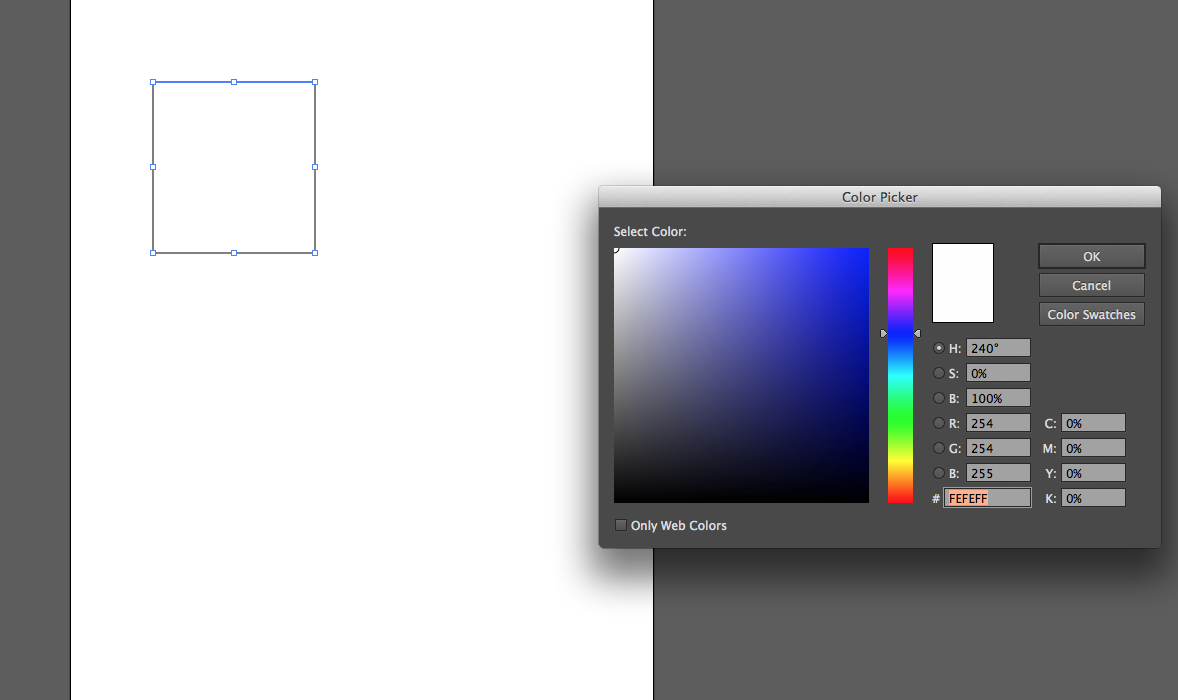
- Colour picker
-Swatch Pallet
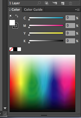
- Colour Pallet
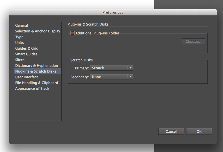
We firstly had to make sure our preferences were correct, we had to make sure on preferences that the primary scratch disk was on Scratch
Creating a new document
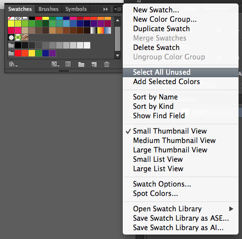
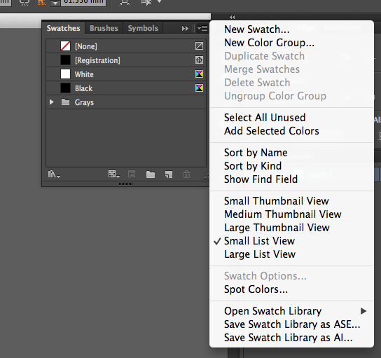
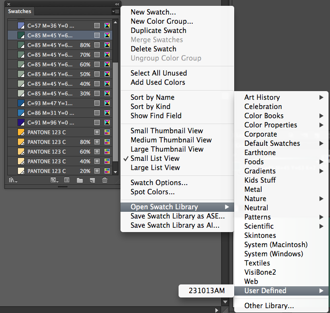
Today are going to focus on the swatch pallet, the swatch pallet allows colour to be applied consistently. There is already a range of swatches there, but we want to create our own colours. To do this we go on the menu select all unused and then delete.
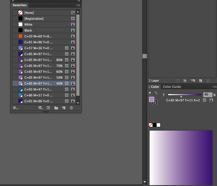
We then viewed it in a small list which displays the colours a lot clearer as shown below.
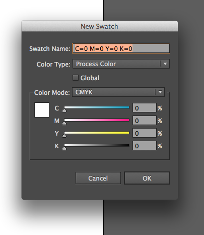
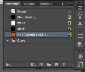
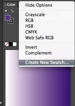
We then went on menu and the new swatch to create our own colours.
The colour then is shown below the other colours seen in the image below here. The registration colour is crop marks and and register marks for print.
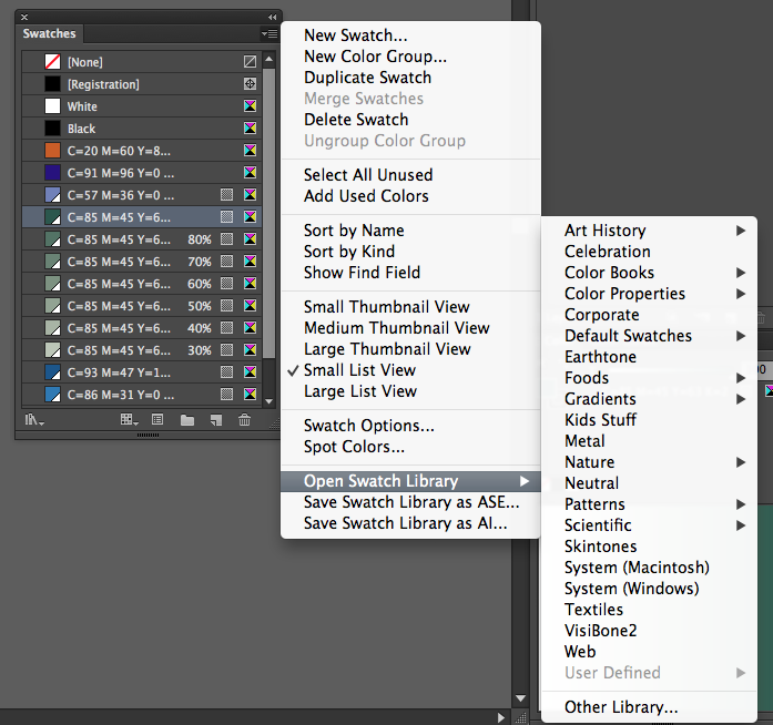
Next we created boxes that we coloured in, then going on menu and selecting used colours it adds the colours that we've used to our swatch library.
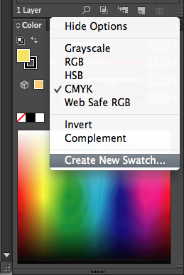
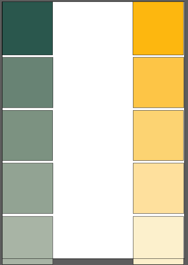
Next we created tints of a colour and the selected new swatch and again it appeared on our swatch pallet. Creating colours this way by not using the swatch libary it creates a global colour, showed by the corner thats coloured in white on the small swatch, colours without this corner are called local colours but with the corner are called global colours, this means if this swatch is edited it edits any object that has that colour, making 'global' changes within a document. It now allows us to create varying tints of the colour.
As can be seen below is a range of tints i created just by reducing the percentage by 20% each time.
Then when you go on a global colour and press swatch options and edit it it changes all the colours
Next we looked into Spot colours and processed colours.
Spot colours are much cheaper to print with than processed colours because it only uses 4 colours, they also allow for consistency because the same colour will be printed everywhere.
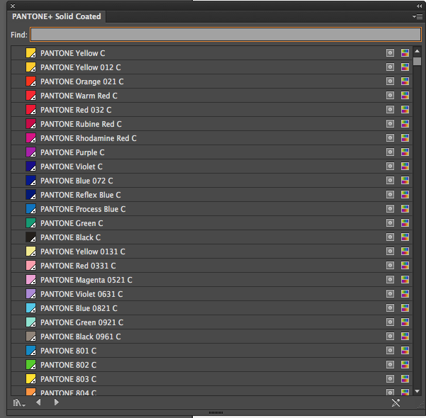
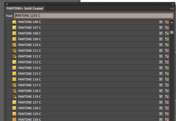
We opened up the Pantone colour library next
We then typed in a colour to search in the find bar shown below.
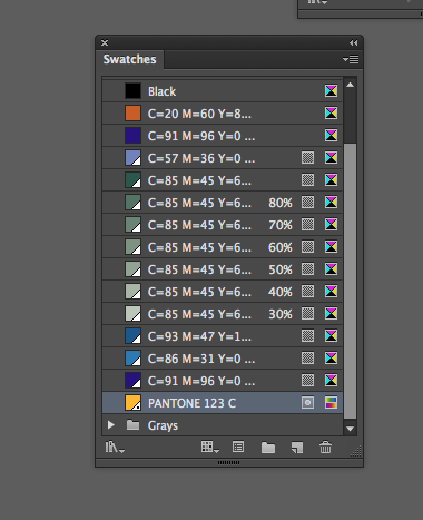
The pantone colours are shown by the white triangle in the bottom corner that has a small black dot in the centre.
The pantone colours can then be added to the swatch list. But the name should never change because when it comes to printing at a printers they wont be able to find the colour without the code.
Next we saved our swatch list by going on save swatch library as Ai. This can then be opened again by going on open swatch library then user defined then selecting the saved swatches.
We then saved it again but this time we saved it as a ASE, then going on photoshop we went on the swatches menu then load swatches and then open the swatches which then automatically load to Pohotshop.
.jpg)