Friday 28 February 2014

Purdeys advertisement design

Within this brief Purdeys said they don't have advertisement and that there drink is just discovered, so despite them saying they have no advertisement it would obviously be beneficial for them to have some. So i thought of a way this could be done is to hint at advertisement but isn't so in your face. 
The way I thought would be good is having posters around that don't have the Purdeys name on them but just had colours and shapes that are relevant to this drink i have created. 


So i created these poster which hint at advertisement, they show the circle that is on the drinks and the ingredients thats in each drink. The idea is that somebody will see these and think whats that, and when they next see the bottles they will remember the posters and buy the drink, this then implies that the drink has been 'discovered'. 


After creating this very simple poster i mocked it up so it is in the environment. 


Thursday 27 February 2014

Concertina and flyer task

In today's session we were given a task by Phil, this is what we were given: 


Background:
This simple layout will ask you to utilise a short amount of body copy, title, date, and location. The minimal amount of text allows for the simple use of single imagery and the type to serve as the main visual elements.

Brief:
You are asked to produce a simplistic flyer design for Jackson Rising Exhibition at MoMA (Museum of Modern Art – New York) using the instructions below. 


The images given


Specifications:

Format: A5 – Portrait

Title: Jackson Rising
Sub-Title: Curated by Jenny Dowd
Date: August 3, 2014 - August 31, 2014

Copy: Four artists met at an artist residency at the Ucross Foundation in 2013, now they come together to inhabit at MoMA, New York.

Location: MoMA, New York.

Contacts:
info@jacksonrising.com                                                                            
www.jacksonrising.com
www.moma.org

Image: Jackson Rising ident / MoMA logo / NYU logo
Use of two colours only: Black and white
(Use embedded InDesign file and follow grid.)
Save as PDF file. 


We then had to make all this information and images look good, it would give us a chance to have work that necessarily didn't look that good and we'd have to make it look good using a strong layout. 


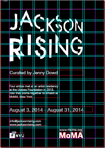
This was one of my first flyers, i started off seeing where i would put things on the paper, but i felt this wasn't working, i also wanted the background to be black so i then changed that and took all the white logos and images. 


This is then my final design, i changed the hierarchy of the text so the most important text was bigger than the least important information, i also made the logos smaller and put the website of MoMAs above there logo.


We were then set another task:


Background:
This text/image heavy layout will ask you to utilise body copy, title, date, and location, heading, sub heading, imagery, indexes, highlighted quotes. The amount of text allows for the use of imagery and the type to serve as the main visual elements.

Brief:
You are to layout and design a 10-page concertina folded brochure for a forth-coming exhibition titled ‘Jackson Rising’ at MoMA, New York. All images, copy and branding are included. You have to create a visually stimulating layout that showcases the artists’ imagery but does not sacrifice important information in this process. The images and information must flow harmoniously and offer a taste of what is to be expected during the exhibition.

Branding elements must be kept to black and white. Images must be unaltered and in colour.

Considerations:
Headings, headlines, body copy, grid, type, colour, image sizing, bleed, margins, flow, audience, narrative, language, purpose, size, external print methods, preparing for print, stock, distribution.


The Images given


We were then given the same logos and information for the flyer but also informtion about all the artists and the curator.   


This is the colours i used to resemble each page and each artist and it would be put on the front page of the publication.  

Below is the grid that i used for my front cover of the publication.


Below is the top of each page, the name of the artists and then the colour that resembles them.


This is the layout i used across every page, with the text on the left, this is because most people read from left to right.


I then put in the photos keeping the layout consistent across all the pages again


This is the final layout of the publication which would then be printed and folded into a
Concertina. 


On the other side i would then have the image shown below: 


This could then be stood up at the exhibition with the folded ones flat down on the table.


This task that was set helped us to prepare us for a brief that we might get set in the real world and then have to have a fast turn around, it also prepares us for work that we might get given that we don't like or is of poor quality that we then have to make look good with layout and other things that surround it.


Wednesday 26 February 2014

Champneys Poster

Because we wanted focus around creating work for Champneys that related to not going out and instead going to the Spa i created a poster that would should why you should go to the spa and not go out, this poster will be used to show the really bad side of going out and then the really good side of going to the spa. 


This is a very quick example i did for the poster we would be aiming towards, although it would be of much a higher quality, i am going to take this to the crit so i can show what aesthetic we would be looking at doing. 


Wednesday 19 February 2014

Secret 7

Song, Elbow, Grounds For Divorce.

These are my initial sketches for secret seven brief, i took a number of objects and telling parts of the song that i thought meant something or were important parts of the song. So i looked at the stopwatch, a pint illustrating the pub he always goes to, some cards, and a rose.


Below are my initial sketches of the rose i first drew,  one reason for having a drawing instead of pure vector based image was because a lot of elbows albums have neat illustrations on them that form a picture that sums up there album, this is why i have drawn a rose which i feel sums up this song.


I then icreased the contrast of the rose so it gave it more depth


I then cropped the image so i was left with this. 

Next i selected the rose on Photoshop and put a deep dead red on it, to emphasize the death of the rose.


I then used my drawing to create a vector with a vibrant red.


I then put a gradient behind it to give it some depth.


My final choices for my album sleeve


Evaluation

I feel this project was helpful because i was able to turn around the brief quiet fast because i gave myself the weekend to complete it. It also gave me a chance to draw with a pencil which i feel adds a unique aspect to my work or anyone's work, it then stands out from the rest and is more personal. I think my final outcome for the one shown above is strong and looks clean and crisp, i also feel it illustrates the song well, but has been done very simply. But this simplicity can mean a number of different things. I think to improve this brief i could have maybe spent more time thinking about background colours and colours for the rose itself and also making the illustrations on the one shown first above more detailed and again with stronger chosen colours.


Tuesday 18 February 2014

Purdeys further design


After deciding on the colours of the bottle i thought they might need something else on them, so looking at the ingredients of the individual bottles i decided to make some illustrations. 


i Firstly drew some of the ingredients that are labelled on the drinks in my sketchbook 


I would then use these so i can get the correct shape of the fruit 


Adding colours to the fruit 


After adding the relevant colours i then just used type for the other important ingredients in the drinks.