To start in today's session we firstly lay out are scamps so people could go round and comment on them and give us feedback.
Images of my scamps
Feedback on my scamps
Favorite design is the one in pen
I like the logo placement the most on the third one but layout and access to each film on the middle one. Downward links relate well to film.
I think there is a lot more potential that what is here, imagery?
Logo placement is defiantly better on the third one, whilst the navigation seems clearer on the 2nd
Like the simplicity of the pen deign. Clean and efficient. Like the icons on the end design
Creating the website
we need to specify the width and the height, we did this by putting in a open { the pressing enter and typing in width: and the specifying the width and height as shown below.
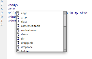
On source code we then created the container or wrapper, this is the outsider of the website, it contains it all. To get it we used the <div which brought up id= and we typed in container
close using the </, this then selects anything that hasn't been closed yet and automatically comes up
so </div> came up
we then went on the css sheet to add a colour, this was done by pressing return and then typing in background: then hashtag, then select colour, i choose the blue, this then fills in the container we created earlier.
refresh the web page to see if it has worked correctly
this then centers the image as seen below
Next creating the navigation bar, in css we created this
We then created a logo in illustrator which we could then move over to Dreamweaver, Simon gave us 1minute to create it, we then saved it in illustrator, by using the save for web button. We saved it as a PNG 24.


No comments:
Post a Comment