Final images
Design Boards
To Conclude
Pamphlet stitch
I think one of the best methods of binding for the publication i am creating is pamphlet stitch, because it is easy to do and can be produced on a large scale. I also like the aesthetic it gives on my publication making it have a hand crafted touch to it. Something that when it is given out in a shop the audience will like. It also relates well to the crafted look because it is showing bikes which are a crafted object.
Creating a pamphlet stitch
I firstly held the book together with bulldog clips
I then came up through the middle hole down through the bottom back round up through the top hole then back down the centre. Again showing how quick this method is.
In this book i also printed the mock up on different paper so i could see what would look best with my illustrations
So in the book i had
Ivory paper at 160gsm
Antique paper at 120gsm
Cartridge paper at 120gsm
Watercolour paper 180gsm
I decided that the ivory was far to dark and i didn't like how it worked with the black illustrations or the blue gradient on the pages. I also thought that cartridge paper was not the correct colour and looked a bit dull, the watercolour paper was far too thick and i dont think it would work well as a folded publication of pages, i also didnt like how the ink a ran slightly on the paper. I think the best paper was the antique white paper where the illustrations looked sharp and the colour wasn't too far off white that it looked strange. Although i feel there could be a better choice of paper i could use.
Perfect bound book
For my book i decided to experiment with different types of binding so i could see what would work best with my book.
I firstly created a perfect bound book.
To start i printed the pages out so they were individual sleeves, and then held them together with sound clips.
I then sanded the pages down so they were perfectly flat and applied a layer of glue along the paper.
I then left it to dry and placed the book under some heavy weights to help the glue dry in the correct place. After this i then applies another layer so it is strong.
The result i felt was strong but it didn't feel the book was physically that strong because there was so few pages. I did however like how it opened up flat because i had bikes going across a fold.
I then decided to add a cover to see how that would work and if it would give me extra strength.
I started with having the cover that i folded 3 times so it would fit round the edge of the book and also lay flat on the top and bottom of the book.
I think i carried out this method really well and the quality of the finish was high. I like how the book folds flat because throughout my publication i have a number of different illustrations that go across the pages. Despite this the book is a very small number of pages and i don't think is suited to this method of binding, especially as my publication is to be handed out in shops, and so it would realistically being using a much faster method of binding such as staple binding or a quick 3 hole pamphlet stitch.
I think though i have developed a very helpful skill here that i can now carry across to other modules and start creating and binding my own books.
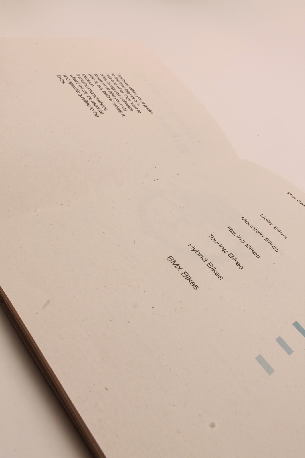
After having a crit i decided to change my book completely so i started looking at different ways i could layout my book.
I then created these layouts shown below, using one of the illustrations i have created i used to see where would be best to have it. I also put in text to see where that would work with my design.
I have highlighted the ones i feel are best and ones i will take forward with my publication.
I then started to look at different colour schemes to see what i could use for my publication.


I used this grid system to layout my book,
I then looked at the colours i selected earlier to see what they look like.
I decided that the blue looked best, and that it also worked best as a gradient.
Using the layouts above to see what works best
I then selected the layout above, i felt this was the best because it showed the bike as the main attraction and the colour isn't too overpowering on the whole page. There is also a small description that isn't too big but is easily readable.
Using the gradient i then started to insert the other illustrations i had made.
I also added information at each bike, from my research i was able to find out information about key parts of the bike, i have put these on to the page via a numbering system, where each part is labeled with a line and that number is put at the bottom.
Front cover
for the front cover i took the gradient and used it across the bottom and put the title of my book at the top, keeping it simple and easier to read.