Project Report
Showing posts with label OUGD503. Show all posts
Showing posts with label OUGD503. Show all posts
Thursday, 24 April 2014
Wednesday, 23 April 2014
Final Boards for all briefs
Responsive briefs final boards
Bare Munch
Champneys
Dialogue
Champneys 2
OCD car parts
Purdeys
Secret 7
Bare Munch
Champneys
Dialogue
Champneys 2
OCD car parts
Purdeys
Secret 7
Bare Munch, Take Away/Delivery Company
The Brief
To create a fast food delivery compnay logo that contained a bear using the imagery he gave me and then creating other collaterol.
Deliverables
2 logos that can be used across other material and other printed material.
Concept
To start i was given a image that is shown below to use to create the logo for him, so what i am going to do is make that logo for him but then do my own interpretation of it and what i think would look better because also gave me instructions on what colours to use. So i want to create a logo that can be used across a range of different printed material that is simple and playful.
Firstly creating this logo.


I firstly started by drawing round the 2 images i was given


I then coloured them in using colours he wanted me to use and put them together.


I then added the name of the company to give it some reference.


So this was the logo i did from the details he gave me and the timeframe given, as can been seen there wasn't much room for movement within the logo . So i did the best i could.
Given more time i started to work on another logo that i would give to him and show what it could look like.


The process of making the logo


The final logo

Mocked up vinyl logo that could be used on a window

After creating this logo shown above i felt i needed to create something else that he could use as a secondary logo that could be used across things like shop windows, leaflets, hand outs and wasn't just a circle.

Next i created those bits of information where i could use the logo above and the first logo i have shown.
Letterhead


Loyalty Card


Back of card


Loyalty card mock up

Business card
Back


Front

Mock up of the business card i have done for him

Tuesday, 8 April 2014
Champneys Photographing the work
Today i set up a photography studio so i could photograph the printed work i had done for Champneys.
Not much to it really but i did it so i could show the printed material at the highest of qualities to display on the final boards for mine and Ants project.
The final images i took i shown below.
Not much to it really but i did it so i could show the printed material at the highest of qualities to display on the final boards for mine and Ants project.
The final images i took i shown below.
Wednesday, 2 April 2014
dialogue exhibiton work
We were given a brief from the 3rd years, they set us a challenge of creating some work that was based around the theme dialogue.
The objective is to encourage contributions for a week long, non profit pop up print exhibition and shop that will be held at the Leeds Corn Exchange between March 28th and April 4th 2014.
The theme of the exhibition is 'dialogue' where each creative will submit a design that will be used in a blind collaboration. Contributors must be open to their submissions being manipulated through the use of print and the match making process, that will pair the two submissions together. This will create a series of screen-printed artworks that will be displayed throughout the running of the exhibition.
Submissions can take any form of the theme. It could reflect directly on past conversations, forms of interaction or it could spread further afield to what you think communication is today.
After reading this and doing some research i thought i would look into different conversation and what has changed over time in forms of communication.
I discovered what the different forms of communication had changed from till this century. From this i created the design shown below.

I then decide to create another design, this design is based around the fact that the world has become so small due to communication, we can connect to somebody who is on the other side of the world at the click of a button. Not only this but we can fly to the other side of the world faster than ever before to communicate with somebody, again 'the shrinking' of the world.
This then formed the concept of have a very large plane and and very small world.

The objective is to encourage contributions for a week long, non profit pop up print exhibition and shop that will be held at the Leeds Corn Exchange between March 28th and April 4th 2014.
The theme of the exhibition is 'dialogue' where each creative will submit a design that will be used in a blind collaboration. Contributors must be open to their submissions being manipulated through the use of print and the match making process, that will pair the two submissions together. This will create a series of screen-printed artworks that will be displayed throughout the running of the exhibition.
Submissions can take any form of the theme. It could reflect directly on past conversations, forms of interaction or it could spread further afield to what you think communication is today.
After reading this and doing some research i thought i would look into different conversation and what has changed over time in forms of communication.
I discovered what the different forms of communication had changed from till this century. From this i created the design shown below.
I then decide to create another design, this design is based around the fact that the world has become so small due to communication, we can connect to somebody who is on the other side of the world at the click of a button. Not only this but we can fly to the other side of the world faster than ever before to communicate with somebody, again 'the shrinking' of the world.
This then formed the concept of have a very large plane and and very small world.
Evaluation
During this project i was able to exhibit my work in a gallery for the first time, not only this but the people who came down to see it were studios and other designers, so it gave me a taste of taking part in a gallery and gave me a chance to talk to other designers. Not only this but we had to take into account that the design was going to be overlapped with something else which was a consideration i had never taken into account before, so working to these strict details was interesting and thought provoking. The brief itself also made me think about communication in another light to what i did before, not just because of my own research and design but also from looking at what other people had done and what there ideas were behind them.
Saturday, 22 March 2014
Design for Champneys
Taking the illustrations created by ant i set about creating posters that would be used to advertise the products and the Champneys brand. These posters should be simple and in keeping with all the other Champneys brand as well as the app Ant has made.
So after the crit and the ideas we got Ant created these drinks shown below using the research i did when i went to boots to look at there product range.

So using these illustrations created by Ant i am going to create posters that will show the glass on one side and then the product on the other, incorporating the Qr code that Ant has made.
I started off with a simple grid that i took from the brochures i had been researching so they would tie in with the rest of the Champneys brand.

This grid allows me to have the product as the centre of attention but also i can insert other information at the bottom and top.
i then started dropping in relevant information

The main image in the centre

The logo at the bottom so they know its Champneys

Then the slogan
After this i felt it looked a bit boring so i inserted a colour to the background.

I then created the product poster that would be displayed next to the one above.

This is how they would be displayed next to each other.

After looking at them closely i felt they didn't match very well with the App that Ant made and the colours needed to be changed and maybe changing the type as well.
SO using the same grid i inserted relevant information and also chnaged the background colour.

I then did the same for the product poster.

I then did the same for all the other products.


I then made sure they were all consistent and so lined them up and used rulers to line them up.

I then went about creating some mock ups for the design boards of the posters in an environment.

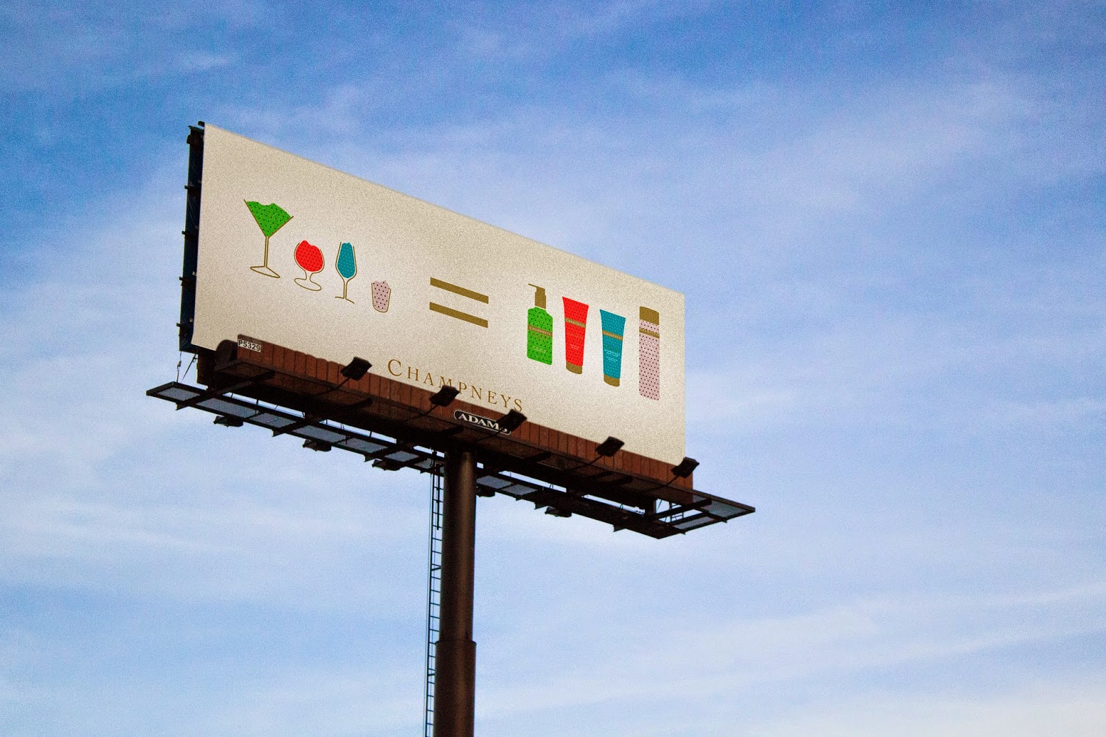
Next i thought about other ways of advertising and so i thought a billboard would work well with what we were portraying.
i firstly created one with just one of the products

and then made one with all the products

I then mocked these up on to a billboard.

So after the crit and the ideas we got Ant created these drinks shown below using the research i did when i went to boots to look at there product range.
So using these illustrations created by Ant i am going to create posters that will show the glass on one side and then the product on the other, incorporating the Qr code that Ant has made.
I started off with a simple grid that i took from the brochures i had been researching so they would tie in with the rest of the Champneys brand.
This grid allows me to have the product as the centre of attention but also i can insert other information at the bottom and top.
i then started dropping in relevant information
The main image in the centre
The logo at the bottom so they know its Champneys
Then the slogan
After this i felt it looked a bit boring so i inserted a colour to the background.
I then created the product poster that would be displayed next to the one above.
This is how they would be displayed next to each other.
After looking at them closely i felt they didn't match very well with the App that Ant made and the colours needed to be changed and maybe changing the type as well.
SO using the same grid i inserted relevant information and also chnaged the background colour.
I then did the same for the product poster.
I then did the same for all the other products.
I then made sure they were all consistent and so lined them up and used rulers to line them up.
I then went about creating some mock ups for the design boards of the posters in an environment.
Next i thought about other ways of advertising and so i thought a billboard would work well with what we were portraying.
i firstly created one with just one of the products
and then made one with all the products
I then mocked these up on to a billboard.
Subscribe to:
Comments (Atom)