To start we spoke through what research we had found and what we had put on our boards, we then were given feedback on some ideas of what we could do.
My boards
Feedback i was given:
- Publication on the history of the bike
- Why they did the big wheel bike?
- Publication that folds like the folding bike
As a group to start we were asked what we thought should not go on design boards.
Do nots
- To get rid of first person, the people who will be marking/viewing our work dont care what 'i' have been doing, they want to see finished work.
- Spelling mistakes, check for spelling mistakes
- Food stains, re print boards that have had a faulty print on them or marks from the printer
- Poor image quality, make sure the images are off a high quality
- Too much text (TLDR-Too Long Dont Read) if the text is too long the marker wont read it.
- Too little text, the images on the page have to have some context
- Details, add details to the page, the typeface used, how the publication is bound, the pantone colour, publication size ect
Things to add to a board
- Name on boards
- Board numbers (3 of 5), (3/5)
- Titles, what part of the work is it
- Show my own work, there should be more of my work than of others, markers are interested in looking at my work rather than others
- Good quality photos
- Consistent layout across all the boards
- Final images of the work
After hearing all of this i realised that most of my boards had these exact faults on them.
Next we then passed our boards to the person next to us so they could go through them and pick out the faults just talked about.
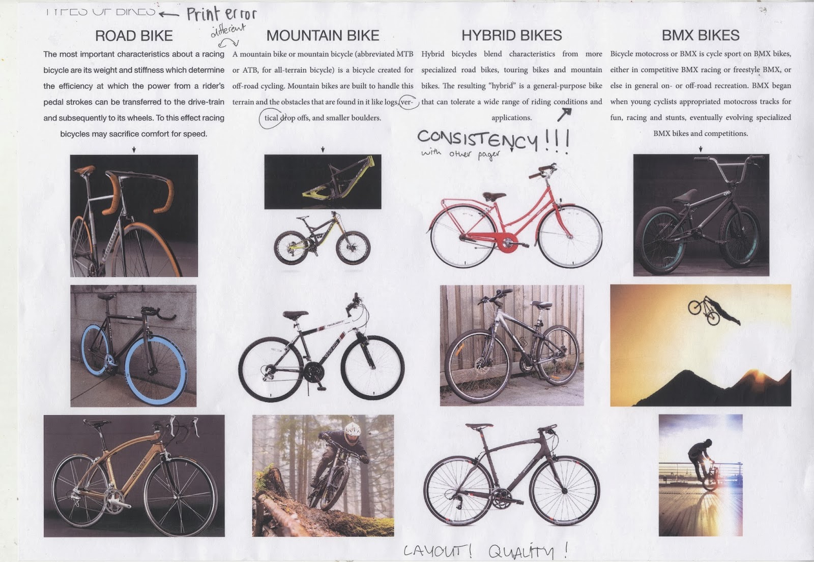
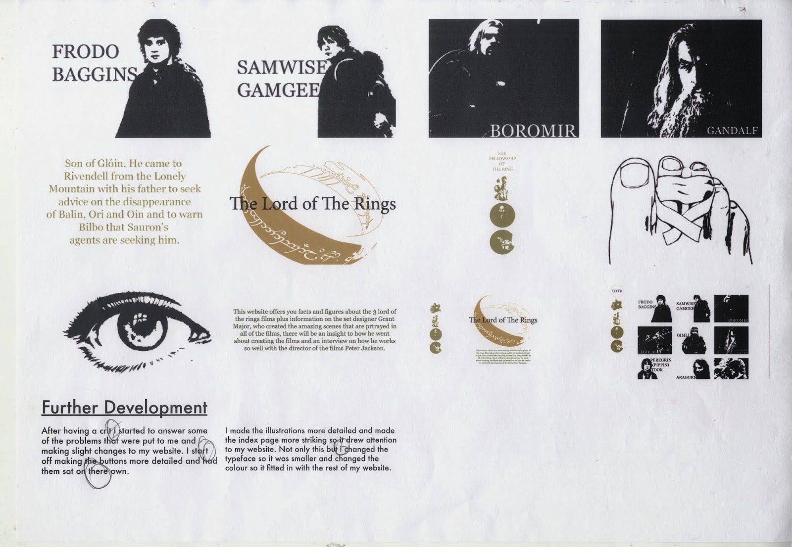
Below are all my boards and the feedback that was put on them.
Below are all my boards and the feedback that was put on them.
- Print error, get the board re printed
- Have a stronger layout with all the images the same size or in a strong grid
- Have higher quality images
- Boards need name, titles, module code, page numbers ect
- TLDR (too long dont read), i need to shorten the text so its not waffle
- Higher quality images
- Print error, get it re printed
- The type is different, have consistency across all pages as well as on the same page
- Check spelling mistakes
- Make all the images the same so there is a strong layout
- Have a bigger space between the two paragraphs
- Consider spacing on the paragraphs
- Center align the text
- Better quality images
- Check for spelling mistakes
- More detail in the colour, what pantone numbers are they? ect
- Title and module code needs to go on all boards
- Make all the images the same dimensions
- Check spelling mistakes
- Check spelling mistakes
- Check the spacing between the images
- Check spelling mistakes
- Have a higher quality image
- Check spelling mistakes
- Don't use first person, same across all other boards
- Cannot read the numbers on the wireframes make them bigger
- Don't use first person
- Check spelling
- Don't use first person
- Don't use first person
- Check spacing of the images
- Check spelling
- There is no need for the shoddy drawn images
- Use stronger quality images
- Check the consistency of the type
- Layout of the images needs to but stronger
- Check the spacing of images
- Why is there a missing image, make it more consistent
- Consider the layout
- Check the spacing between the image
- Get them re printed if there is a print error
- Add some text to avoid a scrapbook look
What i found out about during this session is that design boards are essential and provide a perfect opportunity to get the design that has been made across to the audience, they should get straight to the point and proivde detailed information of the design without being to overwhelming with information. They also give me a opportunity to propose different things in a visual and interesting way. Another thing i discovered during the session was the layout of the page is just as important as any other piece of design i was doing and whoever is marking my work will be able to see the smallest of problems or spelling mistakes which will have an impact on how my work is viewed.


No comments:
Post a Comment