Design Practice
Wednesday, 21 May 2014
Tuesday, 20 May 2014
Edited images and boards studio brief 2
Edited images for boards studio brief 2
Final Boards
To Conclude
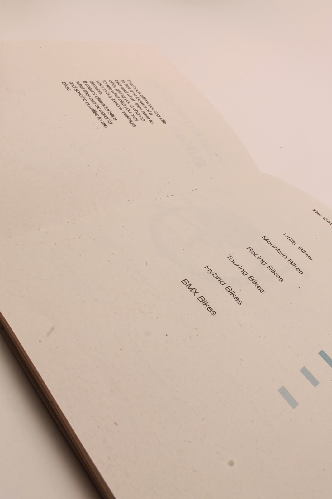
I feel like this project went well and i have created a strong concept and idea for the event, i think i was rushed towards the end and so the overall look is no way near as strong as i wanted it. Things i think that have worked well are the colour scheme which i feel stands out from the rest and it has been applied in a number of different ways strong. I also think the vinyl has come out strong and it was just a matter of sticking my logo on everything i only had a few items with it on and even then it was more to do with identity of the overall brand and the objects used were relevant and not just any old items used for the sake of it. Things i feel that didn't go too well were the information book, i think this was rushed and although it looked good on the screen when i printed it i really disliked it, i think if i hadn't been so rushed i would of used a different stock and thought about the design a bit more, another thing that didn't go to well was the design boards, for some reason the photos i edited in Photoshop and then moved over to indesign were blurry despite being much larger than the size i scaled them down too and even when i exported them they were still blurry, now if i hadn't of left these to the last minute then i could have sorted this problem and my design boards would have been a lot stronger.
Final images studio brief 2
Final images
All the printed collateral
Free gifts for the athletes
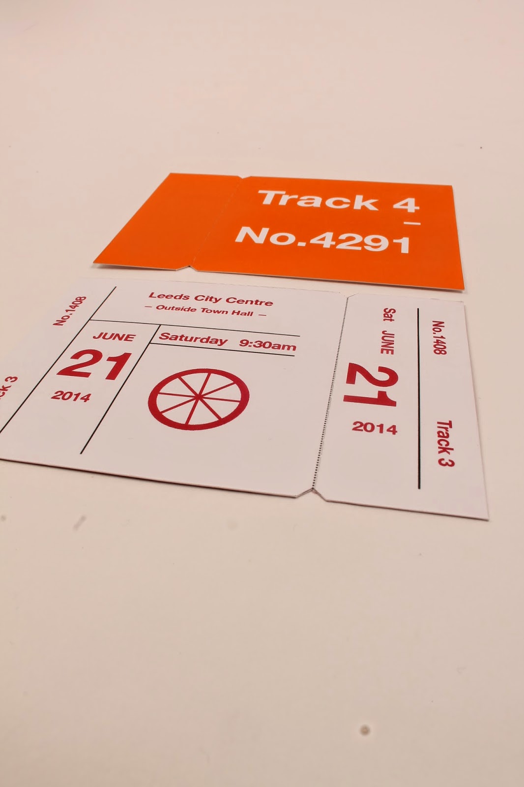
Tickets
Event pass
MAPS
Event information book
Posters
Subscribe to:
Comments (Atom)


